These 3 graphics explain 2016’s record warmth
Climate scientists around the world just announced that 2016 is the warmest year on record, beating out 2015 and 2014 for the dubious distinction.
The temperature milestone means that 16 of the 17 warmest years on record have now occurred since 2001, with each of the past three years setting global heat records.
SEE ALSO: 2016 sets 'terrifying' milestone as Earth's warmest year on record
It's all well and good to say that 2016 was the hottest year on record, but to put that figure into context, you need decades of data.
On Wednesday, NASA and media outlets (including Mashable) released graphics to do exactly that by showing exactly how 2016 eclipsed other years to become Earth's hottest year on record.
The graphics below help drive that grim reality home:
NASA's record warm years animation
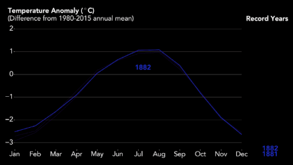
Image: NASA/Earth Observatory.Joshua Stevens
NASA scientists released the above animation showing the long-term warming trend, with record warm years listed on the right hand side.
This graphic makes clear that 2016 exceeded past years by a considerable amount, owing to NASA's inclusion of Arctic temperature data. The Arctic was record warm during 2016, scientists have found, with record low sea ice and other widespread environmental changes.
Decadal Temperature Trends
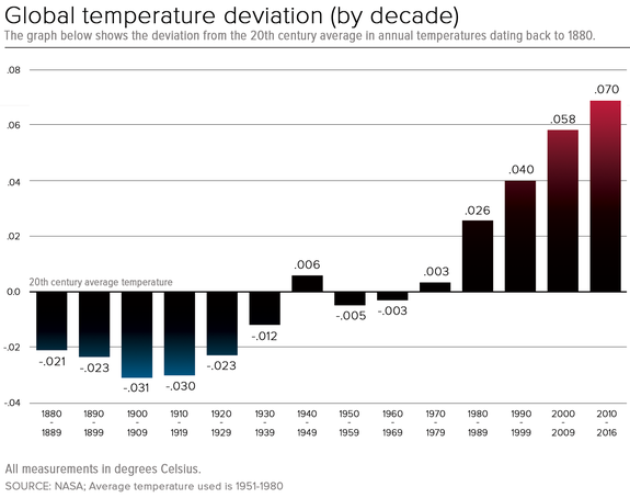
Image: bob al-greene/mashable
This temperature chart, based on NASA data, shows temperature deviation from the 1951-1980 average per decade.
It illustrates that climate change has accelerated in recent decades, with the current decade ranking as the warmest so far, though that could change if there are several unusually cold years from now through 2020.
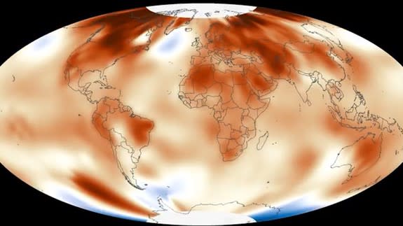
Temperature anomalies show a world turning red
Both NASA and NOAA released versions of temperature animations showing the progression of temperature anomalies over time, which eventually paint the planet orange and red hues as recent decades show up.
NOAA found that global land and ocean surface temperatures were 0.94 degrees Celsius, or 1.69 degrees Fahrenheit, above the 20th century average, which beat the 2015 record by 0.04 degrees Celsius, or 0.07 degrees Fahrenheit, according to the Wednesday announcement. The first eight months of the year were each record warm, NOAA said.
Using independent methods, NASA found that globally-averaged surface temperatures in 2016 were 0.99 degrees Celsius, or 1.78 degrees Fahrenheit, warmer than the mid-20th century average.
NASA and NOAA differ in their base period as well as their precise methodology, which accounts for the divergent temperature findings.
What's more, according to NOAA, not a single land area on the planet was cooler than average last year.
