
 Business 2 Community
8 Landing Page Design Best Practices
Want to design a landing page to stop potential leads in their tracks and boost your conversion rate sky-high?
If so, this is the article for you.
When it comes to building a landing page, design is everything. Ultimately, your design is what will make it easy for leads to understand your landing page and convert.
When users arrive on your landing page, it should be clear to them what you’re selling in 5 seconds or less. This idea comes from a 2006 study at Carleton University, which showed that you have under 5 seconds to engage and impress first time viewers before they leave your landing page.
Most people mistakenly believe that aesthetics are the easy part of creating a landing page. In reality, a poorly designed page has been proven to kill businesses’ conversion rates.
In this article I’ll walk you through 8 pivotal landing page design practices guaranteed to increase your conversion rate.
Lets get started!
Landing Page Design Best Practice #1: Use Context-of-Use Videos & Images to Explain Your Offer
Context-of-use is a great way to explain your product or service to potential leads. Including an image or video demonstration of your product in use is eye-catching and shows potential leads the exact features your offering has. It lets potential leads place themselves in the actual situation with your product or service.
A good-quality image or video can also visually show the benefits of your offering. Images or videos should serve a direct purpose rather than just filling space on your page. An example of using an image with direct purpose can be seen in the Atlantis Resort landing page below. Hotels and resorts use images of their white sand beaches with the crystal-clear ocean to cause viewers to imagine being at this relaxing destination. In this example an image is more powerful and impactful than any written message.

The landing page below is a great example of using a short video demonstration. It shows the Magic Bullet and its ability to chop and blend just about anything “in 10 seconds or less.” The video clearly enforces how life in the kitchen is made easier with this convenient device.

Landing Page Design Best Practice #2: Display Images of Happy People to Make Your Page Welcoming to Visitors
Images of people can make your page more personal and warm. These images are the most appealing and welcoming, and will make your potential leads feel more comfortable on your page. Actually, one study showed that having a picture of a smiling person on a specific landing page increased conversions by 102.5%! People act off of their feelings and we can use emotions to make potential leads feel a certain way. Displaying a smiling face puts them in a positive mood, leading to a positive impact on conversions.
You can also use images of people as a directional cue, guiding page viewers to what you’re offering. It’s human nature to follow other people’s eye-line to their point of focus. Have the person in your image look towards your offering, and viewers’ eyes will be drawn to the person’s focus-point. The landing page below is a great example as the woman’s eyes direct you straight to the information and call-to-action.

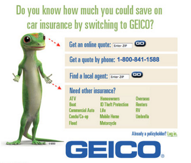
The same applies to the person’s body language which you can use to steer viewers’ eyes to a specific part of your page. Using a person’s body as a directional cue is a great way to get viewers to look somewhere specific without them even noticing. Be subtle in how you do this, however, as obvious pointing or gesturing by the person can come across as annoying or distasteful to viewers. The image below from Geico is a great example of this technique, as the gecko’s eyes and body language subtly draw your eyes to the information.
Landing Page Design Best Practice #3: Highlight the Most Important Areas of Your Page With Contrasting Colours and Whitespace
Contrasting colours are sharp variations or changes in colour, such as a bright orange icon on a dark blue background. As humans, we are naturally attracted to this type of severe difference. You can use this in your design to highlight the sections of your page that you want to be seen. The heading, lead-capture form, and the call-to-action (CTA) button should be the most prominent elements. With contrasting colours it’s easier for potential leads to digest the information on your page and convert.
One big mistake many marketers make is packing too many elements onto one landing page. Whitespace is the best way to fix this. Whitespace is blank space used strategically on your page to make certain areas standout. Place whitespace around features like your heading, lead-capture form, and CTA button to give them room to breathe. This will make your page very clean, and force potential leads to focus on what’s important.
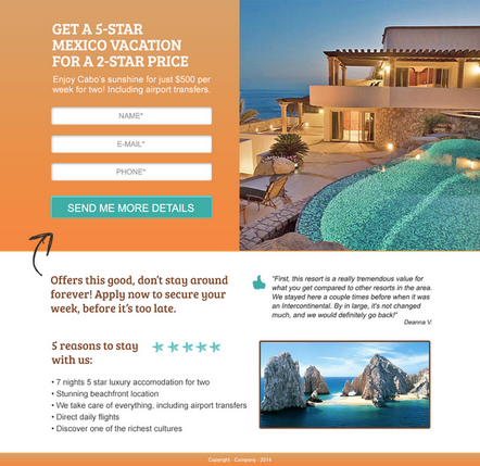
The landing page below is a great example of using contrasting colours and whitespace. Here are 5 reasons why:
Call-to-action button “Send Me More Details” is highlighted against a contrasting orange background
Use of an arrow as a directional cue
Lead-capture form displays white form fields on an orange background
Consistent theme of orange, white and turquoise is used throughout, but contrast makes certain areas stand out
There is enough info on the page to entice customers to want to learn more, but it doesn’t appear overcrowded
Landing Page Design Best Practice #4: Design an Obvious Call-to-Action (CTA) Button
Your CTA button is ultimately the most important feature on your landing page. Your entire goal is getting viewers to see this button and want to take the action to convert on it. The effectiveness of your CTA button can be changed instantly through an eye-catching design and obvious placement on your page.
1. Demand Attention Through Your CTA Design – As I mentioned above, it’s crucial that you use contrasting colours to make your CTA stand out against the background.
Here are 4 more attention-grabbing design elements to make your CTA demand attention:
Bold your CTA text: This makes the words jump out, driving viewers to read your CTA button, making them more likely to convert.
Make your CTA button large enough to be seen: The button should be a main feature that potential leads see when they land on your page.
Use directional cues to guide viewers to your CTA (arrows, lines, line of sight): These types of indicators are a great way to steer viewers to the CTA button so that it is obvious where they click to convert.
Make your CTA appear clickable through a 3D design or download arrow: This gives your button a special design element to make it unique from any other component on the page.
The CTA button from Skype below is perfect. Here are four things that make it great:
The green button contrasts the blue background
The button is a large feature on the page
The white button text stands out against the green button
The button text is bold and easy to read

2. Place your CTA Where It Can Be Seen - Where you place your CTA button on your landing page is also a crucial design aspect to consider. It needs to be in a visible location where it will be seen by everyone. It should be one of the first things your customer sees on the page and shouldn’t require a lot of effort for viewers to find.
Generally you want to place your CTA “above the fold,” on the right hand side of the page. “Above the fold” means positioning your CTA so that it’s visible to potential leads without scrolling down. This makes the CTA button a key feature as soon as viewers arrive. Seeing your CTA immediately tells potential leads the whole focus and theme of your landing page.
3. Time the Appearance of Your CTA – One advanced call-to-action technique is to use an embedded video landing page with a delayed CTA. This means having a video as the main component of your landing page to hook in viewers and grab their full attention. After about 20-30 seconds set your landing page so that your CTA and lead-capture form appear. This gives your potential lead the opportunity to watch part of your video without any other distractions on the page. Once they have an understanding of your offering, the late appearance of the CTA button will make them more inclined to convert.
The landing page below is a good example of timing the various elements of your page. After watching 20 seconds of this video, the lead-capture form and CTA arrive on the right-hand side of the page. This allows viewers to get a preview of the type of information they will receive in the Landing Page Conversion Guide, before being asked for any information. The delayed arrival of the CTA and lead-capture form make them more obvious, and potential leads more likely to convert.

4. Define the Action to Take Through Your CTA Button Text – When designing your CTA button, it’s crucial that your button text actually describes what the viewer is doing by clicking and converting. You should never have a button that reads “submit” as it doesn’t convey what the viewer will get from clicking the button. One Hubspot study that looked at over 40,000 landing pages with “submit” as CTA copy found that these pages actually had lower conversion rates than pages with different copy.
A few good examples of CTA button text include:
Start My Free Trial Now
Get My Ebook
Download My Copy Now
The more specific and clear you are with your button copy, the higher your conversion rate will be.
5. Avoid Common CTA Design Mistakes – There are a number of common mistakes to avoid when designing your CTA button. A few examples include using similar colours for the background and CTA button, making the button a small feature on the page, and having vague button text like “submit.”
The landing page below is an example of a bad CTA button. This landing page has enticing images of the Perivolos Resort, but even after looking at the page for a few seconds it’s hard to find the CTA button in the bottom right hand corner. Instead, the company should have a large “Book Now” button higher up on the page, with bold lettering and a contrasting button colour.

Landing Page Design Best Practice #5: Make Your Benefits Clear or Risk Potential Leads Looking Elsewhere
Potential leads need to know how your product offering meets their needs. What exactly are they going to get from this relationship? Present benefits in a clear, simple way that makes them curious for more information.
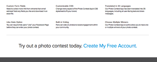
It’s best to present these benefits in a list or small blurb. This allows potential leads to easily skim through and see if this is the right product offering for their needs. The landing page below is a great example of 4 encapsulated benefits which clearly stand out from each other.
Be careful not to overwhelm the customer with language or terms that they won’t understand. The tricky task is giving them enough information to feel educated about what you’re offering, but short and sweet enough that it’s easy to comprehend.
Some benefit item examples include:
Save money instantly! Get our new _______ and save ___/month starting today
Increase productivity by reducing time spent ___________
With the most advanced technology, _________ helps you optimize your business’ efficiency and security
Landing Page Design Best Practice #6: Provide Potential Leads With One Single Action to Take
When creating your landing page, the goal is to provide potential leads with an easy path to conversion. We need to provide viewers with only one action they can take to convert. This means removing any navigation bars, footers, or outside links apart from our CTA. Having multiple things for potential leads to click on is a large distraction and will reduce the number of people actually clicking the CTA and converting.
Below is an example of a poorly designed landing page that has not removed any links, making it very hard to tell what the actual goal of the page is. Is the call-to-action to sign up for the mailing list, book online, or order a gift card? Always ensure you are giving potential leads just one thing to click on if you want to see your conversion rate excel.

Landing Page Design Best Practice #7: Use Bold Headings to Make It Easy For Potential Leads to Skim
A heading and subheading are crucial to your landing page design as they hook in potential leads. However, marketers should also remember to use bold section headings throughout the page to explain additional benefits or selling points. Break information down into small, digestible segments with one consistent topic discussed in each. With small sections and logical headings, your page will be more appealing and easier to skim.
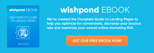
Near the bottom of your landing page you should also include a bold statement that reaffirms your value proposition. This final declaration should include a call-to-action. This is your last chance to convince potential leads they need your offering. An example of this can be seen in the Wishpond landing page below. Potential leads are given one last statement along with one final opportunity to convert.
Having an organized, easy-to-read display of information is key to capturing leads. Your page design must be easy to skim and understand in order for your conversion rate to soar.
Landing Page Design Best Practice #8: Create a Short Lead-Capture Form to Prevent a High Bounce Rate
As a visitor, there’s nothing more frustrating or daunting than an overcomplicated lead-capture form. When designing your landing page, it is crucial that filling in your lead-capture form is an easy task for potential leads. If not, they will be sure to drop out before completing the conversion.
In fact, a recent study by HubSpot that analyzed over 40,000 landing pages found that conversion rates improved by nearly half when text entry fields were reduced from 4 to 3. The study also found a strong negative correlation between the number of drop-down menu fields and conversion rates.
The picture below shows a good example of a lead-capture form. Shopify asks for just 3 fields which are vital to create an online store, and nothing further.
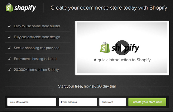
When creating your signup form, keep your main objectives in mind. Only ask potential leads for information necessary to achieve your objectives. The more fields you ask potential leads to fill out, the more drop off you’ll experience.
Conclusion
The design of your landing page is as important, if not more important than the actual content on the page itself. Potential leads need to be able to easily read the page and understand the message you are trying to convey.
Following these 8 design best practices will provide your viewers with a brief, informative and visually appealing glimpse of your brand, leading to higher conversions.
Every landing page does, however, have room for improvement. A/B Testing is the best way to ensure that you have the proper design in place to drive potential customers further along the sales funnel.
This article was syndicated from Business 2 Community: 8 Landing Page Design Best Practices
More Social articles from Business 2 Community:
