
Apple’s killer quarter in charts

Apple’s fiscal first quarter was a complete blowout, sending the company’s stock soaring in after-hours trading on Tuesday night. We already gave you all the numbers: $18 billion in profit… $74.6 billion in revenue… 74.4 million iPhones sold… gross margin that climbed to 39.9%… it’s all simply staggering.
Of course, there’s no better way to put Apple’s killer quarter in content than by visualizing some of the key figures from Apple’s report.
DON’T MISS: 5 reasons Google’s move to become a wireless carrier may be doomed to fail
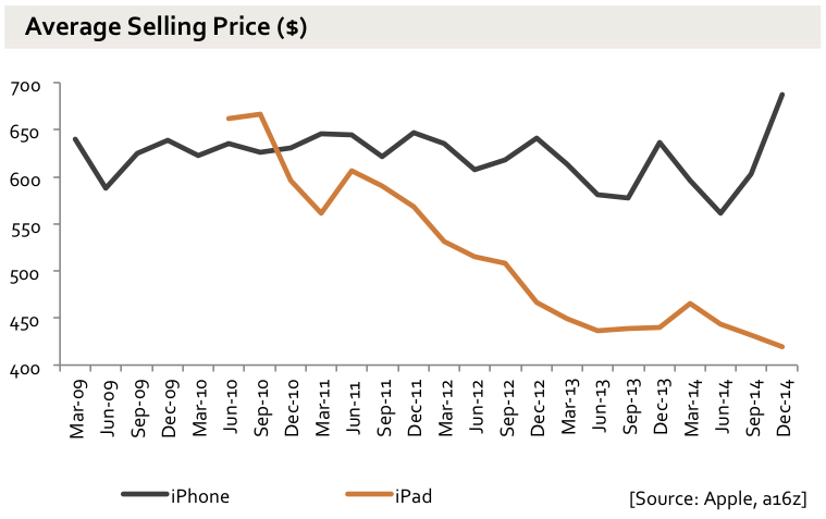
Mobile analyst Benedict Evans from Andreessen Horowitz is a well-respected Apple watcher, and he’s always quick on the draw when it comes to charting Apple’s results. On Tuesday evening, he ran a quick post on his blog that included 12 charts.
They’re all fairly simple and straightforward, but they do a phenomenal job of hitting most of the key points, and of putting all of the numbers from Apple’s fiscal first quarter in perspective.
A handful of some of the most important charts follow below, and the rest can be seen by following the link down in our source section.
Related stories
This brand new free iPhone app finds you cheap flights by predicting the future
The hidden takeaway in Apple's earnings: Android has almost nothing going for it right now
7 awesome paid iPhone apps that are all free downloads right now
More from BGR: 7 awesome paid iPhone apps that are all free downloads right now
This article was originally published on BGR.com
