
Google’s new logo: More than a dozen Google designs that didn’t make the cut
In the late morning on September 1st, Google unveiled a brand new logo that replaces the company’s iconic multicolored typeface with… a new iconic multicolored typeface. This marks the fifth major redesign of Google’s logo since the company first launched its game-changing search engine in the late 1990s. The new logo has an updated look with a font that is much harder and more modern than the previous font, but it’s softened by the customary tilted “e” at the end.
Here’s what it looks like compared to the previous logo:
DON’T MISS: So long, Surface: Lenovo’s Surface Pro clone is the Windows hybrid we’ve been waiting for
It’s simple enough, and it certainly fits well with the new design direction that Google began heading in when it debuted “Material Design” last year. Material Design is a set of design guidelines characterized by hard lines, geometric shapes and subtle layering, often using slight shadows to add dimension.
In the context of Material Design, Google’s old logo was sorely out of place.
Some people aren’t happy with the new logo at all. For example, popular Apple blogger John Gruber complained that the new logo is “simply garbage,” and is “just right for a company with no taste.” That seems like an unreasonably harsh assessment for a logo as simple as Google’s, but everyone is certainly entitled to his or her opinion.
And to be frank, the logo Google landed on is much, much better than other options the company was considering.
In a blog post on Tuesday that showed off the new logo for the first time, Google included an interesting photo that many simply passed over as they read about the design process that led to Google’s big logo redesign. Let’s stop for a moment and check it out, though.
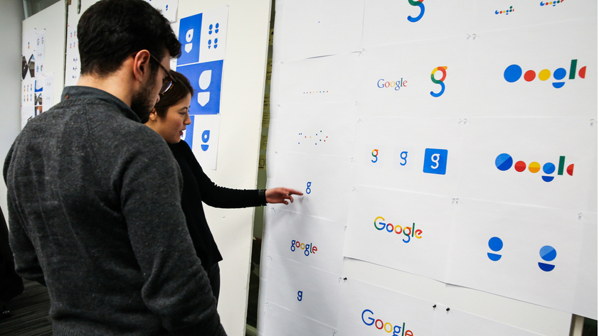
In the photo, we can see more than a dozen new designs that Google toyed with on the way to finding its new look. The designs pictured vary dramatically, ranging from subtle variations of the old logo to a dramatic shift toward abstract geometric shapes.
Interesting though these alternate designs may be, critics of the new logo will certainly appreciate the fact that it could have been much worse.
Related stories
Google's third-gen Nest thermostat is here: Same price, smarter software
I think I've figured out how much the new Nexus 5 will cost
Here's a look at Google's new logo
More from BGR: I think I’ve figured out how much the new Nexus 5 will cost
This article was originally published on BGR.com

