
The Netflix redesign you’ve been waiting for is finally here – this is what it looks like

Last month, we told you about a huge redesign that was being tested by Netflix. While the service itself is loved by subscribers around the world, the service’s website has been pretty terrible for quite some time. Slow, janky animations and slow-moving carousels characterize the site now, and the entire look of Netflix.com has always seemed a bit behind the times.
Now, however, all that is a distant memory.
DON’T MISS: Try to wrap your mind around the incredible future Google is creating
Netflix announced on Monday afternoon that it has begun to roll out a huge redesign. While many people stream Netflix using a set-top box or a mobile app on a smartphone or tablet, many more stream content directly to a computer from Netflix.com.
Now, the web experience offered by Netflix is getting much, much better.
“With the new Netflix website, we’ve created a richer, more visual experience, and a website that works more like an app and less like a series of linked web pages,” Netflix said in a post on its blog. “Information appears in-line and in context rather than on a separate page, which makes exploring the catalog faster than ever before.”
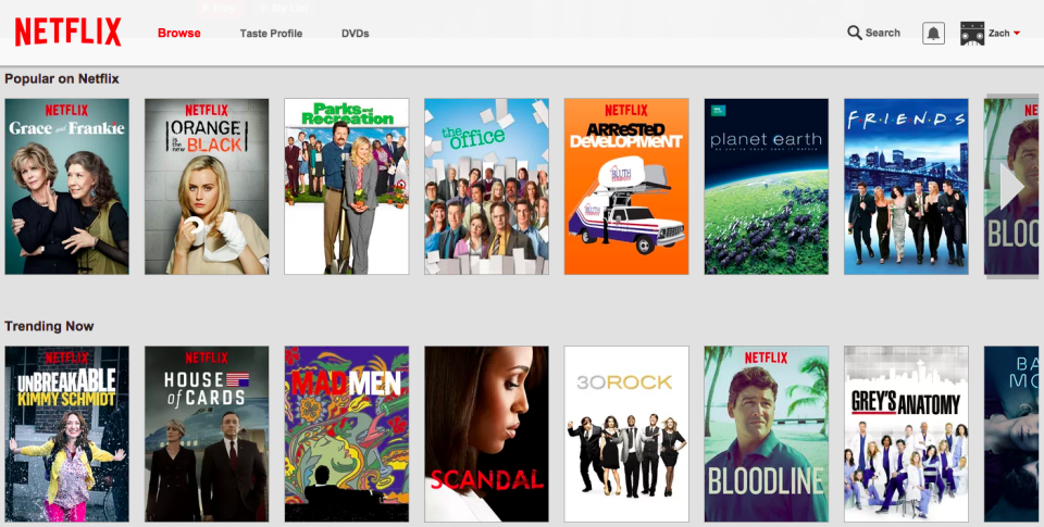
Here’s the old site design:
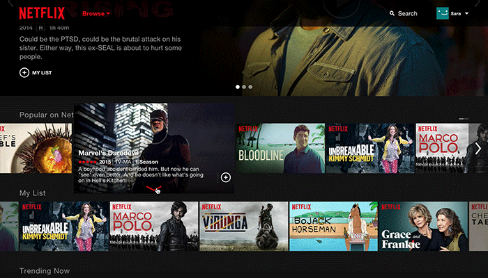
And here’s a GIF that shows us what navigating the site will be like with the sleek new design:
The new site design has already begun rolling out so if you don’t see it yet, be patient and you’ll get it within the next two weeks.
Related stories
The 5 best new movies and TV shows coming to Netflix this week
Every new movie and TV show you can stream on Netflix this week (June 14 - June 20)
You might be ruining your Netflix streams without even knowing it - here's a simple fix
More from BGR: Why can’t Android have great apps? iOS gets two more great releases first
This article was originally published on BGR.com

