South Africa in eight charts ahead of crucial vote
South Africa, one of the continent’s richest and most influential countries, goes to the polls on 29 May amid concerns about unemployment, high crime rates and power cuts.
Here, in charts, are the big issues in this general election - the seventh since the start of the democratic era in 1994.
If the opinion polls are correct then the ballot could herald a new phase in the country’s politics.
The African National Congress (ANC) has been the dominant political force since it successfully led the struggle against the white-minority government and the racist legal system known as apartheid.
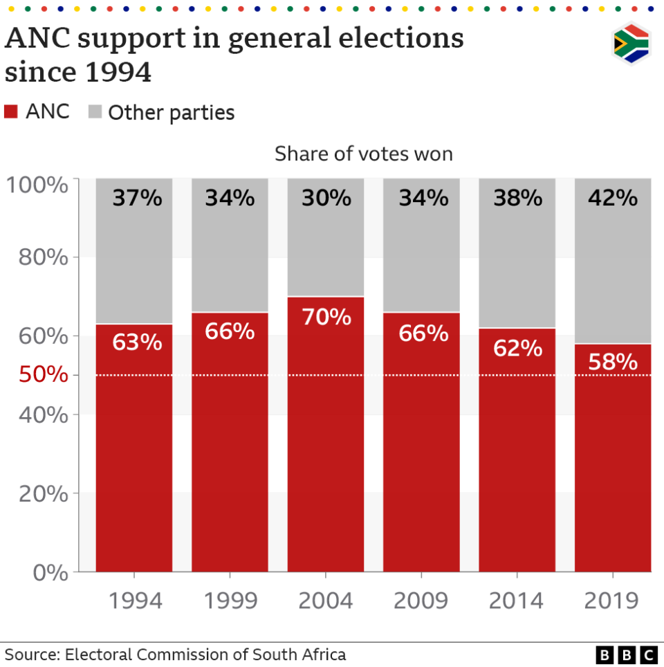
It won the country's first democratic elections in 1994 and has been in power ever since.
But its share of the vote at general elections has been falling steadily since its high-water mark of 70% in 2004.
Surveys suggest that it may drop below 50% for the first time, forcing the party into some form of coalition.
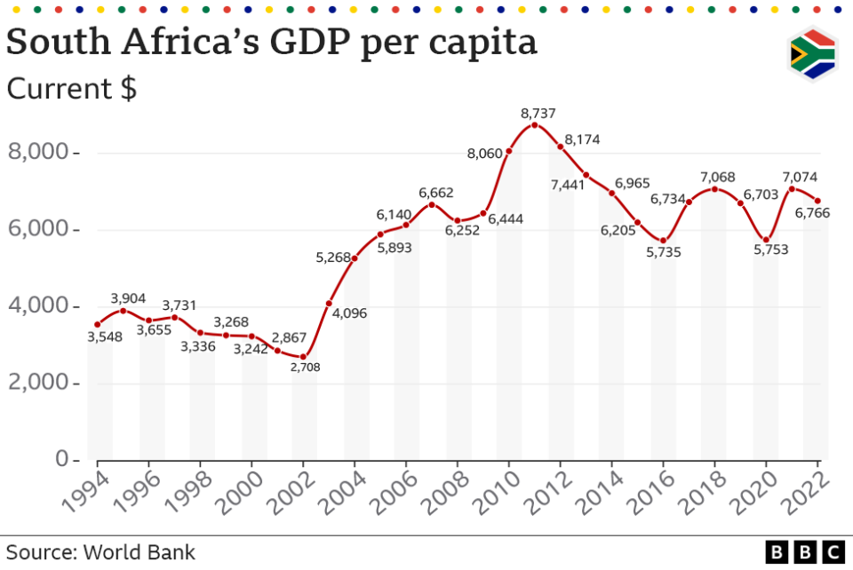
One of the factors that has eaten into the ANC’s support is the state of the economy.
Taking the last 30 years as a whole, South Africans, on average, have become richer. Poverty levels have fallen and, in general, people have access to better housing and health care.
However from 2011 there has been a downward trend in average incomes, leaving many feeling less well-off and leading to accusations that the governing party has mismanaged the economy.
South Africa has, though, been recently buffeted by external factors such as the coronavirus pandemic and the global spike in prices.
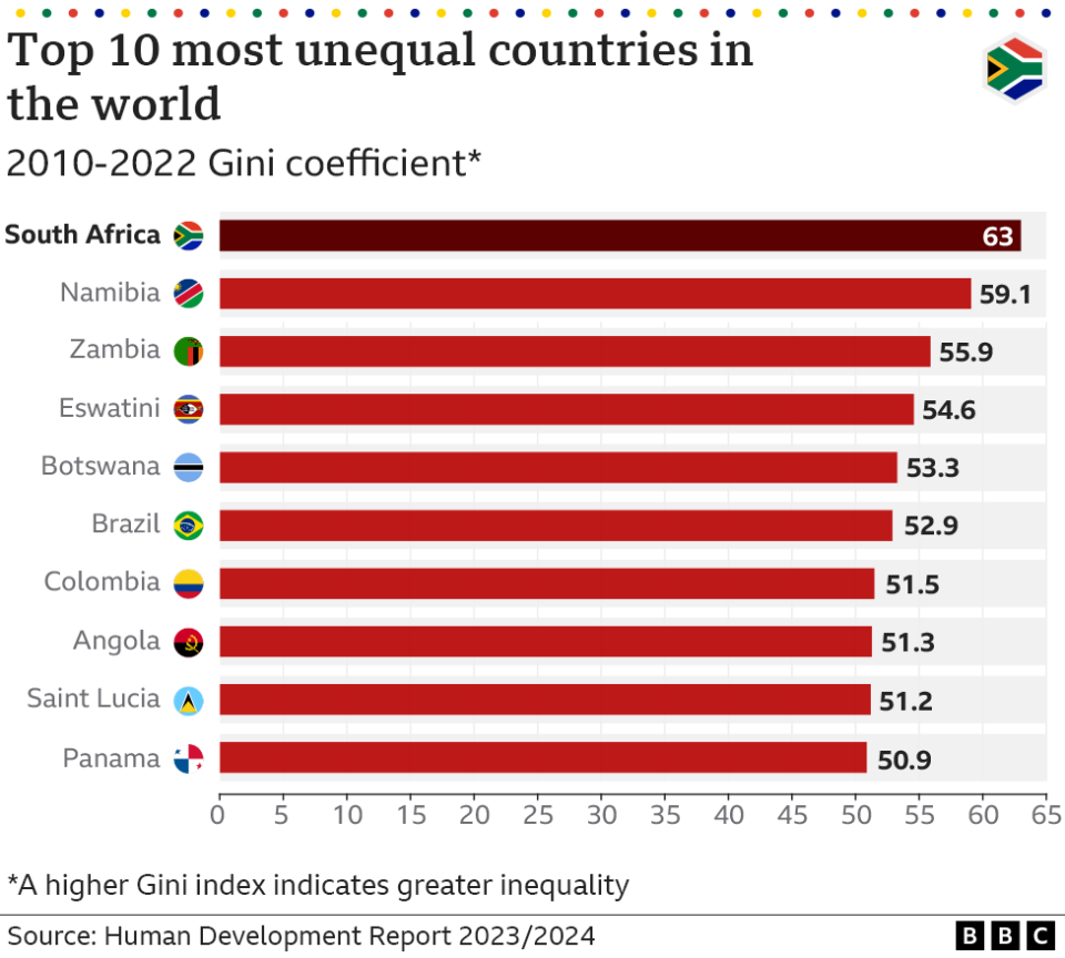
Looking at averages alone does not tell the whole story of a country, as income and wealth are not evenly distributed across the population.
Using a measure known as the Gini coefficient, which looks at the proportion of income different groups of households receive, South Africa is the most unequal country in the world.
For instance, the richest 20% of the population hold nearly 70% of the income. By contrast, the poorest 40% of South Africans hold just 7% of the nation’s income.
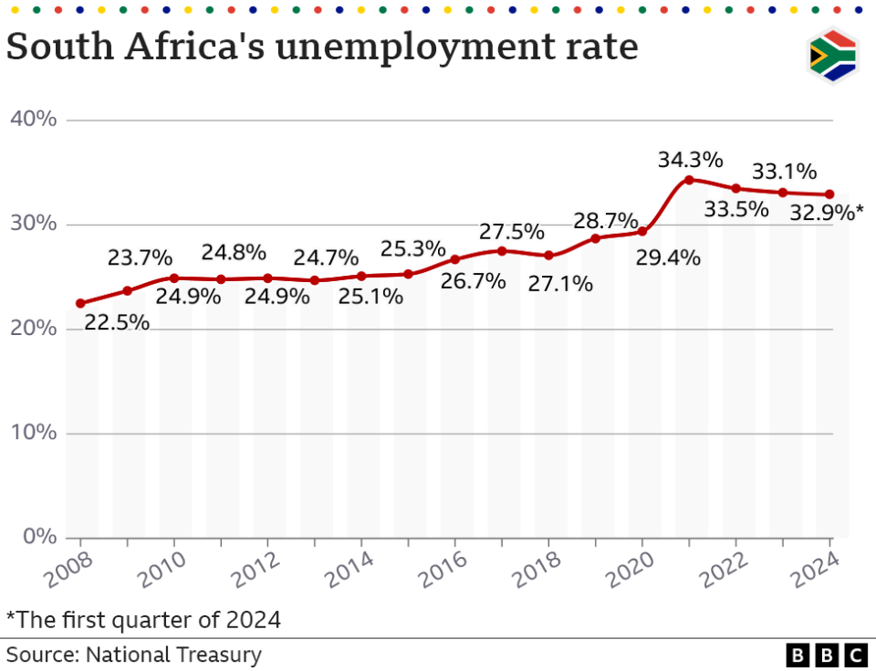
One of the main drivers of inequality and the most obvious impact of the economic problems can be seen in the unemployment rate, which the World Bank says is the highest in the world.
It has barely recovered from its peak during the pandemic and currently nearly a third of South Africans who are looking for work are unable to find a job.
The economy has not grown at a rate that can support the numbers entering the job market.
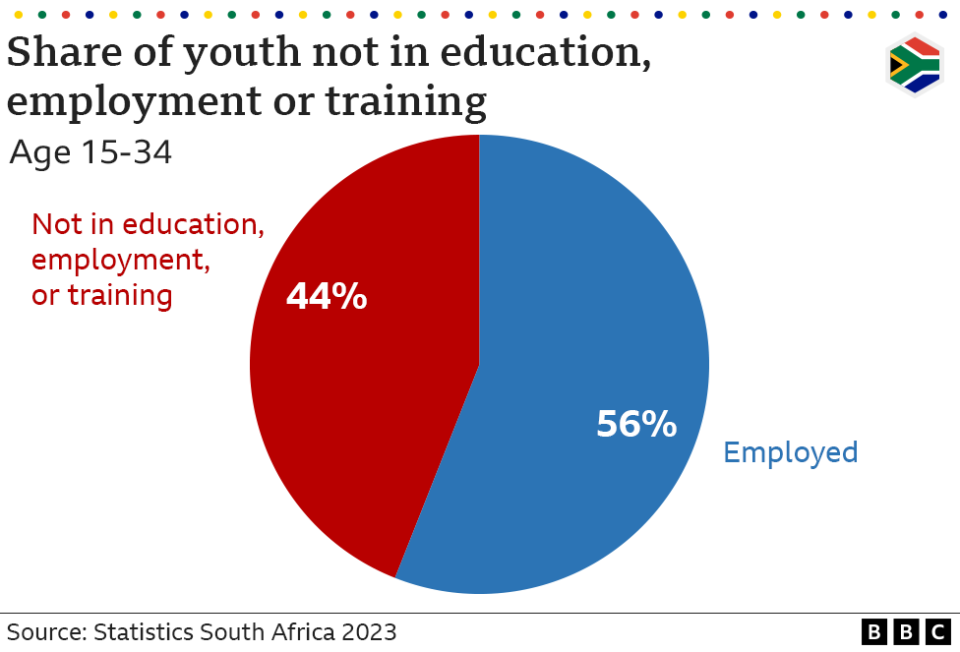
Unemployment has hit young people particularly hard. More than 44% of 15 to 34-year-olds are not in education, training or employment.
Like many African countries, South Africa has a young population - a majority of the country’s 62 million people are under 35.
A UN report last year described the lack of work as a “ticking time bomb”, suggesting that it could be a source of political instability in the future.
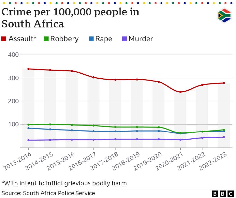
In their election manifestos, the political parties are pledging to tackle the high levels of crime that have plagued the country for many years.
The statistics show that while there has been a small drop in the number of assaults in the last decade, the rates of robbery, rape and murder remain barely unchanged.
On average, in the last three months of 2023, one person was murdered in South Africa every 20 minutes. In the same time period, more than 130 people were raped every day.
President Cyril Ramaphosa has described the level of violence as a war being waged against women, but his party faces criticism over its handling of the problem.
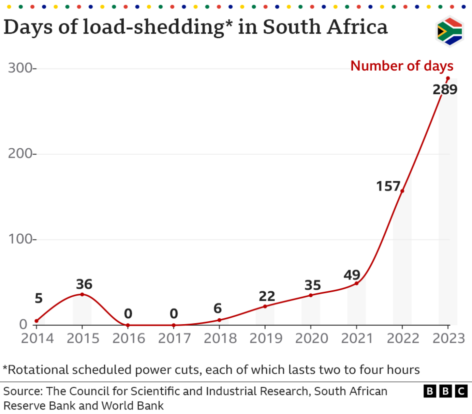
South Africans are currently experiencing a respite from the regular power-cuts that have blighted the country in recent years.
The planned outages - known as load-shedding - have disrupted people’s lives and damaged economic growth.
Poor maintenance, ageing infrastructure, corruption and mismanagement have all been blamed for the failures within the state-owned power company Eskom.
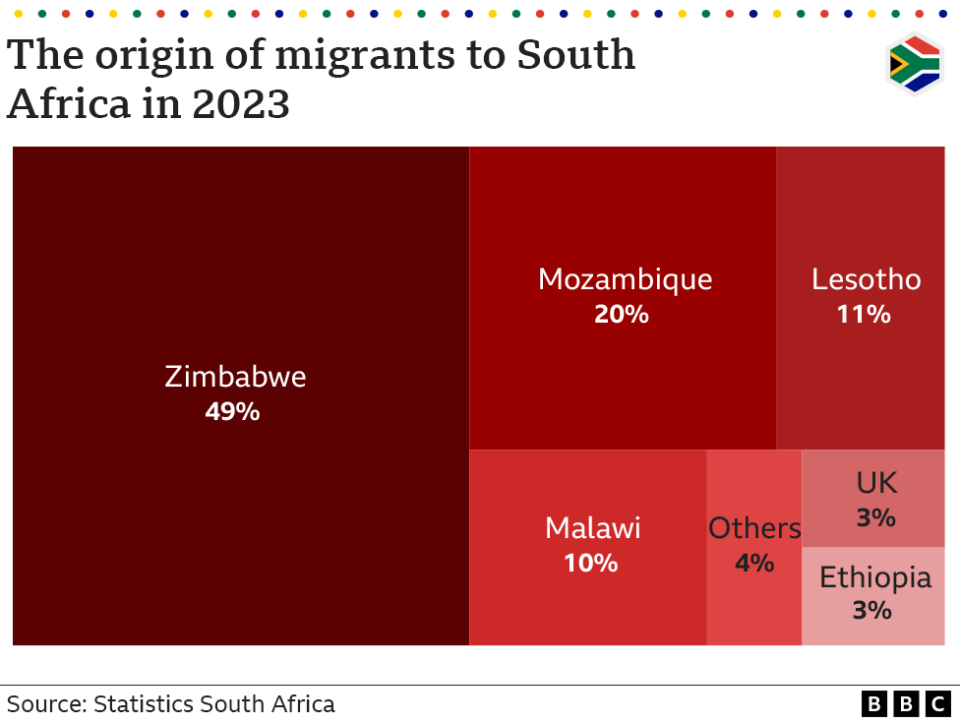
Around 3% of the population, amounting to some 2.4 million people, are migrants to South Africa.
Despite the country’s economic difficulties, it remains a major draw for people from the region and the continent as a whole.
At the same time, some foreigners, despite making up a small proportion of the population, have been accused of taking jobs from locals and blamed for the high levels of crime. Waves of xenophobic violence have seen many people being targeted.
Earlier this month, rights group Human Rights Watch said that foreign nationals had been used as scapegoats and demonised in the election campaign, risking further xenophobic violence.
Go to BBCAfrica.com for more news from the African continent.
Follow us on Twitter @BBCAfrica, on Facebook at BBC Africa or on Instagram at bbcafrica

