5 Easy Ways to Add More Color to Your Home
Think about it: There are certain shades of blue that you probably feel calmer around without even really realizing it, while pale greens or purple (notoriously polarizing colors) might make you uneasy. The power of color is what inspired Brooklyn designer and artist Rebecca Atwood to release her latest book, Living With Color: Inspiration and How-Tos to Brighten Up Your Home.
“I assumed that there were all of these books on color out there,” Rebecca told us. “There are, but there aren’t any that are in service of the reader. They’re more about inspiration or the science of color. They’re not necessarily helping you understand color and how to use it in your home.” As such, her new book functions as a guide on how to use color in your home, whether you’re a beginner or well versed in rainbow-hued walls. Here, Rebecca shares some of her best tips on how to live with color, and we give you a sneak peek at some of the fun homes included in the book.
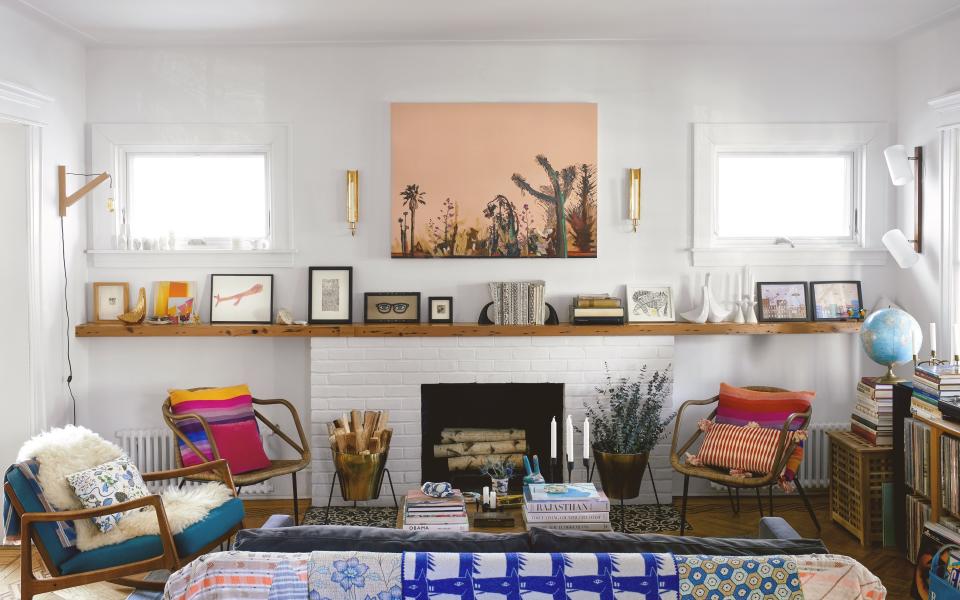
Paint it
“The biggest thing you can do, from a budget point of view, is to paint an entire room or a single wall,” she suggests. You can also think beyond walls and paint a simple pine dresser a bold shade for a strong, statement-making moment. Portola, Farrow & Ball, and Clare, are some of Rebecca's favorites.
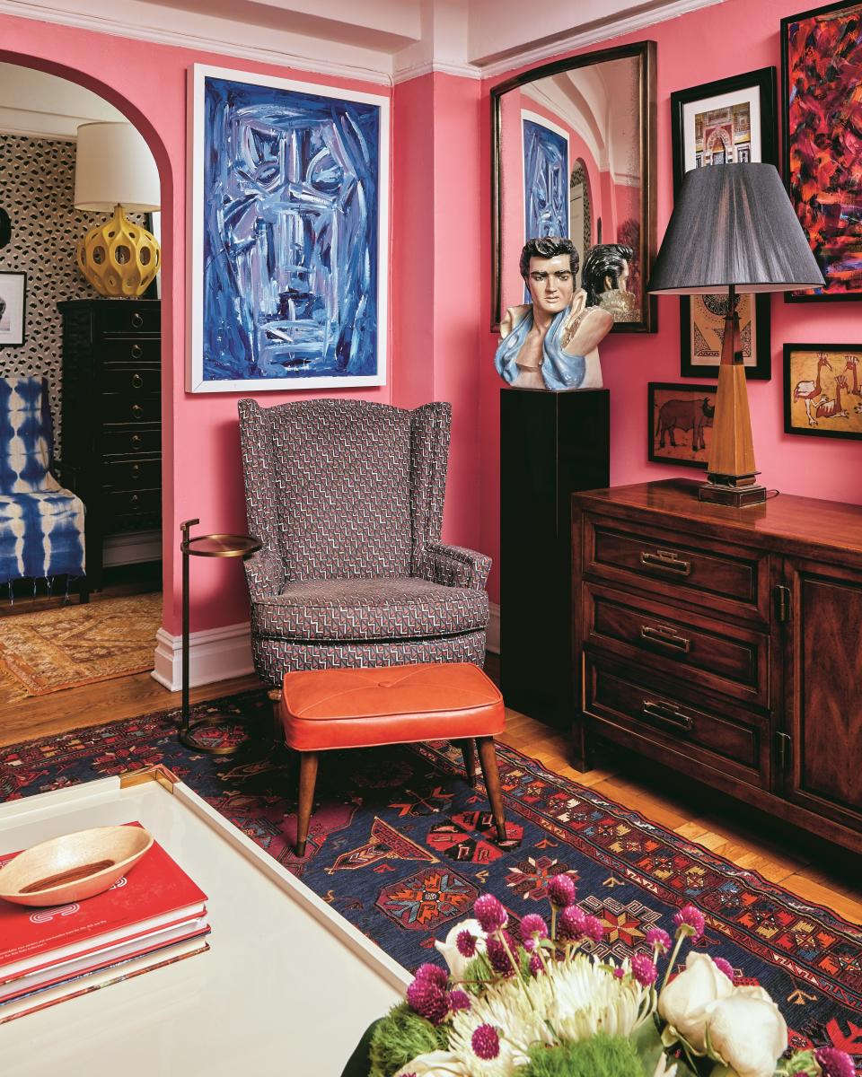
Create an object collection
Each chapter opens up with an image of a small arrangement of objects, all in their own unique color palette. “It can be really simple. A rock that you found, or a vase, or a couple of books,” says Rebecca. It’s an incredibly easy way to create a color statement in any room, and you can also include ceramics. Workaday Handmade, and Helen Levi are some of the designer’s top picks.
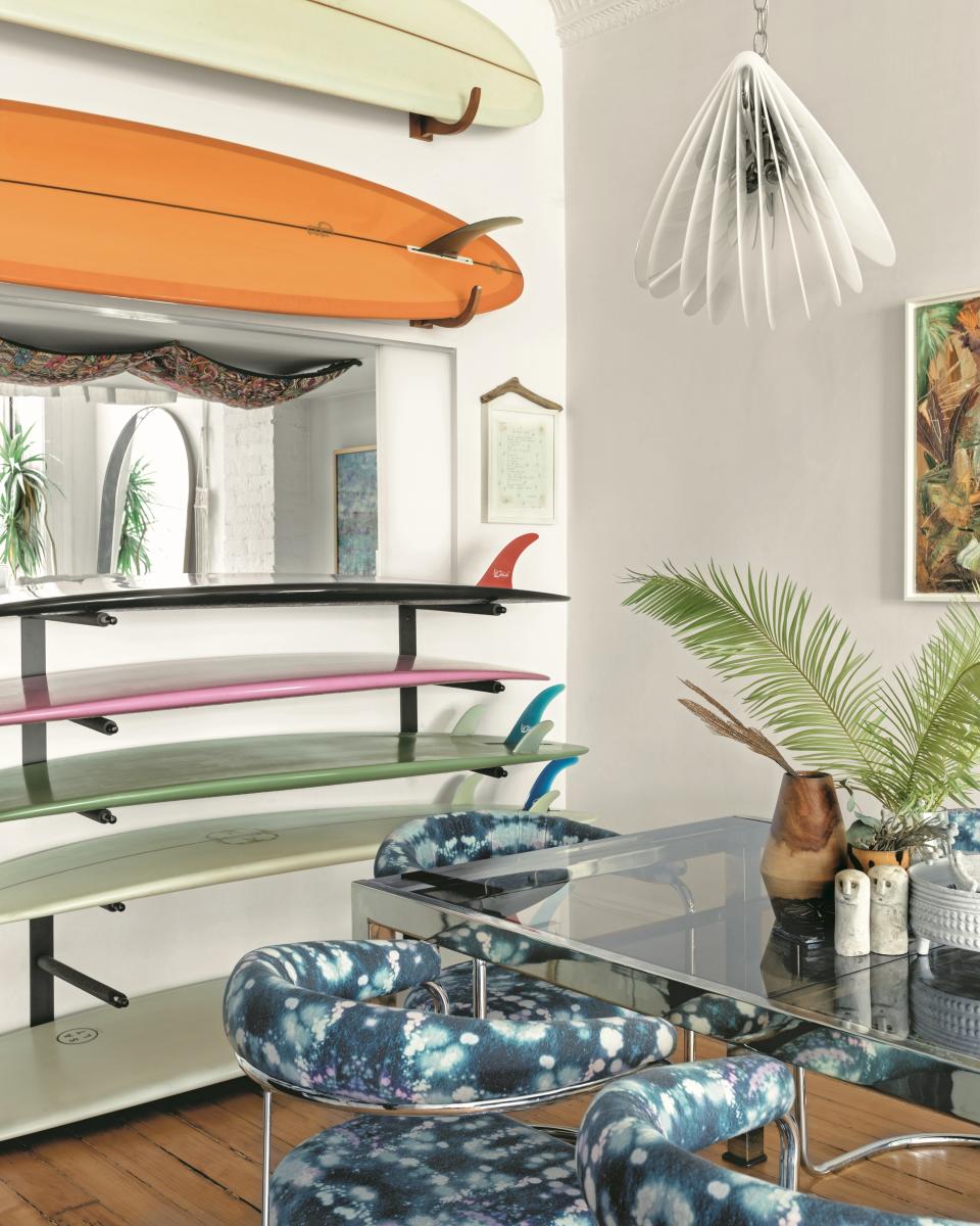
Think in terms of formulas
“For the person who isn’t used to using color, it’s about looking at some different formulas,” explains Rebecca. Choose from complementary, primary, or a combination of tertiary colors. You can then mix home textiles, like Rebecca’s own line, across one room to build a custom color palette that naturally works together.
Don’t forget in-between colors
If you already know what shade you want, Benjamin Moore offers a color-matching service, which Rebecca used for her own studio, based on her hand-painted gouache on paper. When using such a specific color, she says to remember “connector colors.” Following the rule of having a neutral base then adding pops of colors (such as a custom matched red or orange) can fall flat, if you don’t remember the hues in between. “Add in multiple shades of that color. Add some warm neutrals versus cools, so it doesn’t feel so stark,” she says.
Get emotional
If you truly don’t know where to start, Rebecca says to “imagine a place or memory that felt really wonderful,” then pull your color palette out from that. “A landscape is often a really good place to start because you have big washes of color and you can think about that like you would a room.” You can also design the palette from a strong object that speaks personally to you in your home, such as a quirky Aelfie rug.
Originally Appeared on Architectural Digest

