Art Beat: Grateful Dead poster exhibit at the Narrows Center is 'one-of-a-kind'
- Oops!Something went wrong.Please try again later.
- Oops!Something went wrong.Please try again later.
- Oops!Something went wrong.Please try again later.
Uncle John’s Band. Fire on the Mountain. Friend of the Devil. Sugar Magnolia. Touch of Grey. Truckin’.
Those half-dozen songs alone are enough to ensure that the Grateful Dead have left an indelible impression on music and pop culture history.
Deemed the Best Jam Band by Rolling Stone, they have an unrivaled fanbase, and their music has led to the creation of over 300 tribute bands, spreading the Deadhead gospel around the globe, almost three decades after Jerry Garcia suffered a fatal heart attack on August 9, 1995. It was exactly one month after he performed with the rest of the band at Soldier Field in Chicago.
Almost as memorable as the music itself are the artful posters that were created to promote the Dead’s concerts. Currently at the Narrows Center for the Arts, there are nearly 80 of them on display, making it the largest exhibition of Grateful Dead posters ever mounted. It is, as Patrick Norton, the Executive Director of the Narrows, noted — without hyperbole — a “one-of-a-kind exhibition.”
It was co-curated by The Bahr Gallery, which is dedicated to preserving and presenting rare, first-edition rock posters, located in Oyster Bay, New York. All the posters on display are in the collection of gallery owner Ted Bahr and all are for sale.
Many of the posters were created in the late 1960s, well before FM radio dominated the airwaves and became the primary method by which concerts would be advertised.
Largely mass-produced, concert posters were generally considered ephemera, cheap and disposable. They were plastered on telephone poles and phone booths and bus shelters and construction site barriers and barroom bathrooms. They were exposed to rain, hot summer sun and vandalism. But they were also admired and coveted. They were peeled off. They were collected. And with that, what was ephemera became objects of desire.
Among the work on display is a serigraph referred to as “Skeleton and Roses,” an image well-known to Deadheads and casual fans alike. Produced by Stanley Mouse, the hand-pulled screen print depicts a skeleton with a wreath of roses and a crown of roses on its head against a deep purple sky.
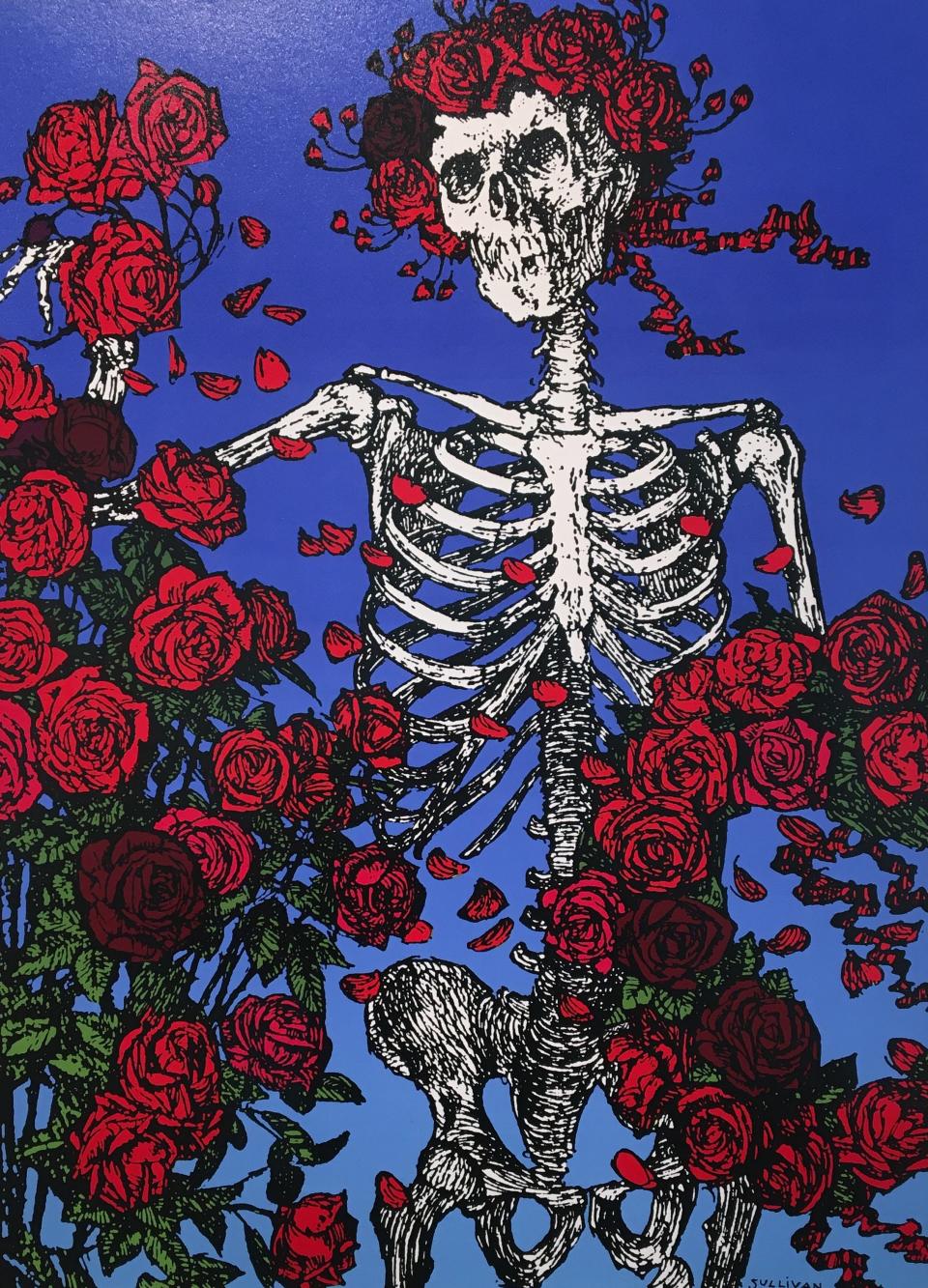
It is as perfect a bit of rock ‘n’ roll iconography as the Rolling Stones' bright lips, the AC/DC lightning bolt logo, or Nirvana’s swimming baby boy reaching for the dollar bill on a fishhook.
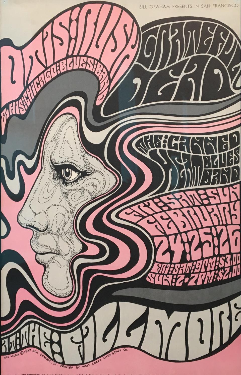
There is a dazzling 1967 lithograph by Wes Wilson, called “father of the hippie poster movement” by the Chicago Tribune that dives so deeply into the psychedelic that the distorted text is almost indecipherable. But that almost seems beside the point. A woman’s face is in profile and her hair, which is cotton candy pink and two shades of gray, contains the vital information if one can discern it: Otis Rush, Grateful Dead and Canned Heat at the Fillmore, Fri / Sat / Sun, February 24 / 25 / 26. Depending on which day one decided to attend, the ticket price was $2.00 or $3.00
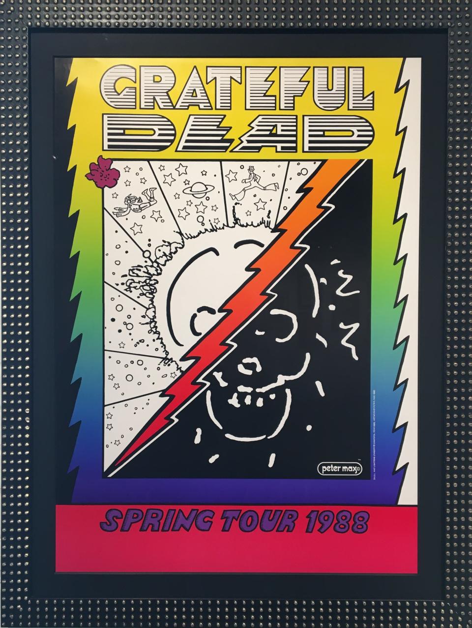
A poster designed by the iconic 1960s artist Peter Max utilizes the split fountain screen printing technique to create subtle gradations of various colors for a seventeen show spring tour in 1988. Starting in Atlanta and ending in Rosemont, Illinois, the poster was sold out at the first few shows and never reprinted.
Robert Rauschenberg, the master pop artist who designed a variant album cover of “Speaking in Tongues” for Talking Heads at the behest of David Byrne in 1983, designed a lithograph poster for the Dead for an event at Madison Square Garden in 1988.
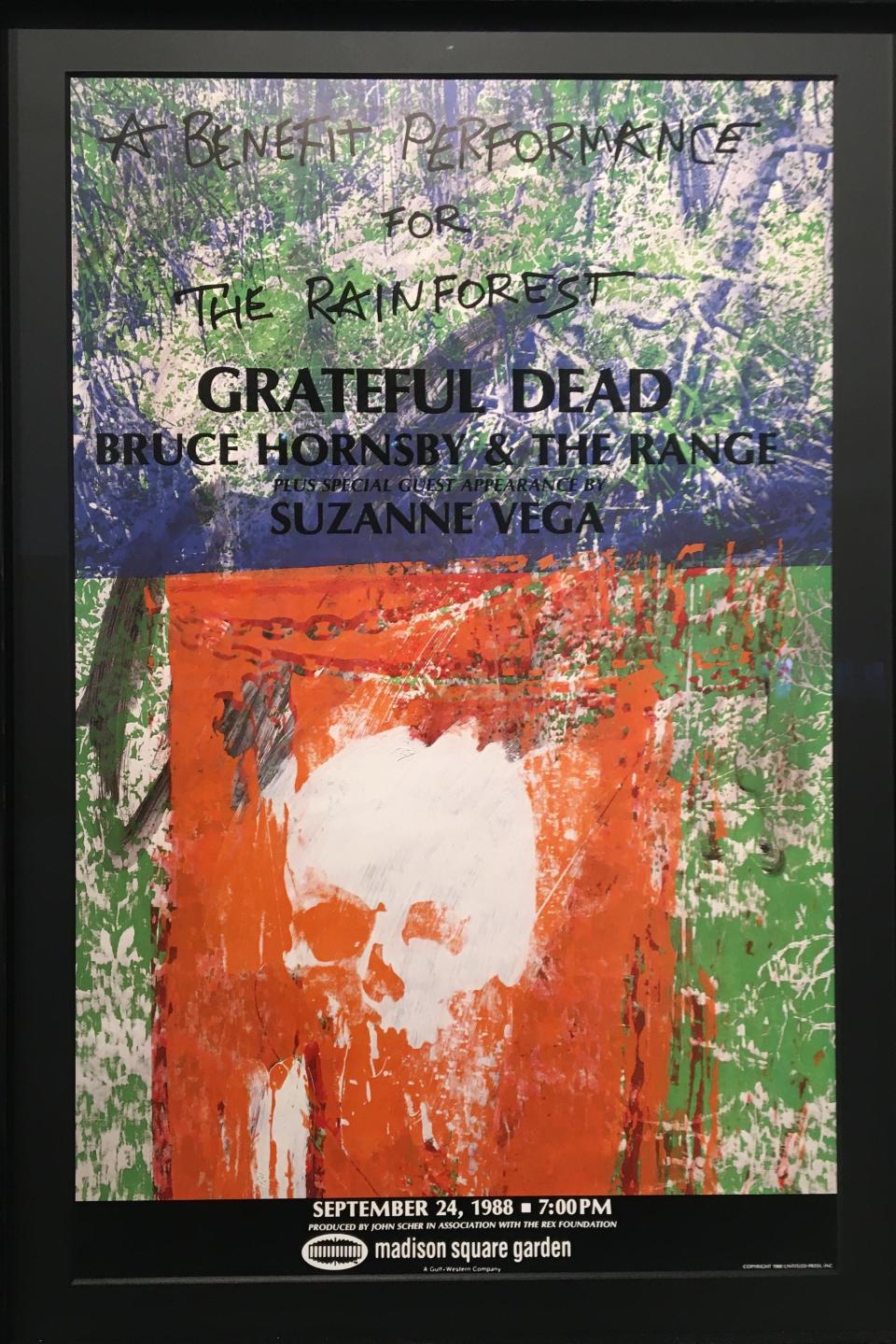
Those familiar with Rauschenberg’s work will note the echoes of his early photo-serigraphic paintings in the poster. The concert, which also featured Suzanne Vega, Hall & Oates and Bruce Hornsby and the Range, was a “Benefit Performance for the Rainforest.”
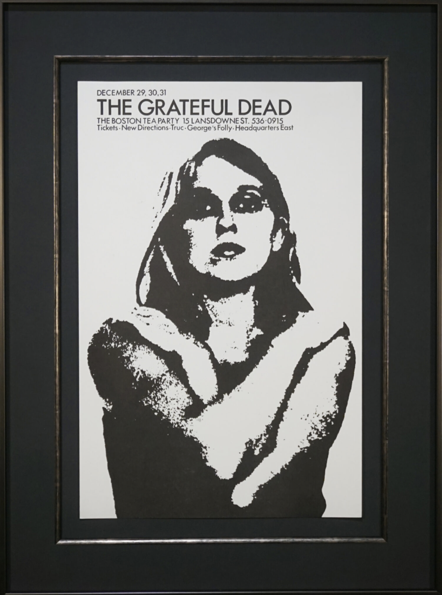
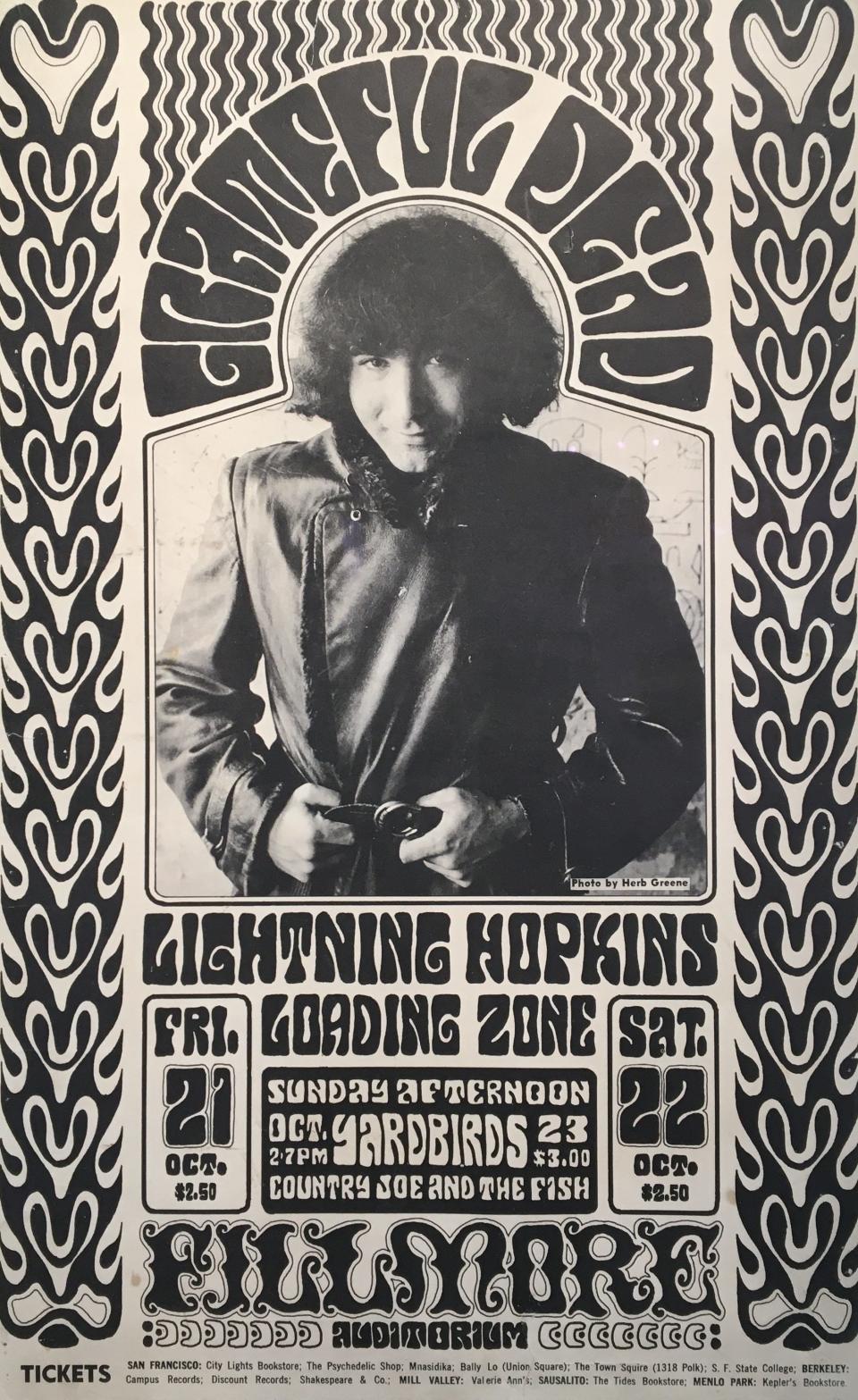
From 1966, there is a vintage black-and-white poster by Wes Wilson and Herb Greene featuring a smirking and beardless Jerry Garcia, looking like a high school junior who just scored.
There is much to see including naked women, Day-Glo colors, anti-war statements, Piglet smoking a joint, Santa Claus with devil horns, cartoon dinosaur skulls, and the Olympian god Hermes delivering a scroll that reads “War over…peace at last.”
And there is what Billboard considered the 3rd Best Rock Poster of All Time (as of 2008): Rick Griffin’s “Aoxomoxoa,” from 1969, which was later used as the title and album cover art for the Dead’s third album.
It is a perfectly 1969 vision, with all the hallmarks of the hippie era: imagery that is hopeful, hedonistic and hallucinatory. It includes mushrooms, cobras, layers of the earth and a glowing yellow sun with cartoon rays that resemble magnified sperm. It is unabashedly sexual, with references to both male and female genitalia and reproduction but in a way that no child would catch the innuendo.
“Aoxomoxoa” is a palindrome created by Griffin (and lyricist Robert Hunter). Some believe that the highly stylized letterforms that spell out Grateful Dead on the cover is an ambigram that can turned upside-down to read “we ate the acid.” I don’t see it but I didn’t do a tab.
In 1987, Garcia said “...posters are the front pages, the covers of your life. I can’t stop looking at these and going BOING! I don’t know why. It’s what art is.”
“Grateful Dead: The Vintage Posters, 1966-1995” is on display at the Narrows Center for the Arts, 16 Anawan St., Fall River, through March 31.
This article originally appeared on The Herald News: Art Beat visits Grateful Dead posters exhibit at Narrows in Fall River

