This Aussie Renovation Masters the Minimalist Pop of Red
Amy and Ben envisioned a suburban home that could somehow personify their adventurous outlook on life. As parents to a 10-year-old daughter and caretakers of a dog, a cat, three chickens, and thousands of bees, they already knew their Victorian double-front cottage in Adelaide, Australia, was going to be lively—the only issue was getting the house to look the part. The couple once lived in Japan and still return there frequently as fans of the country’s bold craftsmanship. They also gravitate toward the clean lines and natural materials of Nordic design, and feel comforted by the bright colors and geometry of ’70s style.
These styles gave them the basis for their renovation, but they didn’t know exactly how to intertwine disparate design movements seamlessly into the house. It wasn’t until Amy and Ben met designers Kate Harry and Emily Rogers of the studio Fabrikate that they finally felt ready to turn a new page.
“They love color as an expression of self,” Kate says. “It was lovely to get playful with a palette, and work with owners who have a keen eye and an interest in design.” The trio agreed on a design that would center around the brightness of saturated red and blue to foil the warmth and minimalism of wood—a cohesion of Japanese and Nordic sensibilities. They also figured that custom pieces would further heighten the overall look of craftsmanship as an example of old meets new.
“It was important to them that the work didn’t feel like a new extension, but had a connection to the original home,” Kate adds. The finished design is adventurous yet cohesive, with enough of a connection to the outdoors to unite the family menagerie. For those seeking a similar outlook in suburbia, these are the top design elements Kate relied on to tell this tale.
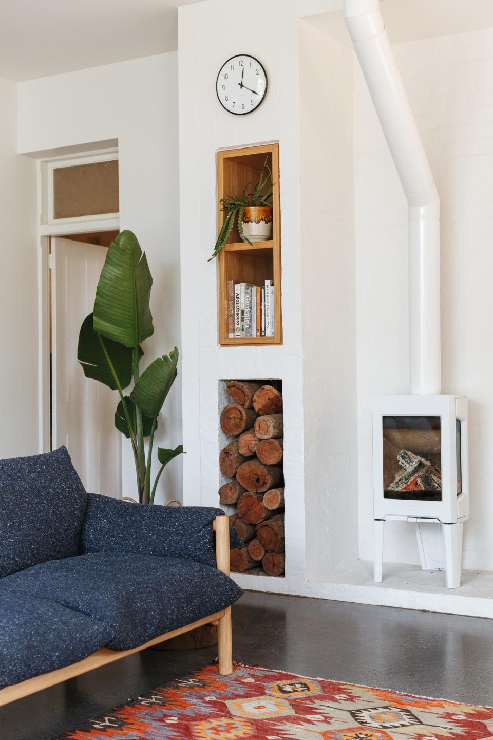
Use wood to bridge two rooms
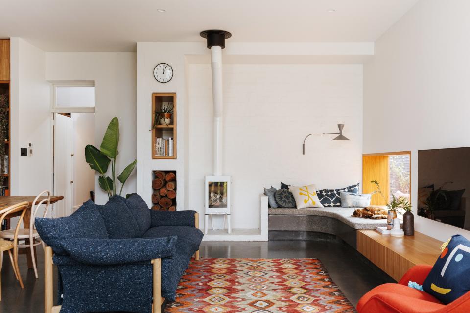
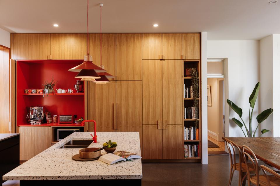
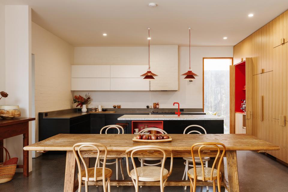
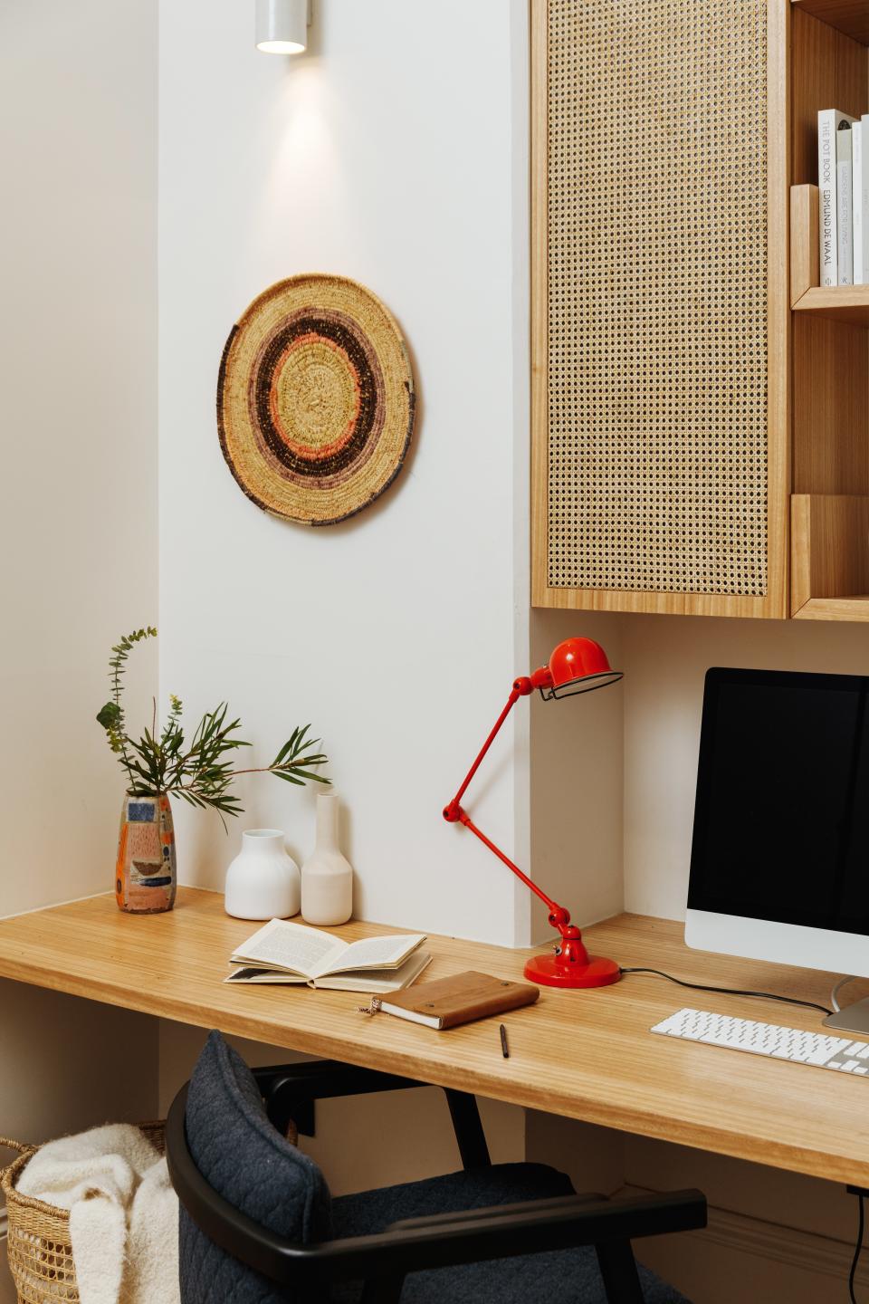
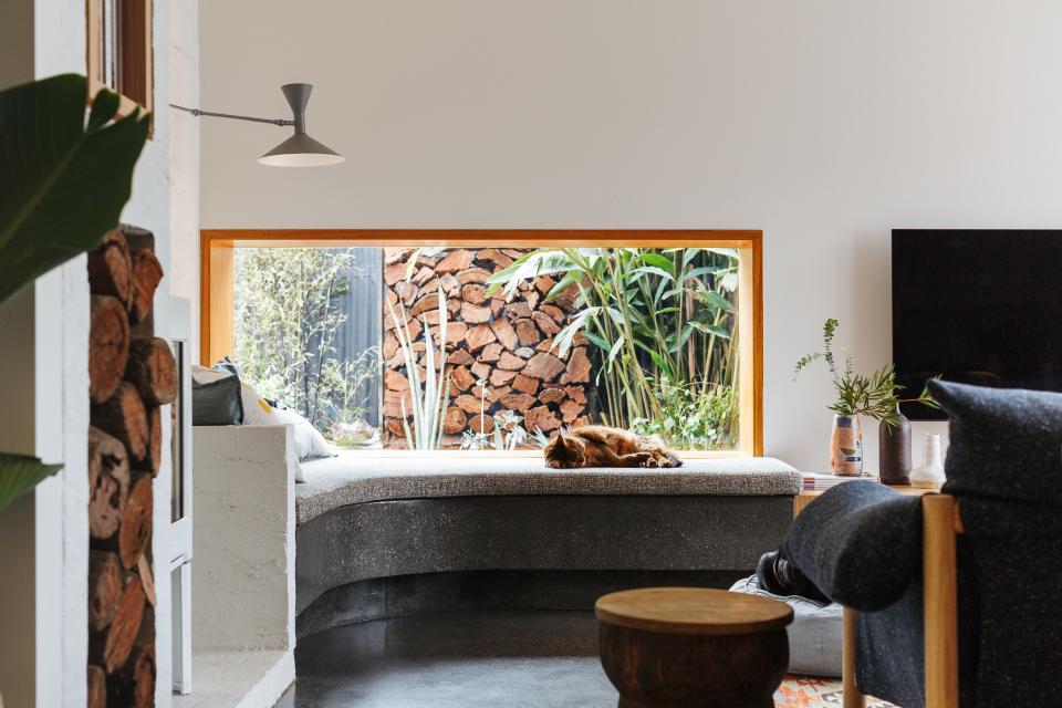
If there was one natural material that Amy and Ben wanted to display prominently in their home, it was a honey-tone wood. So that became the detail that found its way into nearly every corner, especially within the adjoining kitchen and living spaces. “The continued use of timber through the bank of joinery in the kitchen to the living area creates a lovely visual dialogue,” Amy says. Because these two rooms are side by side, Kate relied on wood in big and small doses throughout: It was used to frame the rectangular windows in the living room—which were installed to maximize light, since the pitch of the roof couldn’t withstand skylights—and to create a full wall of storage in the kitchen.
A pop of red done right
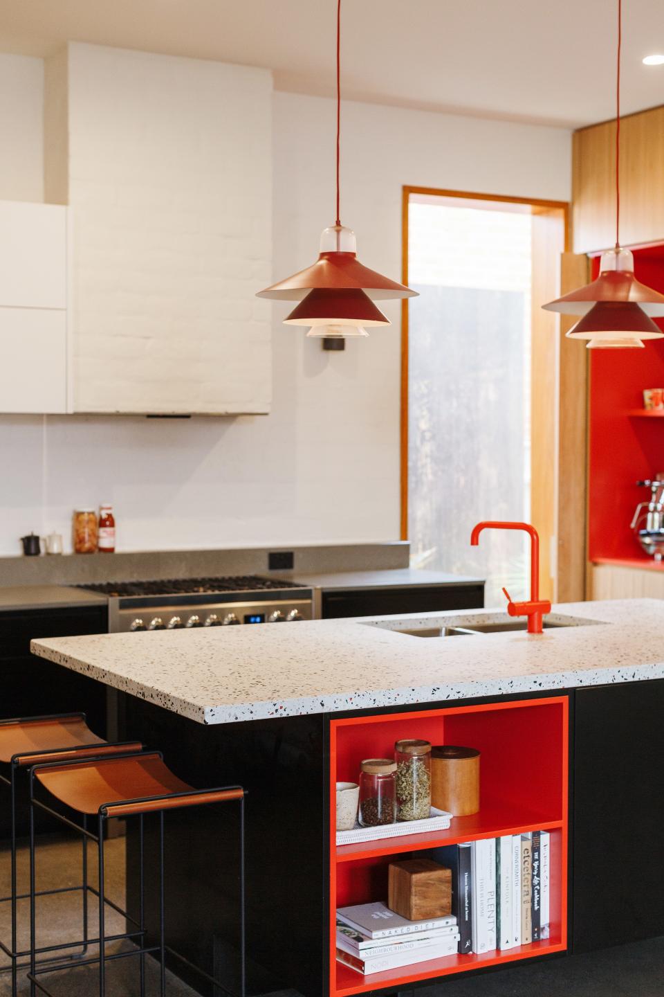
Of all the colors that this design trio could have landed on, they picked red to showcase the couple’s sense of adventure. And they sought to primarily use this shade in the kitchen, where the couple enjoys cooking together. “The red color block adds an element of surprise in the kitchen, and also creates ‘framed’ areas for Amy and Ben to display their collections,” Kate says, which include utensils from their travels abroad. “Mixing natural materials with a strong color accent and custom design makes for something unique.”
Terrazzo forever
Pops of color weren’t the only elements of surprise in the design. Kate also collaborated with The Little Build Co. on various customized projects that would integrate even more of the owners’ personal style into the home. In the kitchen, a custom terrazzo island was made to match the red in the tucked-away appliance nook and surrounding fixtures. In the living room, a curved bench brings that same material to an unusual corner, adding movement to what could’ve been wasted space. “Each stone was hand-thrown into the surface to create the right color balance,” Kate says. “It creates a gorgeous spot for reading and lounging in the afternoon sun, and its curvature opens the room to conversation.”
Originally Appeared on Architectural Digest

