
Beige, Begone: Bring Your Walls to Life With These 14 Beautifully Bold Colors
Adventurous decorators, take heart: Rich, bold paint colors are design’s latest obsession, overthrowing the off-white neutrals that have long reigned supreme. If you’ve always desired decor that is a bit more daring, this could be the best time to go bold.
But liking bold paint colors is entirely different from actually slapping them on your walls. How do you find the right color that will have staying power? We consulted our stable of design experts to find the perfect bold shades that you won’t tire of anytime soon. It’s a full kaleidoscope of color—a rich palette of reds and oranges, greens, browns, blues, and grays.
Don’t be frightened. And if you hate these colors after putting up a coat or two? It’s just paint! Slap on some primer and try again.
1. Raspberry Truffle
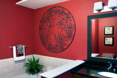
Photo by Decorating Den Interiors
Looking for drama? Benjamin Moore’s Raspberry Truffle is the perfect shade for a living or dining room accent wall—or even a powder room, says Jeffrey Welder, a home decorating expert with Vant Wall Panels.
“It’s vibrant,” he says, with more than a bit of understatement. Raspberry Truffle isn’t just any red. With its warm tones of chocolate and orange, this shade is ideal for interiors and exteriors, according to the folks at Benjamin Moore.
2. Sunlit Coral
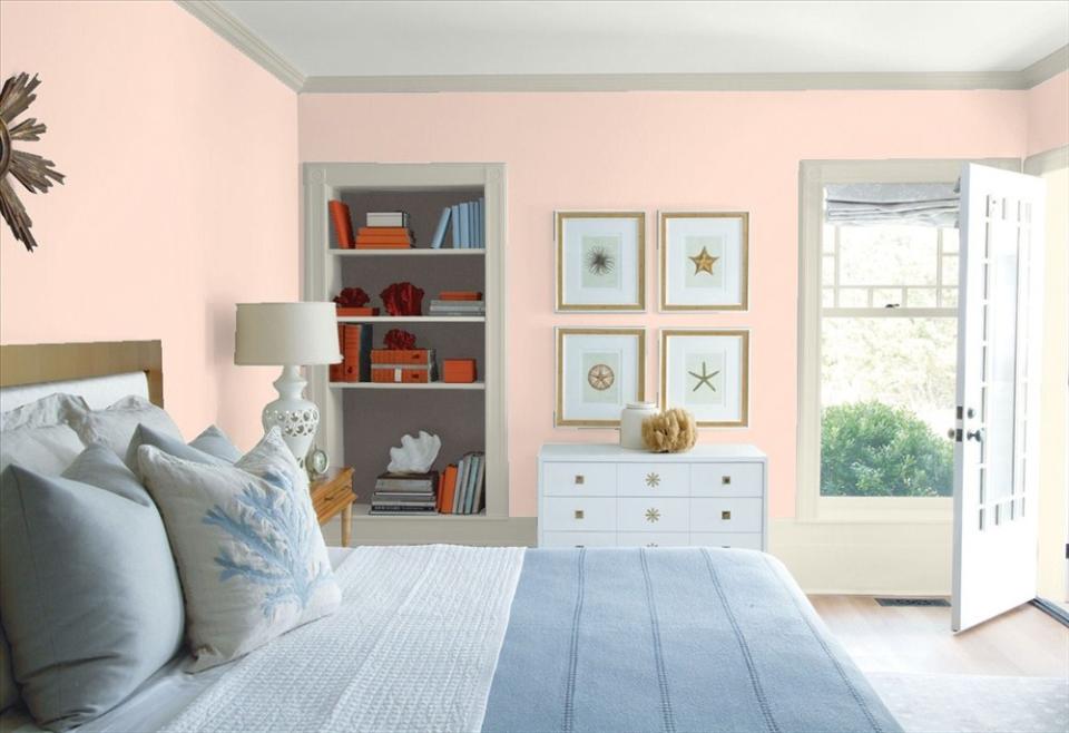
Sunlit Coral gives a breezy beach feel to this bedroom.
Benjamin Moore
Sunny rooms don’t have to be white to feel fresh and modern. Choose a bright peach, like Benjamin Moore’s Sunlit Coral, to “make a room look sun-kissed,” says Hooper Patterson, an interior designer in Wilmington, NC. “It’s an updated peach that is beautiful in airy rooms with lots of light.”
3. Tawny Day Lily
Photo by Hart Wright Architects, AIA
Bold, orange-toned corals add personality—and unlike brighter reds or deeper oranges, this shade rarely appears outdated or over the top.
Brooklyn, NY, designer Jarret Yoshida recommends Benjamin Moore’s Tawny Day Lily, a “very vibrant shade of red-orange. It’s playful and can work in any room of the home,” he says.
4. Magenta
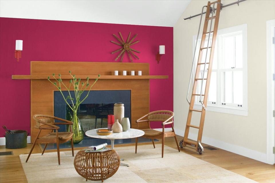
This could be the pop of color you’ve been jonesing for.
Benjamin Moore
Don’t be cowed by pink-tinged purples. Benjamin Moore’s Magenta is a saturated jewel tone capable of giving any room a heaping spoonful of drama.
“Just a touch of it can go a long way in a simple room,” says designer Rachel Schwartz. Yep, we agree: More than a touch Magenta could be rather overwhelming. “A hint of this gorgeous color adds brightness and a sense of levity.”
5. Super Nova
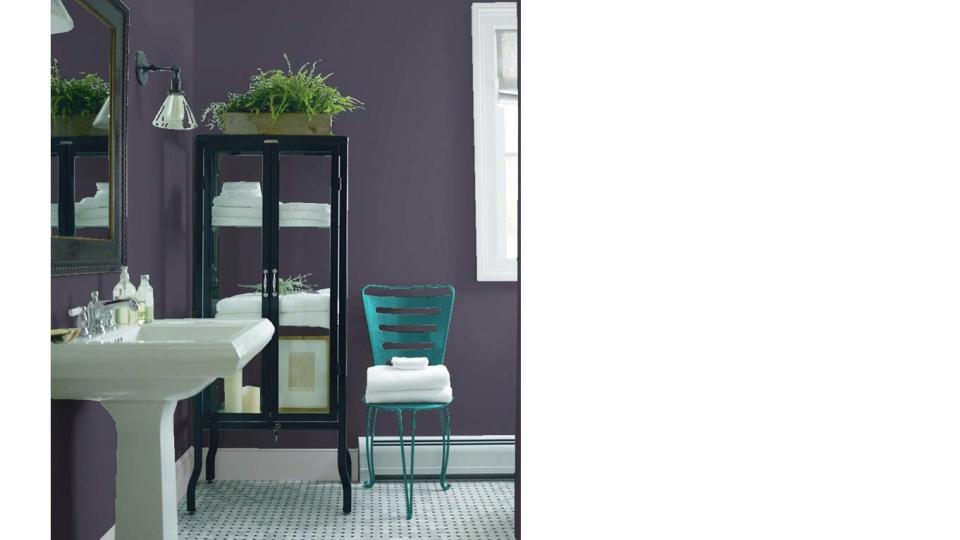
This shade is sure to make you feel like a king or queen.
Benjamin Moore
Deeper purples bring regal elegance to small rooms, without making visitors feel claustrophobic. Allison Grimes, owner of Chromatics Interior Decor in Ottawa, Canada, recommends Benjamin Moore’s classic color, Super Nova.
“This bold, deep purple is well-used in a hallway or powder room, accented with gold accessories,” she says.
6. Emerald Isle
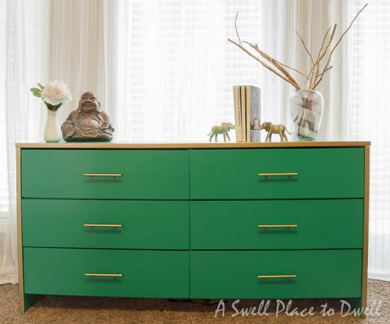
A dresser in Emerald Isle
A Swell Place to Dwell
Take a trip to ancestral Ireland without ever leaving your home. Benjamin Moore’s Emerald Isle is a vivid, soothing green that “complements everything,” says Mitchell Hill, an interior designer in Charleston, SC.
“It’s a very natural, dominant color,” he says. “Juxtapose a fun piece of art against the green to draw attention to the art.”
7. Forest Hills Green
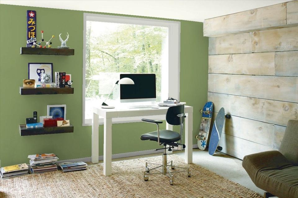
This muted green will put you at peace with your decision to go bold.
Benjamin Moore
Need your green walls a little less intense? Try Benjamin Moore’s Forest Hills Green, which Patterson calls a rich emerald without the (sometimes) overpowering punch of a darker shade.
“It’s beautiful paired with peach, corals, or navy blues,” she says.
8. Lime Rickey
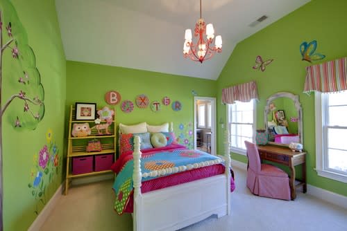
Photo by Kerri Robusto Interiors
If we haven’t hit your sweet spot for bold greens, look no further than Sherwin-Williams’ Lime Rickey. It’s a citrus-green that “evokes a fresh, clean feeling,” says Liz Toombs, a Kentucky-based interior designer. “Lime-green is very versatile. It can be classed up by pairing with black and white accents or you can go wild by incorporating hot pink and bright orange.”
9. Museum
Even this neutral tone has a dash of daring.
Behr
Neutrals can be dark. Just look at Behr Marquee’s Museum, an “amazing neutral color that has a modern flair,” Welder says. The shade’s smooth, earthy tones promise to complement your gallery wall—no matter how ornate your gilded frames are.
10. Joshua Tree
Joshua Tree
benjaminmoore.com
As desertlike as its namesake, Portola Paint’s Joshua Tree glides on as a rich shade of orange-brown. The folks at Portola Paint describe it as “sunset on the rocks in Joshua Tree,” and designers agree with that assessment.
It’s got “an ‘age of the earth’ feel,” says Brynne Rinderknecht, an interior designer in New York City. “The color is very rejuvenated, and can be applied for a spalike bathroom retreat.” She recommends pairing with off-white upholstery, blacks and browns, and brass and chrome lights—and lots of houseplants.
11. Danube
The blue Danube
sherwin-williams.com
Deep blues feel calming, reminding you (and your visitors) of clear skies and gentle ocean vistas. Sherwin-Williams’ Danube is “highly visible, inviting, and not intimidating,” says Wanda E. Gozdz, a Florida interior designer. Pair with an off-white to create crisp, definitive lines.
12. Dark Harbor
Photo by erin williamson
Luxurious teals work surprisingly well in small spaces, adding depth and interest to a powder room, a master closet, or even a cozy living room. Benjamin Moore’s Dark Harbor “is a lovely teal that adds a punch of boldness,” says Alice Chiu, an interior designer in San Francisco.
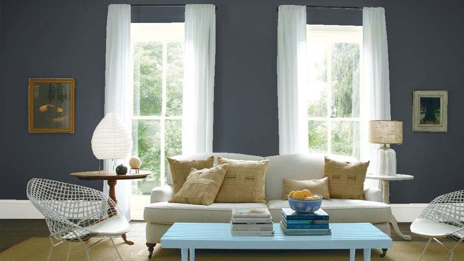
13. Stiffkey blue
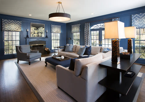
Photo by Accents Et Details
Not a fan of teal? Farrow and Ball’s Stiffkey Blue offers similar depth without the hint of green.
“This soft navy is perfect for creating a cozy feel to a room and looks fantastic dressed with rich cream fabrics that subtly lift the color,” says interior designer Michelle Howard. “It’s a daring color, but it makes a house feel like a home.”
14. Gravel Gray
Gravel Gray
benjaminmoore.com
Dark gray can be just as dramatic as a rich emerald or deep blue—especially if you’re trying to create a cozy, sea-swept effect. Cheryl Chase-Mackenna, a New York–based designer, adores Benjamin Moore’s Gravel Gray.
“I’ve used it with antiques and with stark white, modern furniture,” she says. “Clients are a bit nervous to go bold, but fall in love with this after a bit of hand-holding. It has wonderful depth.”
The post Beige, Begone: Bring Your Walls to Life With These 14 Beautifully Bold Colors appeared first on Real Estate News & Advice | realtor.com®.

