These Brands Have Mastered the Art of Owning a Color
In the summer of 2019, a small insurance startup named Lemonade received a cease and desist letter from telecom giant T-Mobile, accusing them of stealing their trademark color: Pantone Rhodamine Red U.

“At some level I knew it wasn’t a joke, but it sure sounded like one,” Lemonade CEO Daniel Schreiber told NPR. “You’re talking about the one of the three ink cartridges in every printer in the world. The idea that a company can trademark it and own it, just defied belief and I was in a state of disbelief.”
Can a corporation really “own” a color? Absolutely. There are certainly restrictions, but many companies have actually managed to to trademark a particular logo shade before. But perhaps more important than holding the patent on a specific hue is using it so effectively that it becomes synonymous with the brand. Here are some of the top companies to legally and popularly “own” their colors:
Coca-Cola
Coca-Cola may very well have the most recognizable logo on the planet. Its trademarked “Coca-Cola red” is entwined with the drink in consumer minds because the company has blanketed it over all Coke-related business: packaging, marketing, merchandise, and delivery trucks.
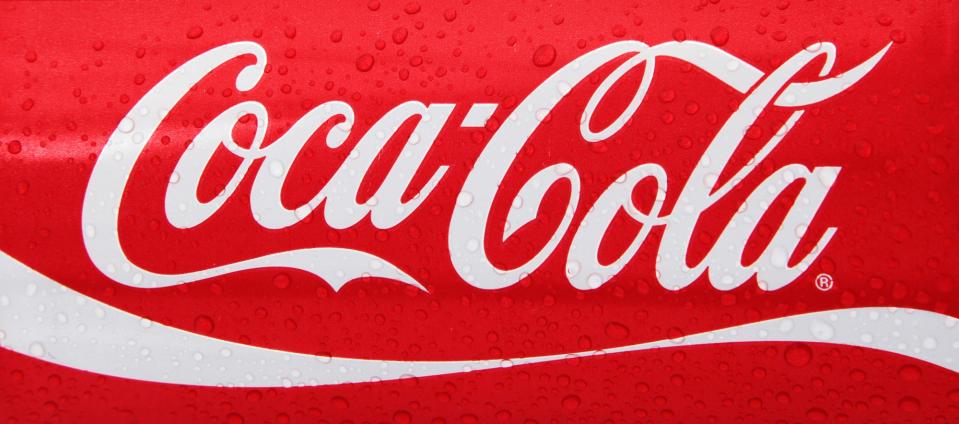
As a color, red evokes passion, energy, and excitement, all traits the firm wants associated with its ubiquitous soft drink. However, the tint choice was originally more practical than psychological. Back in the 1890s, when Coca-Cola was founded, the soda barrels were painted red to easily distinguish them from alcoholic barrels. Once the Atlanta-based business started bottling the drink, it stuck with the red for its label, and the rest is history.
Tiffany’s & Co.

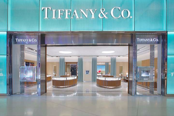
The luxury jewelry brand’s robin egg blue is so recognizable that it now has its own name and Wikipedia entry. Pantone 1837 was trademarked by the firm in 1998 and is rumored to have been chosen back in the 19th century, when turquoise brooches were a favorite gift for Victorian brides to give their attendants. Whatever the history, there’s no denying that Tiffany’s has created a successful link between the aquamarine shade and a company aesthetic of elegance and sophistication.
The Home Depot

The home and garden building chain has followed Coca-Cola’s “one-brand strategy” by covering all its signage, shopping carts, and staff aprons in its trademark orange (Pantone 165 C). The beginnings of the corporation’s mahogany-hued choice had to do with the availability of cheap marketing fabric. “We painted our signs on bright orange circus-tent canvas, which cost a fraction of the more common electric signs,” says co-founder Bernie Marcus. Fortunately for the company, orange also tends to symbolize creativity, friendliness, and enjoyment, all traits that Home Depot tries to embody.
T-Mobile
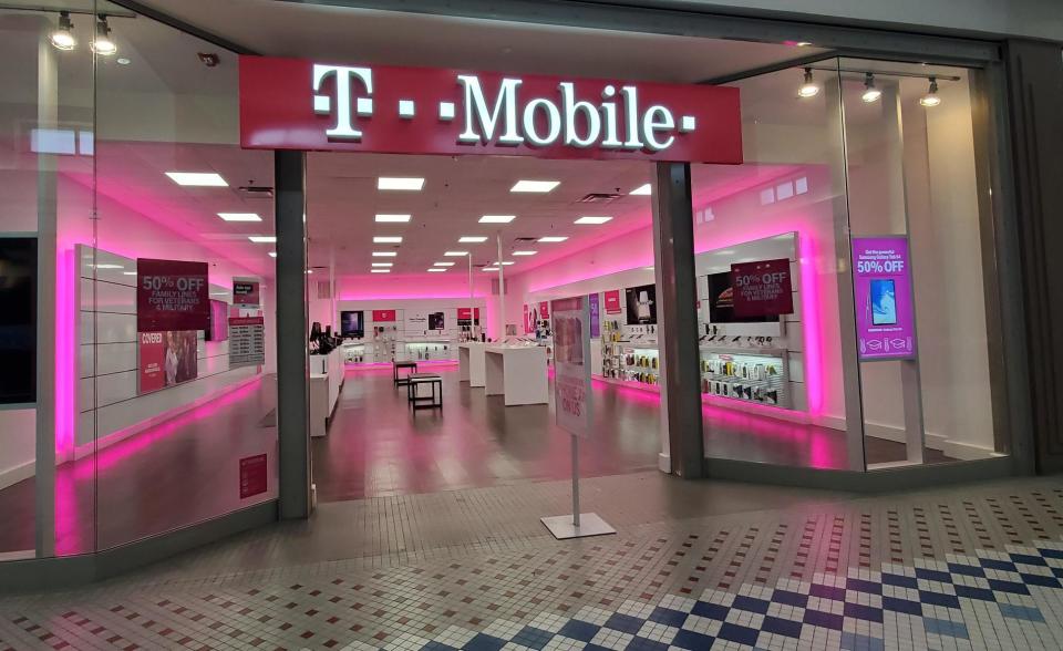
As already pointed out, this company s highly jealous of its trademark bold, hot pink color, even among non-competitors. The chroma reads “youth, “ “energy,” and “fun,” all key to the enterprise’s image. Deutsche Telekom, parent company of T-Mobile, which also owns fashion, broadcasting, healthcare, and tech brands, says its signature shade is “the most important element of our corporate identity.” In the United States, perhaps only the doll brand Barbie corresponds as much with bright fuchsia as T-Mobile.
UPS
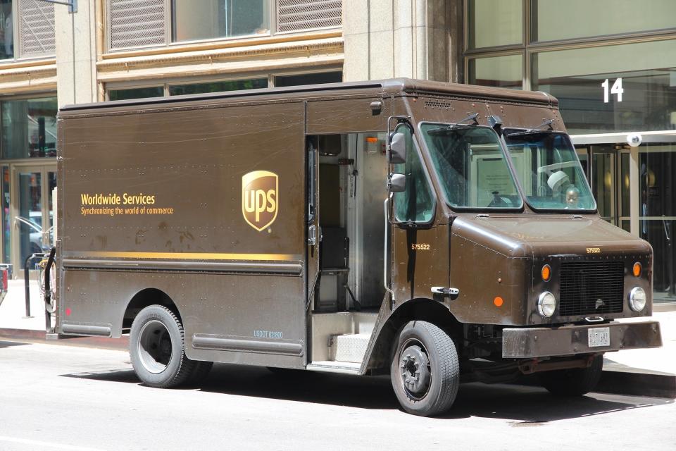
Brown became the symbol of the delivery service back in 1916, when co-founder Charles Soderstrom chose a chestnut tint reminiscent of the Pullman sleeping rail cars, a company that “reflected class, elegance, and professionalism.” The brown also conveniently camouflaged dirt on UPS uniforms and vehicles. Its earthy tones are often associated with simplicity and honesty.
As a side note, effective color branding is definitely subjective to cultural norms. When UPS opened branches in West Germany in 1976, locals were offended by the brown uniforms, which reminded them of the Nazi Party’s “Brown Shirts.” The company subsequently switched its German employees into green attire.
“Owning” a color as a company means much more than simply purchasing a trademark. True ownership requires building a business successful enough to have its marketing seen everywhere. It also means using the shade to not only provide an associated link in the public mind but also to epitomize the firm’s values and message, just as companies like Coca-Cola and Home Depot have done.

