Bring back the custom Super Bowl logos

The National Football League tends to strike gold with the decisions it makes. The world is dealing with a global pandemic? Go ahead with free agency and the draft anyway. Some questioned those moves at the time, but last year’s draft was one of the most-watched sports events during that period of time and it gave football fans – and sports fans in general – something to take their minds off of COVID-19.
Increase the number of playoff teams to seven in each conference? It sounded a bit absurd at the time, but then we were treated to Super Wild-Card Weekend and six games on the opening slate, and as people often find, the more football, the better.
But no one is perfect, and the NFL is no different. As Super Bowl LV looms there is one change the league made in recent years that is a glaring mistake, and one they need to rectify.
They need to go back to the custom Super Bowl logos.
Once upon a time, the Super Bowl logos were a thing of beauty. A way to showcase some flair for one of the biggest sporting events on the planet. You could capture the host city in the logo, as we see here in the logo for Super Bowl XXXIX:

Super Bowl XXXIX was hosted by Jacksonville, known for the nine bridges that span the city and “define [its] River City culture.” Or so Pinterest tells me. Right there in the logo is one of those bridges, the Main Street Bridge which spans the St. Johns River and remains one of the more memorable aspects of Jacksonville’s skyline.
Then there is the logo for Super Bowl XXXI:

Obviously, Super Bowl XXXI was hosted in New Orleans, as you can see the nod to Mardi Gras in the purple, green and gold coloring. Did you know that the colors do have meaning? Purple represents justice, green represents faith, and gold represents power.
See, the logos even have the power to inform. You’ve learned something today. We’ve learned something together.
Another logo that informed was the one for Super Bowl XLII. Hosted in Arizona, the logo for that game displayed not only an outline of the state and two vertical lines to symbolize University of Phoenix Stadium, but the turquoise coloring as another message:

According to the Arizona Super Bowl Host Committee, the coloring was a nod to Arizona’s Native American roots. The Arizona Super Bowl Host Committee also unveiled a mascot, Spike the Super Ball, but we can move on. I’m not here to argue that Super Bowl mascots need to be a thing.
Another classic logo that was simple, yet clear, was the logo for Super Bowl XXI:

Most sports fans can take one look at that and immediately think: “Yep, that game is being played at the Rose Bowl.” Which it was, as emphasized through the image of a single rose.
Sometimes a logo can capture a national mood. In the wake of the 9/11 attacks the logo for Super Bowl XXXVI did just that:

Simple, yet memorable.
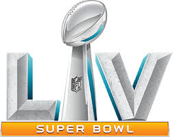
Now? Now the logos are stuffy. Corporate. Boring. I mean look at this:
Where’s the style? Where’s the panache? Where’s the sense of community in that boring logo? This was for a Super Bowl set in Miami for crying out loud!
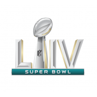
Then there is this year’s:
Yawn.
If you still are not convinced, maybe seeing things on a more macro level will do the trick:
Remember when the Super Bowl used to have unique logos — now been a decade straight of the same generic boring one pic.twitter.com/o6AJIJNMxi
— Pick Six Previews (@PickSixPreviews) January 26, 2021
All that artistic expression, out the window. No Fun League indeed.
So it might not happen in time to save Super Bowl LV, but we can fix this going forward. Let’s right this wrong and do away with these stuffy, boring logos and return to the bygone days of expression and flair. Let the host cities show the world who they are through the art of a logo. Let’s treat the Super Bowl like the cultural event it is, and not the boring buttoned-up conference it has become.
Then maybe we can think about mascots again. Maybe.

