How a Color Guru Designs a Neutral Apartment so It's Anything but Boring
Anyone familiar with Rayman Boozer, the legendary interior designer behind Manhattan firm (and onetime store) Apartment 48 might be surprised, to say the least, to hear that he's designed no fewer than four homes for someone whose go-to palette is a muted mix of neutrals and the occasional light green or blue. You see, for years, Boozer has been known as the "Color Guru," a nickname Time Out gave him in 1997 as a nod for his knack for picking the perfect paint color. But, as his latest home for this client-COO at a tech company-proves, the right shade just may be a quieter one, with a few strategic pops of color, of course.

"We wanted an open and bright home filled with colorful accents," the homeowner says of the penthouse space Boozer designed. She and her family were relocating from Tribeca, where they'd lived in a loft, to a new build with a more traditional layout. But, the building's biggest draw was its views of Manhattan, an asset that made it a little bit easier for Boozer to go more minimal.
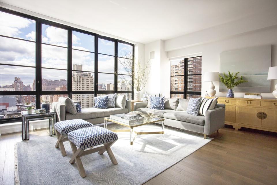
"My default is to give it more and more, but the view is the star of the apartment," the designer tells House Beautiful. "So we did less than we would normally" in terms of window treatments.
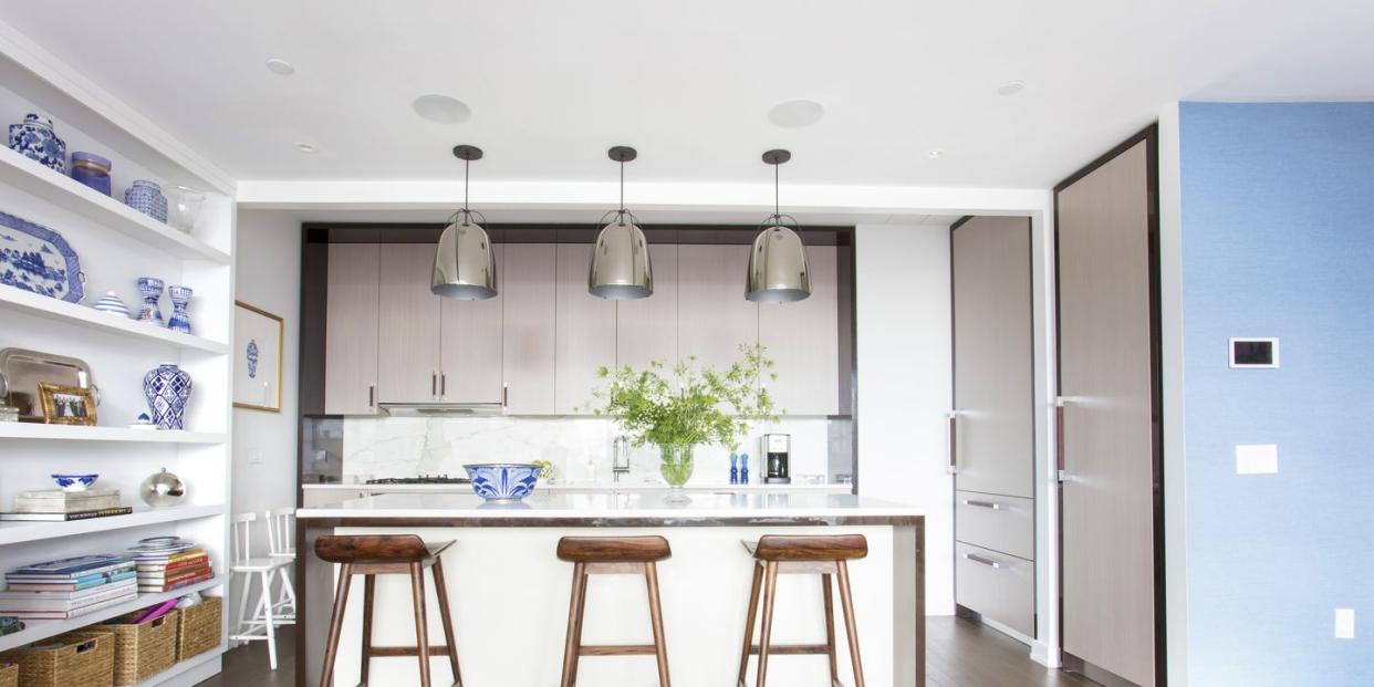
The same went for color. Noting that the client "doesn’t like a lot of different colors together," Boozer worked with her to settle on some subtle schemes. First, since she "likes anything beachy," he devised a blue-and-white palette for the kitchen and dining space, designing custom shelves to include storage and a workspace-all peppered with blue-and-white porcelain sourced at Asian Barn, a favorite Manhattan shop.
"The custom shelving gives more space for storage and just to have a focal point; you walk in and it’s the first thing you see," Boozer explains. "It’s a place where she works from home. She needed a desk and a place to keep stuff where the kids can’t get into the drawer."
In the living area, white walls and bare windows meant Boozer had to turn to the next tool in his arsenal: texture. "Normally, I would paint the walls a color, but in this case since we didn't, we added texture with the furniture, used a lot of patterns of blue on the sofa with the pillows," Boozer explains. Dark floors ground the space, a welcome juxtaposition to the white walls.
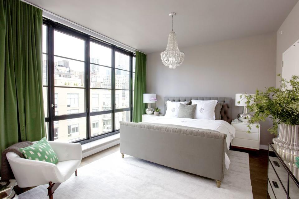
In the master bedroom, the client again picked a two-color scheme-this time, green and gray. " We did the same color scheme in her old apartment and she said it was really peaceful and she loved that, so we tried to capture it with similar colors in a new place," Boozer explains.
Of course, the Color Guru had to try to inject a bold hue somewhere in the home, and he got his wish with the client's daughters' room, which is swathed in "every shade of pink," as Boozer describes. "The walls are this great Élitis wallpaper, the curtains are Lilly Pulitzer for Lee Jofa, then the covers on the chair are a different shade of pink. The kids love it. And it's one of my favorite rooms."
Follow House Beautiful on Instagram.
('You Might Also Like',)

