Columbus Clippers fire broadside at Los Angeles Clippers’ new look

COLUMBUS, Ohio (WCMH) — The Los Angeles Clippers dropped the anchor on its new rebrand and Columbus’ baseball team with the same moniker got onboard to address the similarities.
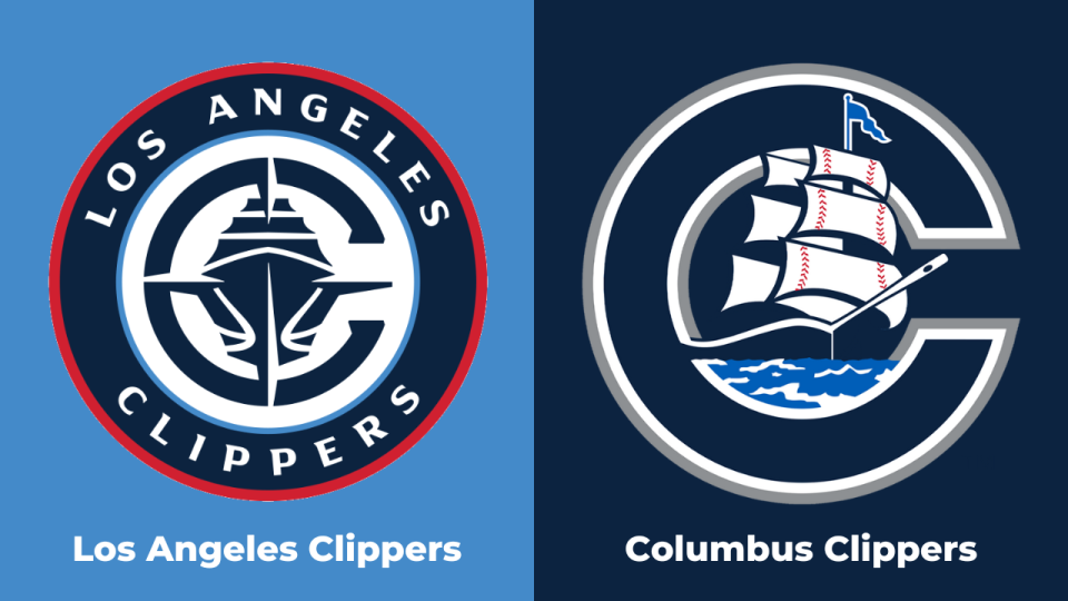
The NBA team unveiled its new logo, uniforms, and court design Monday morning. The primary logo brings back nods to the San Diego Harbor with a navy blue ship in the middle surrounded by a stylized C. When the team became the San Diego Clippers in 1978, its original logo had nods to a sail.
As the logo received reviews from fans online, the Columbus Clippers made a post on X stating “Imitation is the sincerest form of flattery.” Columbus’ logo features a similar shade of blue with a ship housed in the middle of a stylized C. The post went viral and has generated over one million views.
Ohio State keeps No. 2 ranking in AP poll with two regular season games left
Columbus’ Clippers were founded in 1977 one year before the NBA’s Buffalo Braves relocated and changed in name to the San Diego Clippers. Clippers baseball returns on March 29 as Columbus looks to make the International League for the first time since 2021. They have not won MiLB’s Triple-A championship since 2011.
The LA Clippers rebrand will go into effect for the 2024-25 season, when the team moves out of the Crypto.com Arena it shares with the Lakers and plays at the newly built Intuit Dome. The Clippers have never won an NBA championship and currently sit fourth in the Western Conference standings.
For the latest news, weather, sports, and streaming video, head to NBC4 WCMH-TV.

