Detroit Pistons' NBA draft hat doesn't quite live up to Cade Cunningham's potential
- Oops!Something went wrong.Please try again later.
- Oops!Something went wrong.Please try again later.
It’s an odd tradition, when you think about it.
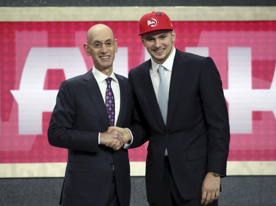
For decades now, prospective NBA players, once they hear their names called in the draft, have strode up to the stage in their suits to meet the commissioner and don a hat with the logo of their new employer.
They’re almost certain not to wear the hats again; basketball — unlike baseball, football and hockey — is almost completely hat-free once players are in uniform. So why should we care what the draft hats look like?
If nothing else, the hats are a tangible symbol of a player’s future; putting on the hat makes it just a little easier for a fan to envision a star in a suit eventually leading their team onto the court. Or some other team. The hats lie sometimes, reflecting the draft order and not any trades made on draft night.
CADE AND THE D: Why Cade Cunningham 'loves' Detroit
FEELING A DRAFT: Mock draft: Pistons locked on Cunningham, but what will Rockets do at No. 2?
THE FIELD: Cunningham is safest pick for Pistons. Experts aren't convinced he'll be best player
That’s how we get, most notably, images such as Luka Doncic wearing Atlanta Hawks headgear and Trae Young in a Dallas Mavericks hat back on draft night 2018. The two were unofficially traded for each other before the picks were made, but first, they had to wear the hats. Or, closer to home, Bonzi Wells wearing a Pistons hat in 1998 then suiting up for the Portland Trail Blazers once the 1999 season began, after a months-long lockout.
And so the hats end up as symbols, simultaneously, of the past AND future. When Cade Cunningham puts on that hat for the first time Thursday, the clock will start on his presumed Pistons stardom – and perhaps the purchase of a few hats here in Detroit. The cooler the lid, the brighter the future, or at least it can feel that way at times.
No wonder New Era puts out an entirely new line of hats each season. The hats for 2020, though, were virtually identical. But this year, the company gave each franchise a personalized touch. With that in mind, Free Press deputy sports editor Ryan Ford ranked all 30 teams’ offerings this year — with some commentary by assistant sports editor Marlowe Alter, the Freep’s true hophead — while sorting them into five tiers.

The result? Well, here’s hoping Cunningham’s performance fares better than his hat’s. And the others? Well, read on…
Tier 5
These six designs look like they’re already tanking for next year’s draft.
30. Los Angeles Clippers
Ford: Oh no, Clips, what are you doing? The interlocking "LAC" was a bad logo to begin with, and then you tried to jam your entire name in there? This looks like a maze on the Staples Center kids menu.
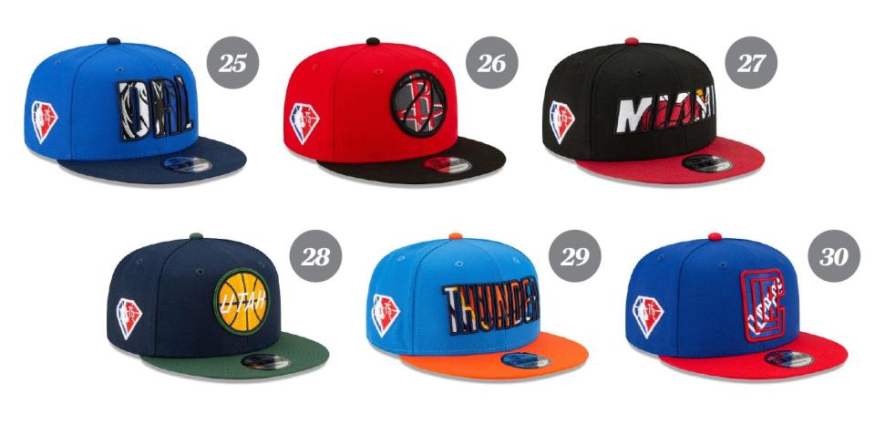
29. Oklahoma City Thunder
Ford: The team with a truck-stop inspired “City Edition” jersey gets a hat that looks like it’s sold at one. The big problem here? Going with “Thunder” for the outline. It’s been 13 years, and we all still call you “OKC” (or “Zombie Sonics”). Embrace it.
28. Utah Jazz
Ford: The Utah Jazz play an exciting brand of basketball. This hat is the exact opposite of that.
27. Miami Heat
Ford: This feels like every Miami Heat hat ever. At least TRY to make an “M” or “H” work in outline form.
26. Houston Rockets
Ford: First off, this is a lot of black for a team without a lot of black in their uniforms; you couldn’t make the old-school red and yellow work? Even worse, the basketball outline over the logo makes it look like the Rockets are being outlawed. Then again, the Rockets won 17 games all year; maybe they should be.
25. Dallas Mavericks
Ford: It starts out so strong in the “DAL” … and then disappears at the end. Congrats, Mavs fans, it’s your playoff loss to the Clippers in hat form. (Also, embrace the old-school green!)
Tier 4
For these six hats, there was a plan — it just didn’t quite work out.
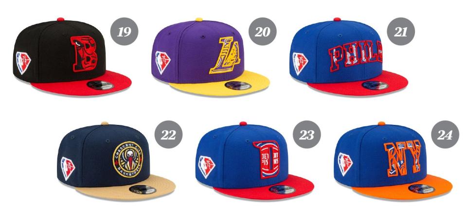
24. New York Knicks
Ford: The bold “NY” should work, but it’s just too much orange clashing with the orange in the Knicks’ logo. For a hat given to someone who will be moving to New York, it looks a lot like something a tourist would wear.
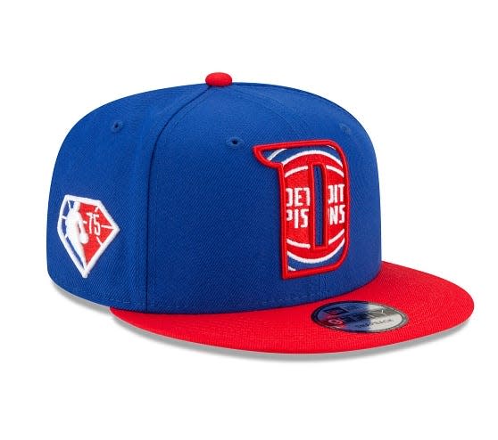
23. Detroit Pistons
Alter: The blue and red is strong, but the left hang on the D of Detroit, I'm out on. Looks like a Red Wings “D.” They could do worse, though. That's the bar on Pistons' creativity with on-court branding.
Ford: I don’t hate the outline “D” — it’s better than the D with the ball shooting through it. But the blah “Detroit Pistons” ball logo is just a killer. Lame logo, lame hat.
22. New Orleans Pelicans
Ford: Looks less like a hat for a basketball team, more like a “Save the Pelicans” group. Which, after Zion leaves for NYC, I guess it will be.
21. Philadelphia 76ers
Ford: It’s got the red, the white, the blue and the “Phila” mark, plus the snake. But it all gets jumbled up.
Alter: Yeah, I like everything when they use the snake, but not this time: The red lettering is too dark, and there's too much going on — just like inside the mind of one Ben Simmons. That reminds me. Hey, Woj or Shams: Announce Damian Lillard to Philly already.
20. Los Angeles Lakers
Ford: Well, you beat the Clippers (not hard) and avoided the mistake the Lions made with the lone “L,” but the small “A” still feels orphaned without “KERS” to finish it off. It’s like LeBron trying to win a playoff series without another healthy superstar.
19. Chicago Bulls
Ford: Colors are solid, as is the block-letter “B.” But poor Benny the Bull looks like he ordered an Uber Black and a Fiat 500 showed up.
NO. 1 STUNNERS: Detroit has a checkered past with top picks, but there have been big hits, too
Tier 3
The danger zone in the NBA — not quite headed for the lottery, but not a championship contender either.
18. Milwaukee Bucks
Ford: Tough to go wrong with green and cream for the new champs. But, uh, the alignment of the basketball shape in front of the Buck kinda makes it look like he’s in jail. Maybe not the look for Milwaukee considering the past couple years.
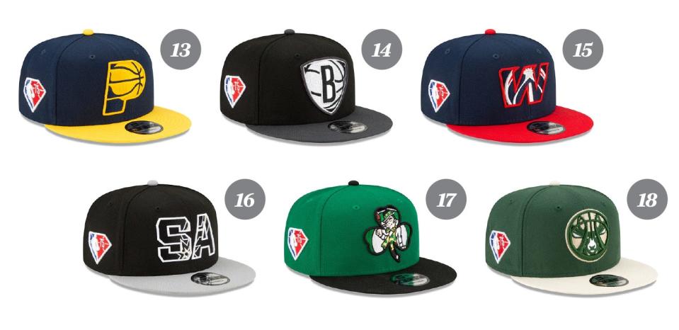
17. Boston Celtics
Ford: I’d argue for a little more traditional white to go with the Celtic green, but the shamrock is a nice touch and shows off the logo more than most of the hats in this collection.
16. San Antonio Spurs
Ford: This is exactly what I expected from the Spurs, a franchise that has spent the past two decades finding out how many shades of gray the human eye can perceive (despite the outstanding “Fiesta Spurs” City Edition jerseys this season).
15. Washington Wizards
Ford: The “W,” red and blue work just fine, and the star in the logo sits fine. But the placement of the Washington Monument is off just enough to annoy me. It's ... fine.
14. Brooklyn Nets
Ford: Did … did … did they just slap the logo on the front and call it a day? Is that allowed?
13. Indiana Pacers
Ford: OK, this one is definitely cheating by just using the old logo. Eh, the other option was just putting Larry Bird on there, which would have been awkward.
THE BUSINESS SIDE: Pistons' NBA draft lottery gives them a big win even before they pick
Tier 2

These lids are strong … but stumbled somewhere along the way.
12. Cleveland Cavaliers
Ford: It’s the sharpest the Cavaliers have looked, on or off the court, since LeBron left. But it’s a little … dark. What happened to the gold in “wine and gold?”
11. Sacramento Kings
Ford: The crown works well with the cross-section of the logo’s lion. And I know purple and black are the colors from the team’s most successful period. But imagine this one in the baby blue and red they wore as throwbacks to their first year in Sacramento.
10. Portland Trail Blazers
Alter: Portland's is clean.
Ford: Yeah, a nice job making their abstract “pb” logo work with the letter outline. Then again, this might be too boring for a team with Damian Lillard (for now, at least).
9. Toronto Raptors
Ford: Bold move to go with the monochrome claw marks inside the “R.” Honestly, though? It looks a little too much like a CFL hat. Give us some throwback purple.
8. Memphis Grizzlies
Alter: Way better colors to use. The claws are creepy or something; I don’t know what it is, but I don't like it.
Ford: Yeah, expansion-era teal would have made this sweet. But the Grizz’s commitment to symmetry pleases me.
7. Denver Nuggets
Ford: The colors are strong and unique, and the mountain-logo outline gives that pick-ax logo room to breathe. My only gripe: It would have been nice to get a reference to the Nugs’ sweet skyline jerseys.
Tier 1

The cream of the crop; these hats bring the fire like a Jrue-to-Giannis alley-oop.
6. Atlanta Hawks
Ford: The classic Pac-Man Hawk doesn’t quite show through the “ATL,” and the black outline is a bit heavy … but they got the red and yellow right and that goes a long way. This feels like the Hawks’ unexpected Eastern Conference finals run.
Alter: Their fiery red and golden yellow combo is gorgeous.
5. Phoenix Suns
Ford: The purple. The orange. The fiery Suns-bat perfectly cropped by the “S.” Perhaps a bit of black, for their “Valley” edition unis, would have been nice … but this is a solid 2-0 lead on almost all the other hats.
Alter: Oh, here come the jokes! That snaked "S" is so stylish, and the purple and orange are always a pleasing combination to my eye.
4. Golden State Warriors
Ford: The “W” outline doesn’t mess around and the asymmetry on the crop of the logo gives it a nice splash, like a Steph Curry heat-check 3.
Alter: Their primary Golden Gate Bridge logo is one of my favorites in all of sports. Get healthy soon, Klay.
3. Orlando Magic
Ford: A unique shape for the outline containing the logo. Sometimes it’s nice to see a team just fall back on its star power. Never mind.
Alter: I'm big on the blue pinstripe jerseys, and that's what I see when looking at this hat with the throwback "star" outline. It just screams cool. The Timberwolves must like it too ...
2. Minnesota Timberwolves
Ford: What’s not to love? Just enough of Minnesota’s neon green to grab the eye, and the howling wolf is well-cropped. Of course, the Timberwolves being the Timberwolves, we might not see this one live on Thursday; Golden State has their first-rounder and Oklahoma City has their second-rounder.
Alter: Fine, I'll say it: I love the wolf of course, but I don't love the dark navy. This hat should have way more neon green and I will not hear any argument against it. Can't believe they whiffed — well, actually, they've been whiffing on the playoffs for 16 of the past 17 years, so yes, I believe it.
1. Charlotte Hornets
Ford: The Hornets already had some “buzz” thanks to their iconic teal and purple combo. But the hexagonal honeycomb frame for the team logo is next-level. In all, it’s almost enough to make you forget the franchise hasn’t advanced past the first round since the turn of the century. Almost.
Alter: The teal and purple might be the best color scheme in the league, and anytime you can incorporate a rare geometric shape into your logo, I'm in. It's about time this franchise matched its awesome branding with a tolerable product on the floor. They are finally on the come-up with LaMelo Ball.
Contact Ryan Ford at rford@freepress.com. Follow him on Twitter @theford.
This article originally appeared on Detroit Free Press: Detroit Pistons' NBA draft hat doesn't live up to No. 1 potential

