This Family Home in Melbourne Gets a Modernized Minty Kitchen
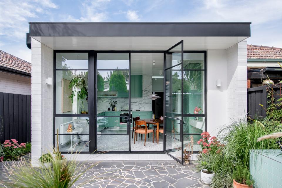
Flemington is a quaint and quiet neighborhood in Melbourne, Australia, filled with heritage homes that have been owned by families for decades. One such home, built in the 1940s and hovering around 1,000 square feet, was the owner’s great-great-uncle and aunt’s place, and he was looking forward to giving it a much-needed update.
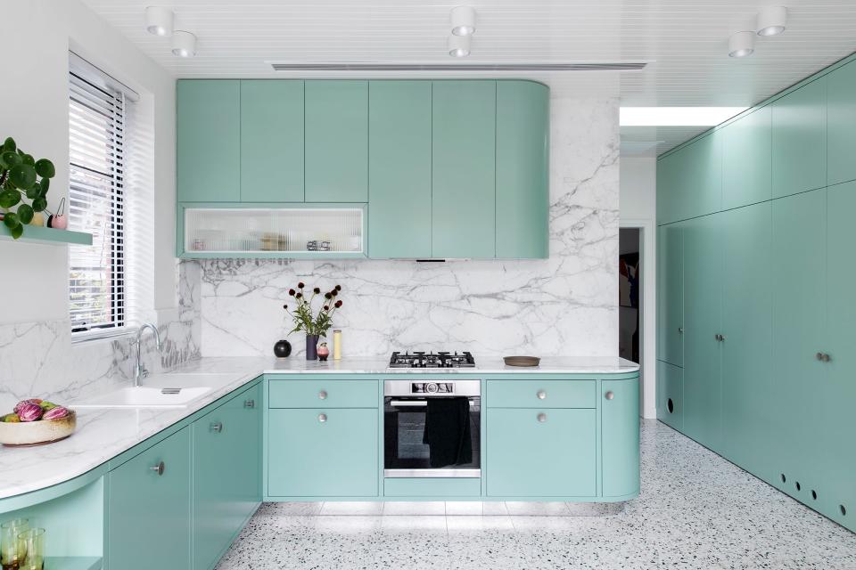
Architect Lisa Breeze was hired in the spring of 2018 and quickly turned to the kitchen’s original minty tone, charming quirks, and glass cabinetry for inspiration.
Location: Flemington, an inner suburb of Melbourne
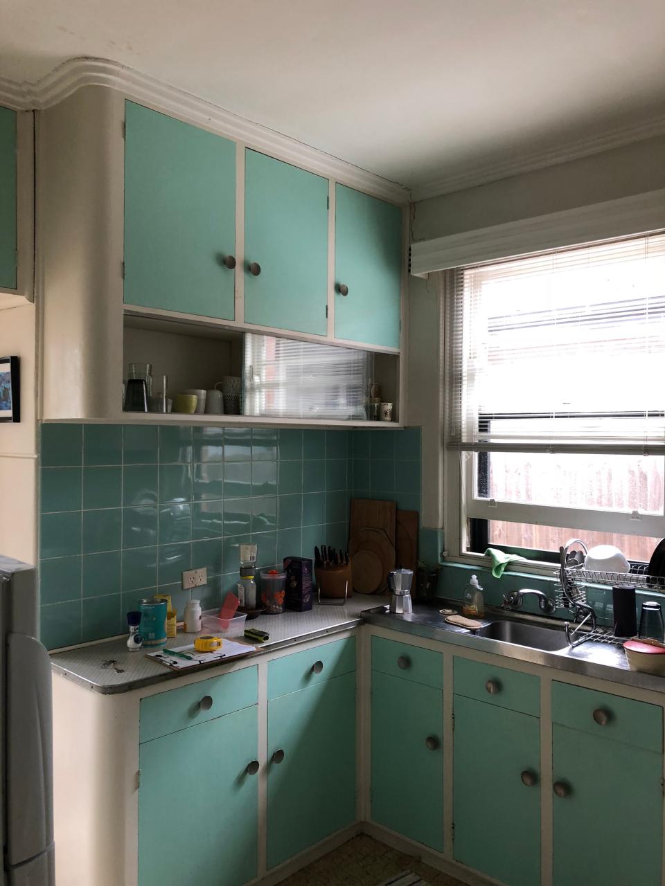
The before: Much of the home hadn’t been renovated at all. The kitchen, which was original, had received a few changes, but “overall it was pretty sad,” remarks the architect. While Lisa worked on the rest of the home too, the kitchen was the key focus in the early phases of the design. The decision was made to gut the back bathroom and kitchen and extend the layout slightly.
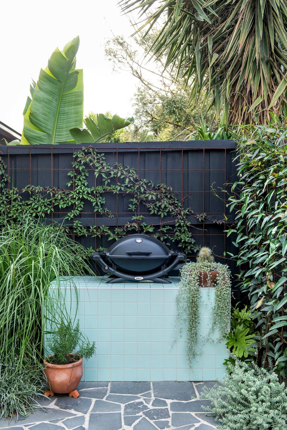
The inspiration: “It’s unusual for a client to be as attached to the features of an old house before a renovation like he was, but I saw it as an opportunity,” Lisa says. The original kitchen’s mint palette, curved corners, and sliding cabinets were some of its most beloved details, and she looked to pick up on those in a contemporary way.
Square Footage: 215 square feet
Main Ingredients:
Paint color: Dulux Beckett in satin finish on the cabinets and Dulux Natural White in lowsheen acrylic on the walls
Countertops: Calacatta Statuario
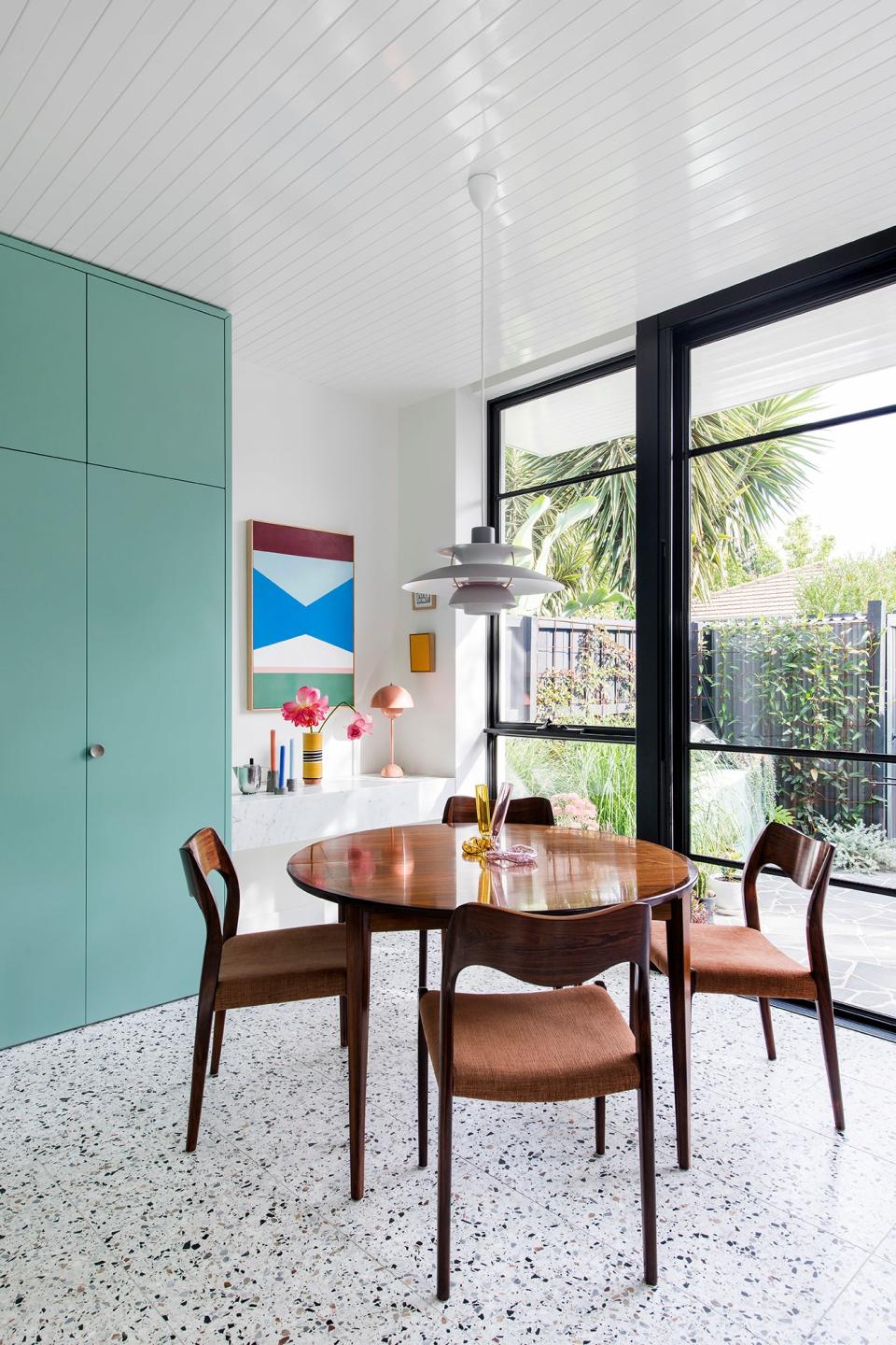
Terrazzo flooring: Point Leo from Defazio Tiles & Stone, which features a mix of black, brown, charcoal, and other natural-toned chips
Table: Danish extension table in rosewood designed by Rosengren Hansen for Brande Mobelfabrik circa 1960
Chairs: 1950s Danish teak dining chairs designed by Niels Otto Møller
Armchair: Penguin Chair by Theo Ruth
Colorful artwork: After the Gold Rush by Esther Stewart
Most insane splurge: “The stone benchtop and backsplash were fairly expensive,” Lisa recalls. “We didn’t initially set out to design it with something as fancy, but the owner fell in love with the stone.”
Sneakiest save: When it comes to saving, working within a small footprint is automatically cost-effective. “There is so much packed into a small space for Australian standards,” Lisa says.
The best part: Who wouldn’t love mint cabinetry? Although the color is one of Lisa’s favorites, she also notes how beautifully the kitchen was executed, from the curves to the framing details and more.
What I’d never do again: Lisa has no regrets when it comes to the design of this small kitchen but would have done an island bench if the room allowed. “I always cater toward the space I’m working in,” she says. “I love an island bench, but it didn’t need one, and it wouldn’t have fit.”
Originally Appeared on Architectural Digest

