The Federal Reserve’s Dot Plot: A Simple Explanation
As investors, wouldn't it be nice if we had a crystal ball that could tell us the future direction of interest rates? Well, we do...sort of.
At the conclusion of its four meetings each year that include economic forecasts, the Federal Open Market Committee (FOMC) releases a document known as the "dot plot" that gives a look inside the minds of the policymakers. In simple terms, the dot plot is a graphical representation of where Fed officials see interest rates going over the next several years.
Each dot represents the interest rate prediction of one Fed official. For example, each dot in the "2020" column on the dot plot (see below) indicates one official's prediction for where the benchmark federal funds rate will be at the end of that year. The dots all look the same and aren't labeled in any way, so there's no way to know which official made which prediction.

Image source: Getty Images.
There are typically 19 Fed officials who give their predictions -- the members of the Federal Reserve Board of Governors and the presidents of regional Federal Reserve banks -- but the actual number of dots can be lower if there are vacancies in the organization. For example, as of the March 2019 dot plot, there were only 17 dots in each column because there are two vacancies on the board of governors.
Example: The March 2019 dot plot
The dot plot is best explained with an example, so to illustrate how it works, here's a real-world example of a Federal Reserve dot plot and how to interpret it. This is the dot plot that was released at the conclusion of the FOMC's March 2019 meeting:
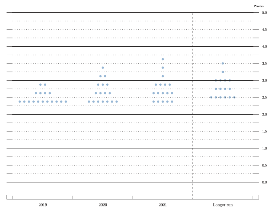
Image source: Federal Reserve.
As mentioned earlier, each dot represents a committee member's outlook for what the target federal funds rate should be. Each member gives a prediction for rates at the end of the current calendar year, the next two years, as well as over the longer run. There are 17 members who give their predictions, so there are 17 dots in each column.
Consider the 2019 column of the dot plot shown above. Based on the positioning of the dots, 11 members see the target federal funds rate in the range of 2.25% to 2.50% at the end of 2019; four members see a target range of 2.50% to 2.75%, which would indicate one rate hike; and two members see a target range of 2.75% to 3%, which would indicate two rate hikes.
Now, when you hear something like "the Fed now sees no further rate hikes in 2019," this is referring to the median projection on the dot plot. I don't want to give anyone math-class flashbacks, but just to quickly refresh your memory, the median of a set of data is its midpoint. In other words, for 17 data points (like in the dot plot), the median is the ninth-highest value.
So, the median projection for 2019 as of the March dot plot calls for a target federal funds rate in the 2.25% to 2.50% range, which is exactly where the federal funds rate was at the time the dot plot was released. Because of this, it can be said that the dot plot shows no further rate hikes for the year.
There are several reasons investors care about the dot plot. For example, higher projected interest rates can tell investors that bond yields are likely to rise. Lower projected interest rates are generally considered a dovish (positive) sign for stock prices. Consumers may want to pay attention to the dot plot as several types of consumer interest rates -- like those charged by credit cards -- are directly tied to the Fed's rate activity.
Take it with a grain of salt
As a final point, keep in mind that the dot plot shows where the members of the FOMC see future interest rates going right now. Just because the dot plot shows a certain number of interest rate hikes or cuts in the future doesn't mean they'll actually happen.
In fact, Federal Reserve Chairman Jerome Powell has cautioned investors against relying too heavily on the dot plot, and there has been talk of getting rid of it entirely. The Fed recently said that it's taking a data-dependent approach to rate hikes, and there's no way the Fed officials can know what the future data will be. The dot plot makes it sound like rate hikes will follow a certain course, and that's just not likely to be the case.
There is also the issue that not everyone who gives their projection on the dot plot gets a vote when it comes to setting monetary policy at Fed meetings. Only 12 members vote on the Federal Open Market Committee, the policymaking arm of the Fed. This includes the seven members of the Board of Governors, the president of the Federal Reserve Bank of New York, and four of the remaining 11 Federal Reserve Bank presidents, who serve rotating one-year terms on the FOMC. The seven regional Fed presidents not on the FOMC in a given year still get a dot, which is why there are 19 dots altogether on the plot (assuming no vacancies).
In a nutshell, the dot plot represents Federal Reserve officials' best guess on where interest rates are headed, based on current data. If the data changes, the predictions and actions of the Fed will likely change with it. So, while the dot plot can certainly move markets, it's important to realize that at the end of the day, it's just an educated guess.
More From The Motley Fool
The Motley Fool has a disclosure policy.

