The New Firehouse Hotel in L.A. Proves Design Risks Can Pay Off Big-Time
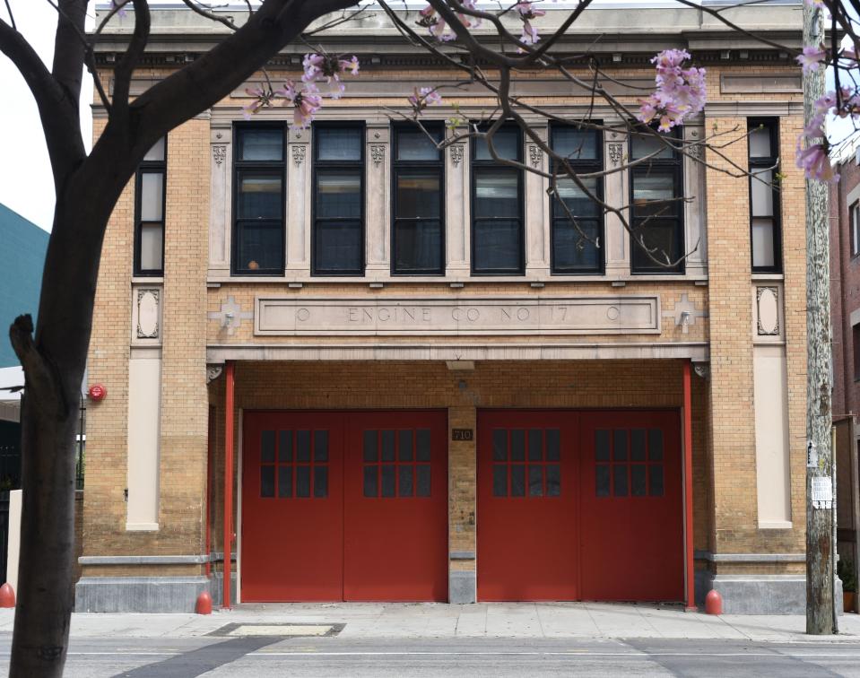
With its set of cherry-red garage doors and the words Engine Co. No. 17 neatly etched into the façade, there's no hiding the backstory of this Los Angeles Arts District building: It was a fire station. Its purpose now, decades later, however, is not obvious until you step inside. As of April 15, the property is officially a nine-room hotel—Firehouse Hotel, to be exact, as is only fitting. We pity the person who walks right by unaware. Bursting with in-your-face patterns, shiny mirrors, and every color in the rainbow (seriously, the rooms correspond with ROYGBIV), this newcomer is already on our bucket list for our next trip to the West Coast.
As you'd expect, a gut renovation was needed to make this transition. Owner Dustin Lancaster tasked his good friend, developer Tyler Stonebreaker of Creative Space, to handle restoration and construction, and longtime collaborator Sally Breer, cofounder of design studio ETC.etera, to oversee the interior design. She essentially started from scratch, other than a handful of original architectural details, like the wood and concrete floors and exposed ceiling beams. "It was a completely raw space," says Sally. "We had to demo everything and start over." At first, she carved out 14 rooms, but eventually the number shrank to nine, plus a lobby/hangout area and a restaurant. "We really wanted to make this a space you could comfortably stay [in] for a while," she explains. "We wanted you to be here and not feel like you had to rush out. It should feel like you’re in an apartment rather than a hotel room."

An individualized approach to the interior design—as we mentioned, each room is unique, with its own color scheme—emphasizes this idea. It also means there are nine times the design details to get inspired by. Here are five we want to try in our own apartments:
1. Using the "why" to inform the "what"

When faced with a ton of design details to choose—the "what"—Sally finds it easiest to create a narrative to guide her decision-making—the "why". As in, a pretend story like the ones you'd make up as a kid, but for the purpose of a cohesive decor scheme.
In this case, Sally imagined a secondary history for the building involving a make-believe mother-daughter duo, Mabel and Marta. "The idea is that Mabel took the building over in the '40s and turned it into a boarding house. So she’s the one who installed the bathrooms and laid out the footprint. She raised her daughter in this boarding house," says Sally. "In my mind, Mabel was this eccentric woman who decided each room should have its own theme, ROYGBIV. The rooms rotate, so next door to the White Room is the Red Room, then the Orange Room, then the Yellow Room. I just imagine her as this kind of wild Italian lady who did this because she could. Then her daughter came along in the '70s and made it a little more punk rock—there’s some curviness and weirdness her daughter brought in later. Hopefully, this creates some tension in the space between something that feels more classic and closer to the architecture of the building and this contrasting funk."
2. One type of tile a dozen different ways

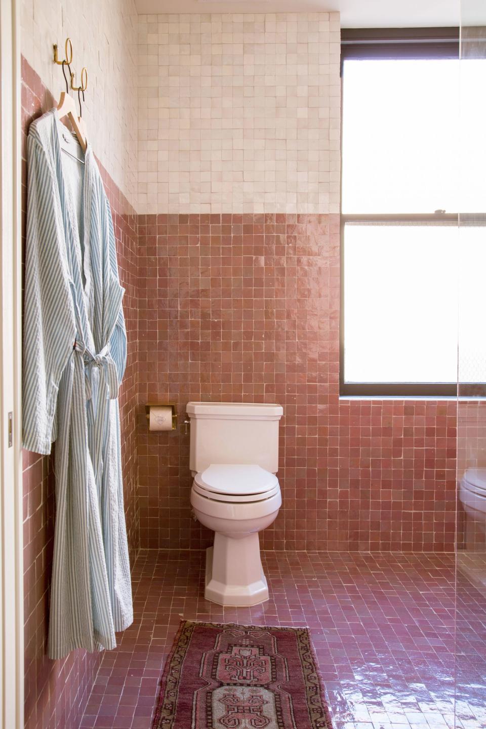
Not only did Sally use a single vendor, Clé, for all of the tile in the whole project, she also used one material and shape: glazed terra-cotta in a simple square. "I'm always saying in my office, 'Pull back—use less,'" she explains. Sally kept it interesting by switching up the color of the tile from room to room, and sometimes even within the room itself. "I’m a big fan of using the same material on the floors and the walls," she points out. "Even if you change the color, but use the same material and same size of tile, it’s such an elegant way to make the space feel bigger than it is."
3. Going big in a small space
The fact that a few of the rooms are on the smaller side didn't deter Sally from thinking big. In the Blue Room, for example, there wasn't space for a true closet. Instead of bringing in a stand-alone armoire of some sort, she designed an entire wall of floor-to-ceiling cabinetry to encase the bed, then gave it a trompe l'oeil affect with paint. "You just need it to be 24 inches deep for a hanger!" she notes.

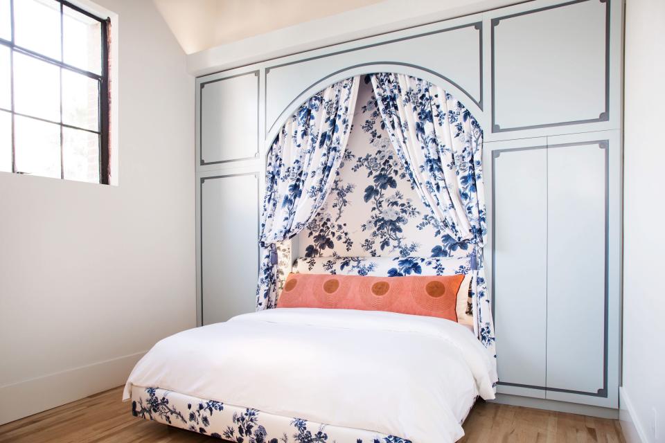
The Red Room might be even smaller, but it's just as bold thanks to an oversize canopy above the bed. Says Sally: "The fact that it’s big and exaggerated is exactly the point. It all of a sudden makes the room feel special. Had we done everything to scale and crammed in a lounge chair, it would have been less of a room. We just said, 'You’re going to have a bed and it’s going to be fucking beautiful.'"
4. Using lighting as a connector
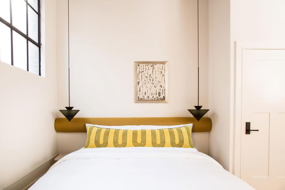
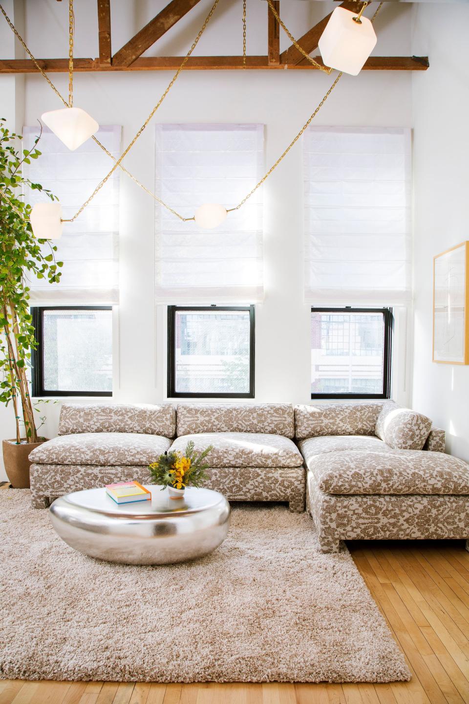
What the hotel rooms are lacking in square footage, they make up for in ceiling height, and various hanging lights keep the spaces from feeling overwhelmingly lofty. Pendants float over all of the nightstands—so the surfaces aren't "all lamp," Sally explains—and in the White Room, a larger light fixture swoops across the seating area. "It’s a really nice way to connect what’s happening below with up there," she says.
5. Minimalist maximalism

Sally took the Firehouse Hotel project as an opportunity to take thoughtful risks. "I was experimenting with the idea of not doing this minimal, all-beige design, which is my comfort zone and makes me feel calm. I wanted to have that same effect of calm but with same, same, same—the same wallpaper, the same upholstery, and the same drapery in a bedroom, for example," she says. "It’s a minimalist take on maximalism. You’ll see it’s still sparse; I only have a couple of pieces of art on the wall. I’m a big proponent of a space you feel like you can breathe in. So, it’s not maximalist, but it’s not restrained. There’s some color and some depth and some playfulness in the space."

