Frida Escobedo's New Aesop Store Blends Classic Brooklyn and Mexican Craft
In Frida Escobedo’s built work, perception is just as crucial an ingredient as bricks and mortar. Some of her creations play with time, like her Serpentine Pavilion, which was aligned with the Prime Meridian to allow changing daylight to blur the structure’s boundaries. Others bend the familiar, as with a series of obsidian tequila drinking bowls that evoke the shape of cupped hands. “I am interested in perception,” the Mexico City–based architect affirms, “and perception has a lot to do with space and time. Without time how can you express a memory?”

EscobedoAesopParkSlope-2
Her yearslong partnership with the Melbourne, Australia, skincare company Aesop has provided particularly fertile ground to explore these ideas. This first began with a 2013 pop-up shop in Brooklyn’s Boerum Hill neighborhood for which Escobedo and her team devised an ingenious “mural” of sand wedged between mirrors, which doubled up as an hourglass. Three years later in Miami, she placed panes of iridescent Dichroic glass at the back of the store so that, over a day, the space would shift in color from gold to pink.
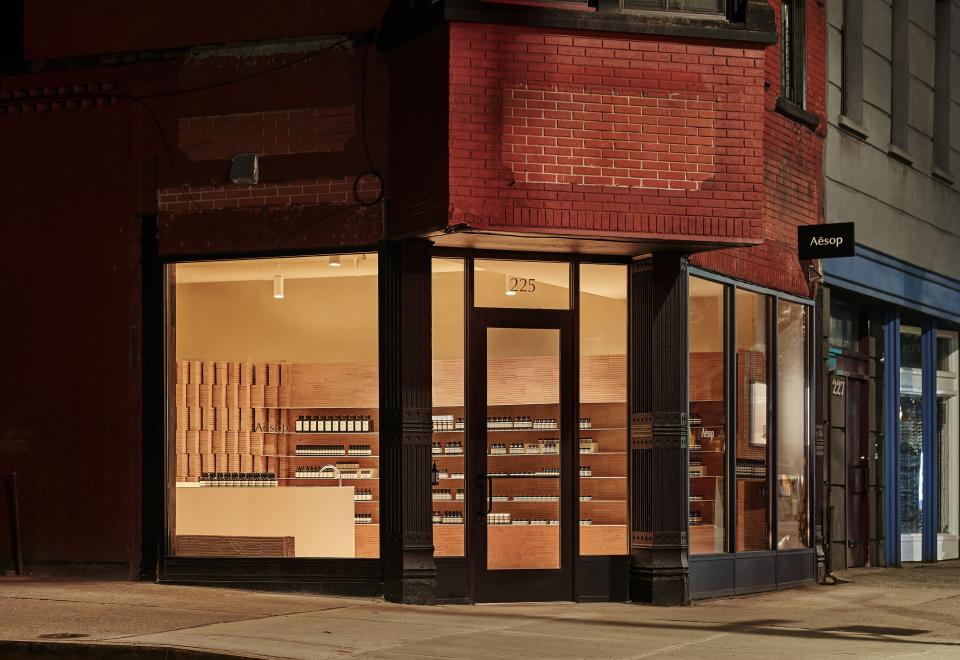
Now Escobedo is back in Brooklyn with a permanent new Aesop location in a Park Slope storefront, her studio’s seventh interior for the brand. Like her other projects, its design is underpinned by a memory—the red brick that has typified the neighborhood for more than a century.
EscobedoAesopParkSlope-1
From a corner entrance of a stately 19th-century building at the intersection of Fifth Avenue and President Street, visitors are greeted with a waft of bergamot, cedar, and rosemary, and attendants beckoning you to try products in white, rectilinear sinks. A rhythmic brick partition snakes along the south wall, providing the store’s blush-colored backdrop as well as niches for display, sales, and storage.
This zen environment marks a dramatic departure from the building’s former function: a veterinarian clinic that specialized in cat care. The deep, linear space was rigidly segmented to provide animal treatment rooms and also had a bathroom awkwardly positioned smack in the middle of the floor. But there was one welcome surprise: The building’s ’70s-era modular ceiling concealed an original one of stamped tin.

EscobedoAesopParkSlope-4

EscobedoAesopParkSlope-3
Brick was the obvious material choice, given its ubiquity in the leafy Brooklyn neighborhood. But instead of relying on local brick, Escobedo opted to work with apricot-colored Mexican tile from Oaxaca, commonly used to pave floors. “It has a completely different texture and tone [than Brooklyn brick],” Escobedo explains. “It’s really special.”
Back in her Mexico City office, Escobedo and her employees played with the tiles, eventually devising a rhythmic modular system to stack together a torquing, Jenga-like wall. The tiles were shipped from Mexico to New York and assembled on-site. (All told, it took 18 workers and 19,000 individual bricks to build.) The completed screen, sawtoothed in plan, allows for sight lines that run the entire length of the narrow store, letting light and views into its furthest stretches. It also doubles as a handy divider to tuck away the troublesome restroom, as well as create generous back-of-house space for employees. As you move past it, afternoon light gives it a moiré effect. “It’s almost like a tapestry,” Escobedo says.
EscobedoAesopParkSlope-6
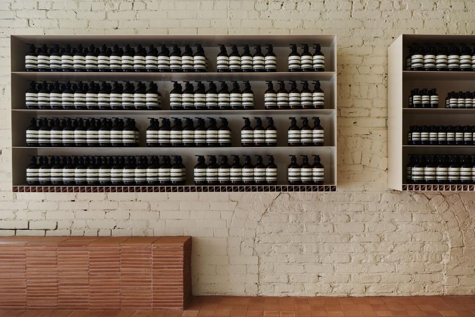
Because of Aesop’s strong graphic identity—bold cream-and-black packaging—the product could speak for itself, according to Escobedo, and “allow us as architects to do very different things.” Rows of amber-colored bottles containing hand soap, facial oil, and shampoo are neatly showcased on powder-coated shelving while Aesop’s signature hand cream cleverly slots into a row of tiny cubbies beneath. An added visual payoff: The scale and uniformity of the packaging creates a formal dialogue with the geometry of the bricks.
It’s a bit of a full-circle moment for Escobedo: This is the first project her team has completed after creating the high-profile Serpentine Pavilion last summer. What’s more, the location of her first Aesop pop-up is just a few blocks down the street. “I was very young at the time,” she reflects. “Aesop was one of the first companies who really thought this collaboration could work, and I am really grateful for that.”
So, will she be designing an Aesop in her home city any time soon? “We don’t have Aesop in Mexico—we're waiting for it,” she says with a laugh.

