Here's How Emily Henderson Picks a Perfect Color Scheme Every Time
Choosing a color palette for your space is one of the most important steps in decorating, as it sets a specific mood and defines the general aesthetic. As Los Angeles-based interior design master Emily Henderson tells us, "[her] biggest pieces of advice for anyone starting a room design (especially if it's an intimidating process) is to pick a color palette to make decisions down the line easier." So whether you're looking for some inspiration or embarking on a major design project, Henderson's easy formula for picking out a stellar color scheme every time will come in handy.
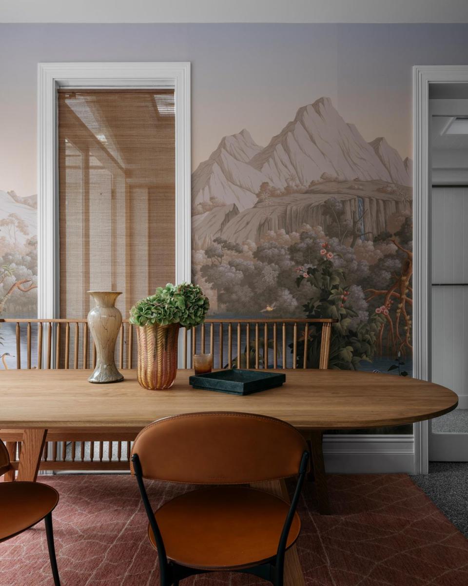
Step One: Pick an Inspiration Piece
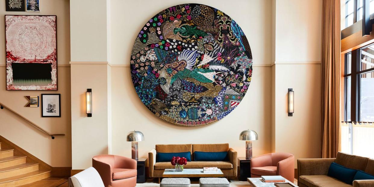
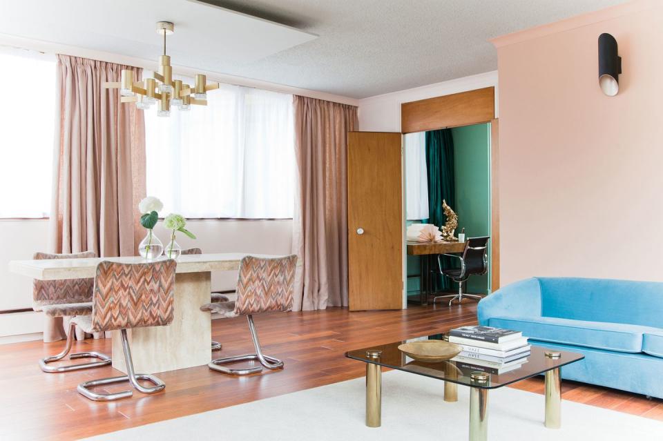
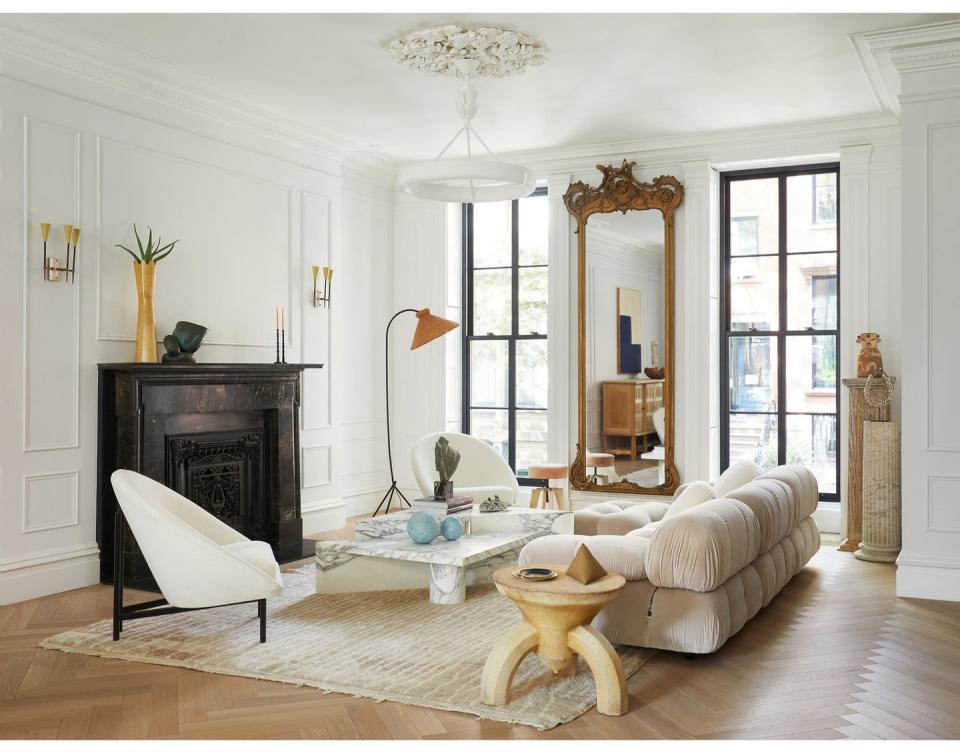
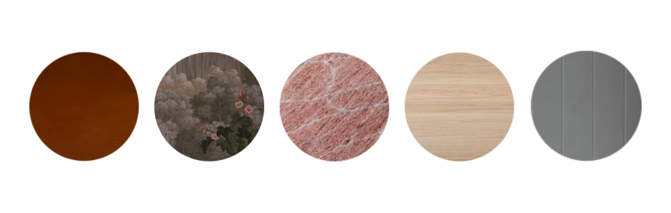
First things first, Henderson recommends picking an inspiration piece you know you absolutely want to use. That can be art, a textile, a rug...really anything you love that you think will anchor the space.
Step Two: Pull Out Its Colors for Accents
Pick 3-4 colors from your inspiration piece to use throughout the rest of the room. "Any more can start to make a space feel chaotic," she tells us. But you can always create depth through texture and material. When you're done picking out the bigger items (that's coming up next), Henderson encourages you to "have fun and accessorize with your 3-4 colors but in a way that feels balanced." Another way to think of it? "30 percent of the color scheme is" one of the brighter "accent colors (or two)."
Step Three: Use Neutrals for Larger Pieces
"Unless you want a BIG color moment, stick with safer neutrals for large furniture pieces," Henderson says. That is, unless your inspiration piece was a colorful sofa or something of the like. Just make sure "60 percent of your room is one main color family (this is usually your neutrals)," she suggests. It's worth noting here that 'neutral' is in the eye of the beholder-to some, it mean beige while to others, it means a muted green, deep navy, or mustard yellow.
Step Four: Add One Last Punch
And now for the finishing touches. That final 10 percent of your design scheme should be used for a splash of color or a metallic accent, Henderson explains. And lastly, "be sure to mix up the tones and play with texture so it doesn't feel too formulaic," Henderson reminds us.
Now Get Inspired by the Color Schemes We're Crushing On Right Now...

[/image]


('You Might Also Like',)

