Holly Christensen: Color my world, or at least my home

“How many houses have you had in the three decades since we met?” my friend Jen asked me this spring. “And you made them all so inviting. You have to come to Philly and help me with our new house.”
The answer to Jen’s question is six, none of which have been new construction. Built to last, costly details in older homes — like ornate brass escutcheons behind glass door knobs on solid hardwood doors — are rare in contemporary housing.
Home with Tess:The pain of painting cabinets
And the quirks of old homes, which they all have, charm me. I have a house with oak floors throughout except for the smallest bedroom, where the floor is pine. The bedroom’s door is solid oak, but the interior of that door, unlike any other in the house, has a pine veneer, presumably so that when the door is closed the wood of floor and door match.
Some old homes reveal messages from prior times. The house I had in central Pennsylvania was built in the 1880s by Quakers who owned significant interest in Thomas Edison’s electric company. When removing modern (and ghastly floral) wallpaper, I discovered the largest bedroom once had been two rooms. Workers removed a middle wall and then signed a remaining one with the date: 1917.
Today I own two homes, which I’ve named after the families who lived in each for several decades. In 2003, Herman Dreisbach was 88 when I bought the home he’d inherited in the 1940s from his uncle, the first owner. Next door lived Claire Cressler, an artist who became a dear friend and regular guest at our dinner table. He died at age 97 in 2008.
I moved into Cressler House two summers ago and have had more fun making it mine than any previous house. For one thing, it is the first house I’ve purchased as a single person. The contents of the home and any remodeling choices are mine alone. I’m not frustrated by someone else’s clutter nor need I negotiate color choices (oodles of purples!).
Secondly, and unlike the Arts and Crafts Dreisbach House, nothing in Cressler House is precious. In the 1950s and ‘60s, Claire and his wife, Gloria, sought to modernize the home. They took photos of themselves gleefully removing all the quarter-sawn oak paneling, pillars and fireplace mantel with crow bars.
That’s not to say that the Cresslers didn’t make choices I enjoy. Claire built a midcentury modern floor-to-ceiling sandstone mantel to replace the 1906 original. And the wallpaper in the front entryway is so groovy cool friends regularly use it as a backdrop for photos.
But the cheapest and easiest way to change the look of a house is paint. Walls rich in color encourage different moods and make art pop, and I have no fear of bold colors.
Standing in front of the seemingly endless array of color palettes at a paint store, however, can be overwhelming. I recommend, as step one, winnowing the choices. I have a few tricks for that, starting with two tips I picked up from Martha Stewart. The first is that green — not white or beige — is nature’s neutral and its various shades are often a good default when struggling to choose.
The second is to let the colors in paintings, rugs or textiles guide you. I’m regularly surprised by what I find when looking closely. For instance, I think of the Persian rug in my office as navy blue. But it also contains a good bit of coral pink and Pacific blue, colors I wouldn’t automatically put together.
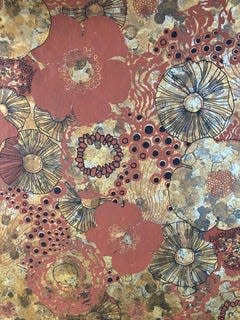
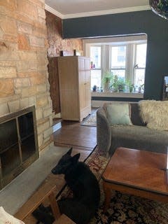
I used the glorious 1960s entryway wallpaper, a dark terra cotta with black and reflective-gold abstract flora, as my starting point for choosing colors on my first floor. Farrow & Ball’s Down Pipe, a charcoal grey, in my high-ceilinged living room not only honors the dramatic wallpaper, it makes the room feel cozy — especially when entertaining guests in front of a roaring fire on a winter’s eve.
Feng shui, an Asian approach to creating healthy spaces, was a bit of a craze in the ‘90s and includes recommendations for certain colors in certain sections of a home. It’s not magic and installing purple Armstrong vinyl-composite tile in the prosperity corner of my house hasn’t generated winning lottery numbers. But it sure ties the room together.
I like to see photos of real spaces painted in the colors I’m considering. Farrow & Ball’s palette is my go-to and their website includes multiple photos of spaces, indoors and out, painted in each of their colors along with others that coordinate.
The color of one room should complement the colors of the adjacent rooms to avoid dissonance. The dusky lilac of F&B’s Brassica in my bedroom is accented by Sherwin William’s Camelback (my only non-F&B color) in the hallway, which looks great with F&B’s Vardo (peacock teal) of the bathroom.
Only once have I immediately repainted because I didn’t like a color once it was on the walls. The room looked like the inside of a cantaloupe.
I enthusiastically encourage everyone to consider painting white walls in vibrant hues. It can change not just how your home looks, but also how it abides.
Contact Holly Christensen at whoopsiepiggle.com.
This article originally appeared on Akron Beacon Journal: Holly Christensen: Color my world, or at least my home

