An Inspiring Mix of Bold and Classic Details in an Iconic Prewar Edifice
Paola Singer
After working in Asia for several years, sharpening her skills at major architecture firms like Kris Yao/Artech and Neri & Hu, Megan Grehl decided to tackle the American market. Born in Texas but raised in Hong Kong and Beijing, the designer had long dreamed of living in New York. Most importantly, she felt she had something unique to offer. “The first job I found in the city was helping Gabriel Scott launch a showroom in SoHo,” says Grehl, referring to the acclaimed furniture and lighting brand. “And when I looked at the invite list, which had all these recognizable names, I realized I could bring something different to the table.” What she means is that while projects in New York and other U.S. cities tend to involve renovations to existing structures, she had a lot of experience with ground-up construction and top-to-bottom customization. “I think my work in Asia allowed me to look at things more holistically, as opposed to having a piecemeal mentality,” she says.
Not long after launching her own studio in 2015—and simultaneously joining the team of designers at Homepolish—Grehl was hired by a couple who’d purchased a 5,000-square-foot apartment at the Apthorp, a historic Upper West Side condominium built in 1908. Aside from a series of colorful paint jobs, the home had been untouched for several decades and retained a host of original details. Both Grehl and the homeowners agreed that the property shouldn’t lose its prewar style. But where another designer might have worked around the apartment’s bones, Grehl planned a complete overhaul of the space, opting to re-create several turn-of-the-century flourishes instead of striving to preserve them.
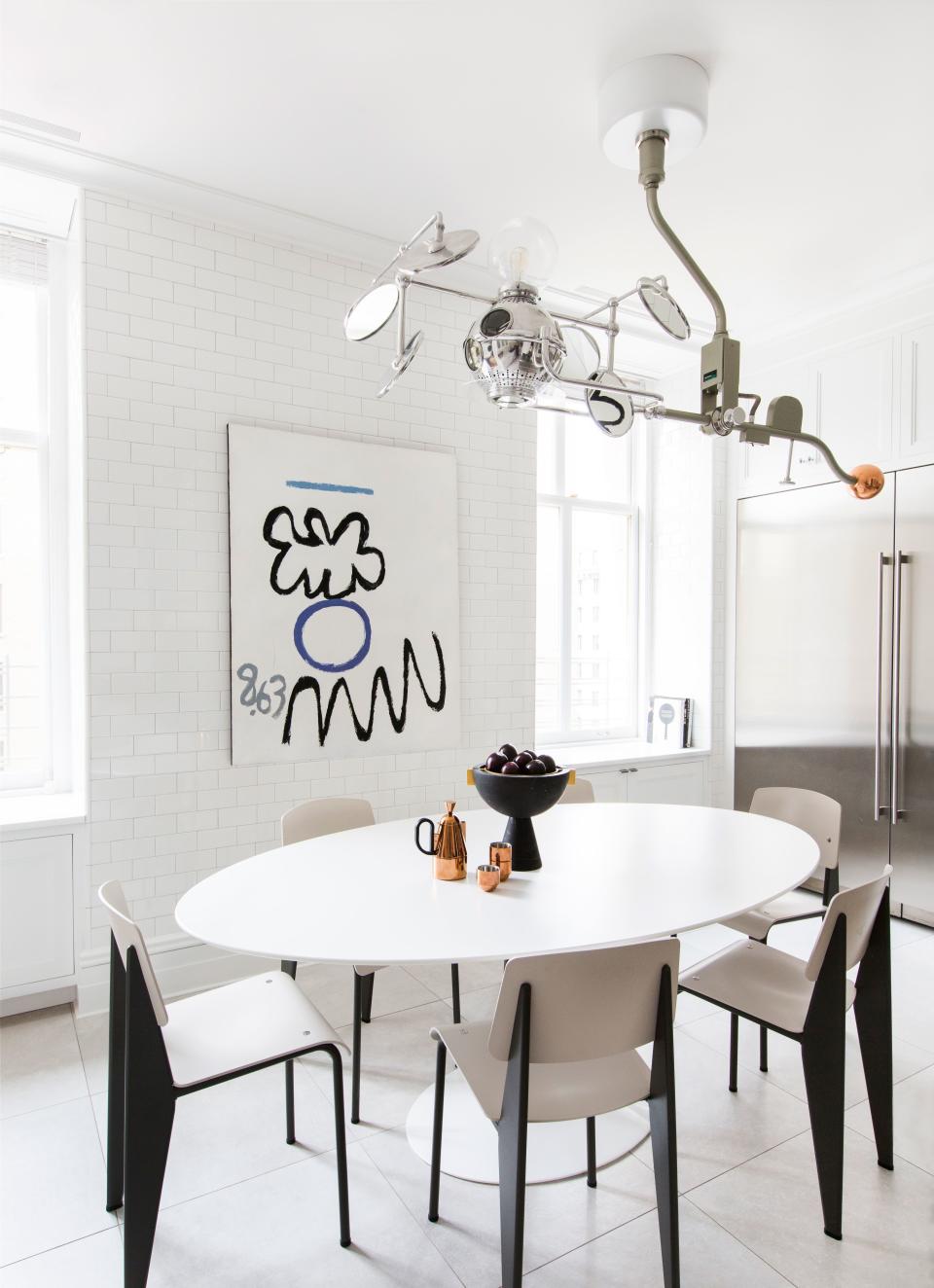
The kitchen, which was covered in white subway tiles in a nod to New York City, features a distinctive light pendant made from an old surgical light fused with Sofie Refer’s “Mega Bulb” glass fixture for andTradition. Jean Prouvé’s famous chairs surround Eero Saarinen’s equally iconic pedestal table. The abstract artwork is a painting by Raymond Hendler called The General.
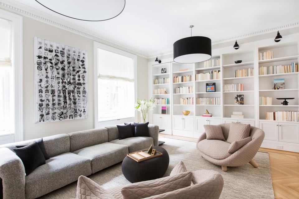
“We wanted to bring the apartment up to modern times while respecting its history, and Megan was very much into that,” says dermatologist Eric Berkowitz, who shares the home with his wife, Claire Wolinsky, also a dermatologist, and their young children. To build the ample, soon-flooded library, for example, several walls were torn down. Yet thanks to faithfully replicated dentil moldings, classic chevron-patterned parquet floors, and built-in wooden bookshelves, you’d think the room was designed that way a century ago.
By contrast, there’s no doubt the apartment was decorated circa 2019. Nearly every room features bold contemporary artworks as well as a clever combination of furnishings from some of today’s most coveted brands and designers, including Patricia Urquiola, Tom Dixon, and Marcel Wanders. “I really like to play with a juxtaposition of modern, minimal lines and classic references, and create these yin and yang moments,” says Grehl. “It’s all about balance and harmony.”
An Inspiring Mix of Bold and Classic Details in an Iconic Prewar Edifice
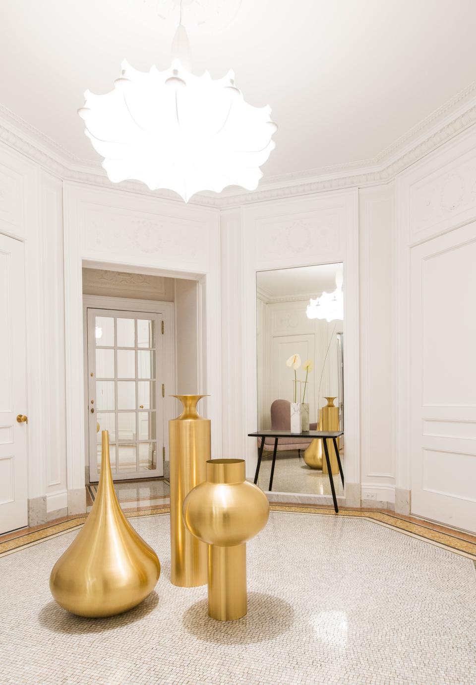
This 5,000-square-foot five-bedroom apartment in the Apthorp, a landmarked New York City condominium built in 1908, was designed by Megan Grehl of Homepolish. The foyer shows off a trio of Tom Dixon's “Beat” floor vessels, whose curvaceous shapes pair well with Marcel Wander’s “Mad” chaise lounge (seen in the mirror) and “Zeppelin” light pendant.
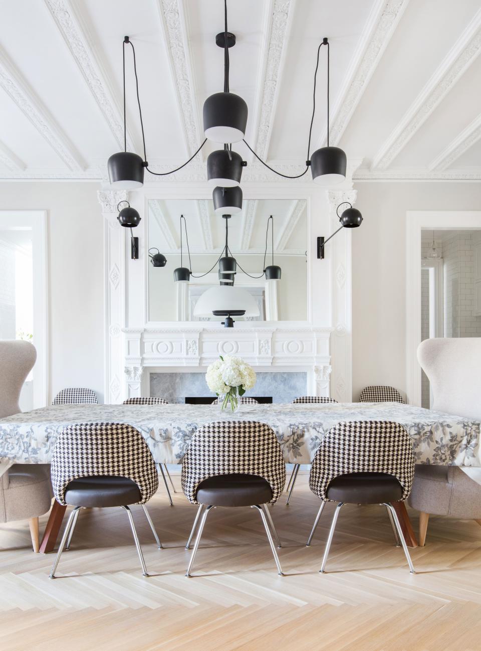
In the dining room, which features original ceiling moldings, Grehl created a modern lighting installation using Flos’ “Aim” pendants. “These are usually hung in an organic, multilevel way, but because of the symmetry of the room we wanted them to be very even,” she says. A flowery tablecloth covers the sporty nine-foot-long table, A.P.O.’s “Bola Service Table” for Design Within Reach. The Eero Saarinen armless chairs, upholstered in a traditional houndstooth pattern, were paired with two Tom Dixon wing-back love seats.
The kitchen, which was covered in white subway tiles in a nod to New York City, features a distinctive light pendant made from an old surgical light fused with Sofie Refer’s “Mega Bulb” glass fixture for andTrandition. Jean Prouvé’s famous chairs surround Eero Saarinen’s equally iconic pedestal table. The abstract artwork is a painting by Raymond Hendler called The General.
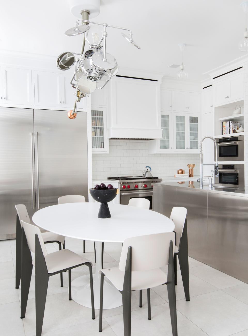
An abundance of stainless steel, seen in the kitchen island and several appliances, gives the kitchen a “super utilitarian feeling,” says Grehl. Midcentury furnishings both complement and counterbalance the sleek look.
To build the ample, soon-flooded library, for example, several walls were torn down. Yet thanks to faithfully replicated dentil moldings, classic chevron-patterned parquet floors and built-in wooden bookshelves, you’d think the room was conceived that way a century ago.
Speaking of customization, one column of shelves pulls out to reveal a cachette—a small secret study. A cube-shaped sofa, from Cassina’s “Mex” collection designed by Piero Lissoni, was paired with a set of curvaceous “Love” armchairs designed by Marcel Wanders for Mooi.
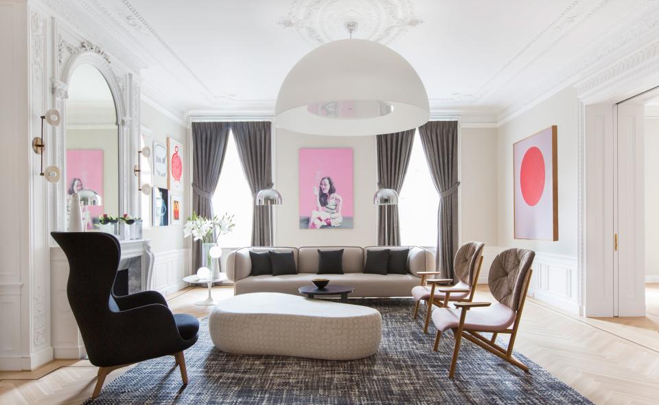
The clients’ desire to “bring the apartment up to modern times while respecting its history” can be seen in the living room, where an original fireplace and re-created ceiling moldings provide a classic backdrop to the decidedly contemporary decor. A dome-shaped “Avico” pendant from FontanaArte anchors the space, furnished with a “Tender” sofa and a set of “Klara” armchairs, both designed by Patricia Urquiola for Moroso.
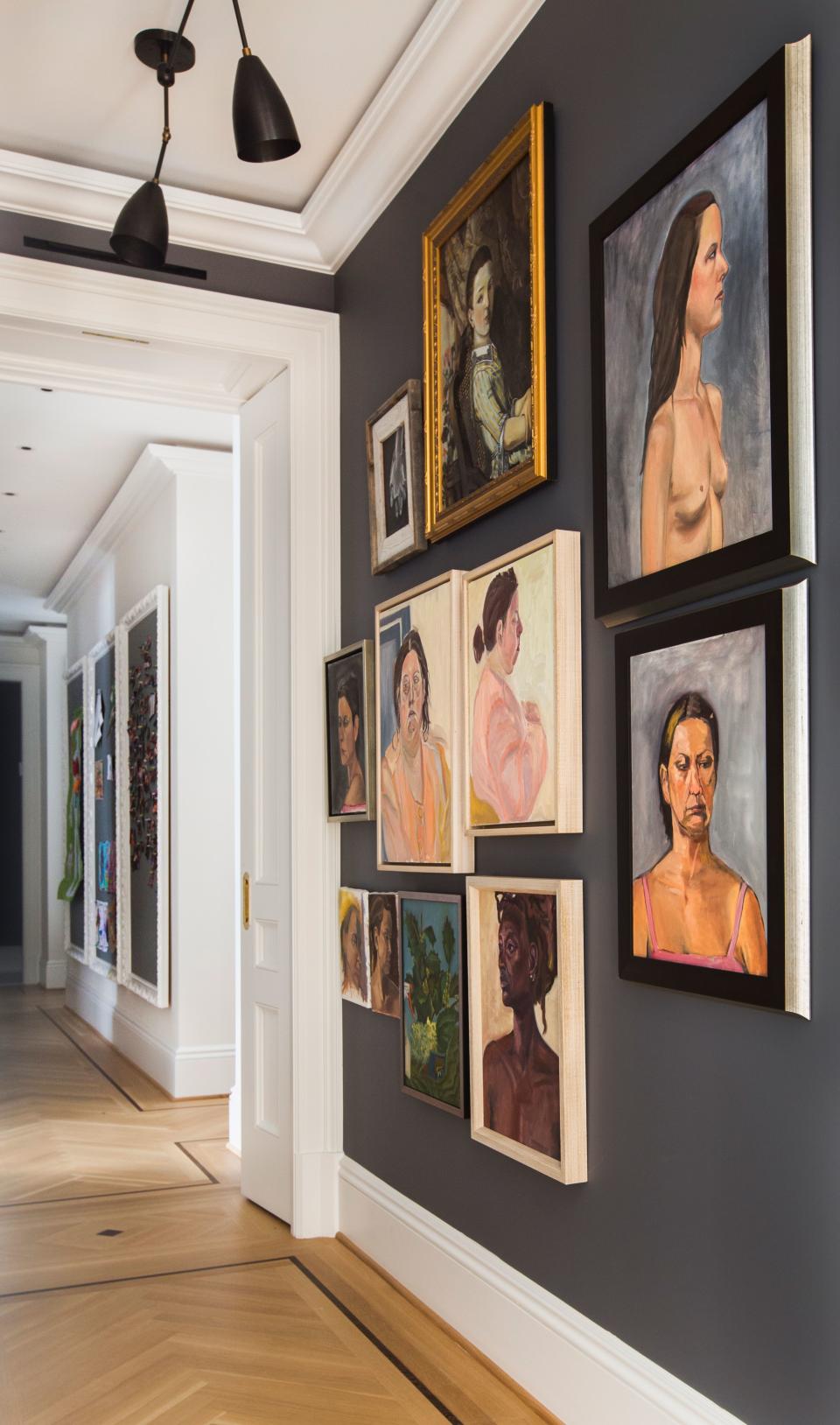
To decorate the hallways of the apartment, Grehl took a cue from Frank Lloyd Wright’s concept of compression and release. “The idea was to create a dark central section and then an explosion of light in the periphery,” she says. All of the portraits on this wall were painted by homeowner Claire Wolinsky, who studied fine arts before becoming a doctor. The custom-installed “Twig” ceiling pendants are from Apparatus.
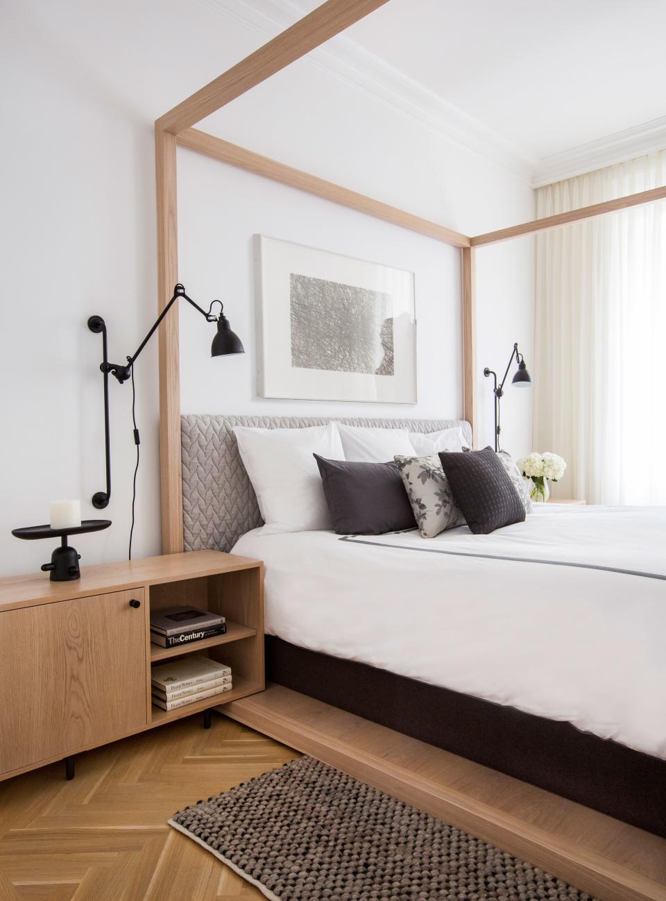
A minimalist custom-designed four-poster bed anchors the master bedroom. “It‘s really seamless woodwork inspired by Japanese traditions; there’s no hardware,” says Grehl of the piece, which was built by A.B. Hornbake (as were the matching bedside tables). The adjustable reading lamps, designed in the ’20s by Bernard-Albin Gras, are from Design Within Reach. To add coziness, Grehl picked an upholstered headboard covered in Patricia Urquiola’s “Big Braid” fabric, and a textured wool carpet from Bludot.
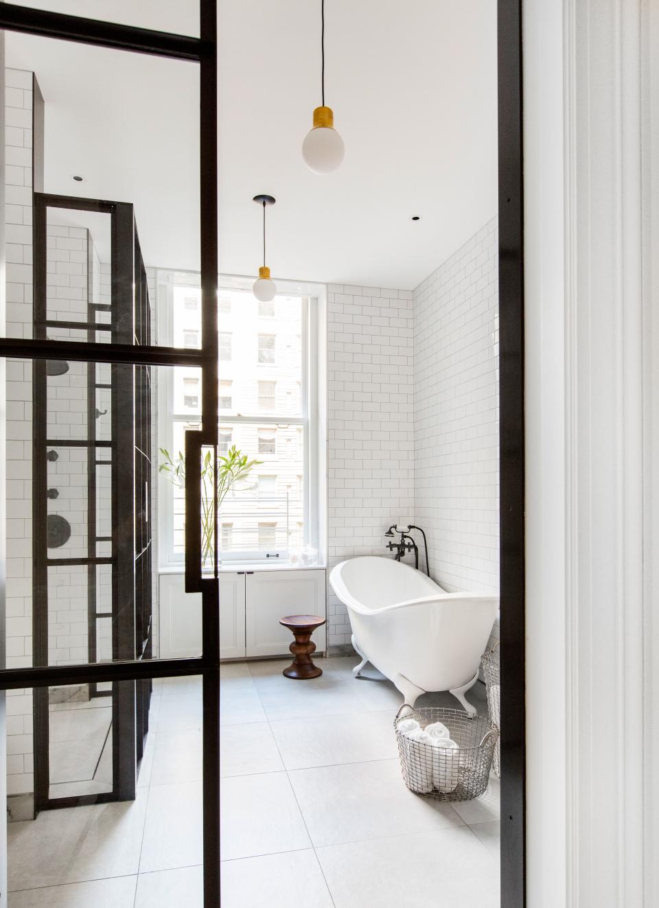
The master bathroom—one of six bathrooms in the apartment—features iron-framed glass divisions designed by Grehl. “We wanted very minimal, clean details that wouldn’t take away from the existing architecture,” she says. To balance the sharp lines and masculinity of the metalwork, the designer chose a curvy claw-foot tub from Chevriot. The Eames walnut stool is from Design Within Reach.
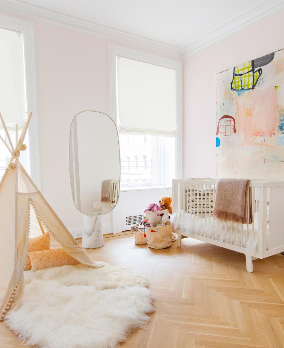
This little girls’ room is decorated with a sculptural pedestal mirror from Matter, a buoyant painting by Gary Komarin, and an ultra-plush rug from Nanimarquina.
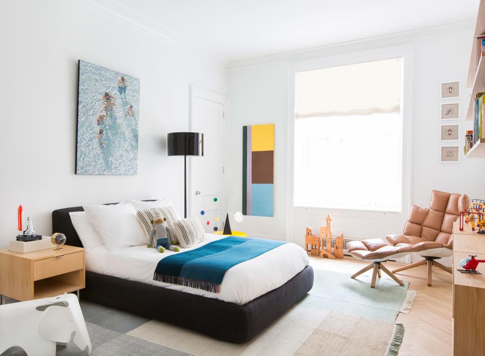
In this bedroom, designed for a young boy, a charcoal-hued storage bed from Design Within Reach was paired with a tan leather armchair and footrest by Patricia Urquiola for B&B Italia. “This bed is very useful; you can flip it open and put away toys in there,” says Grehl. “You never have enough storage in Manhattan, even in a 5,000-square-foot apartment.” The Pointillist painting behind the bed is by William Betts, and the geometric one next to the window is by Albert Stadler.
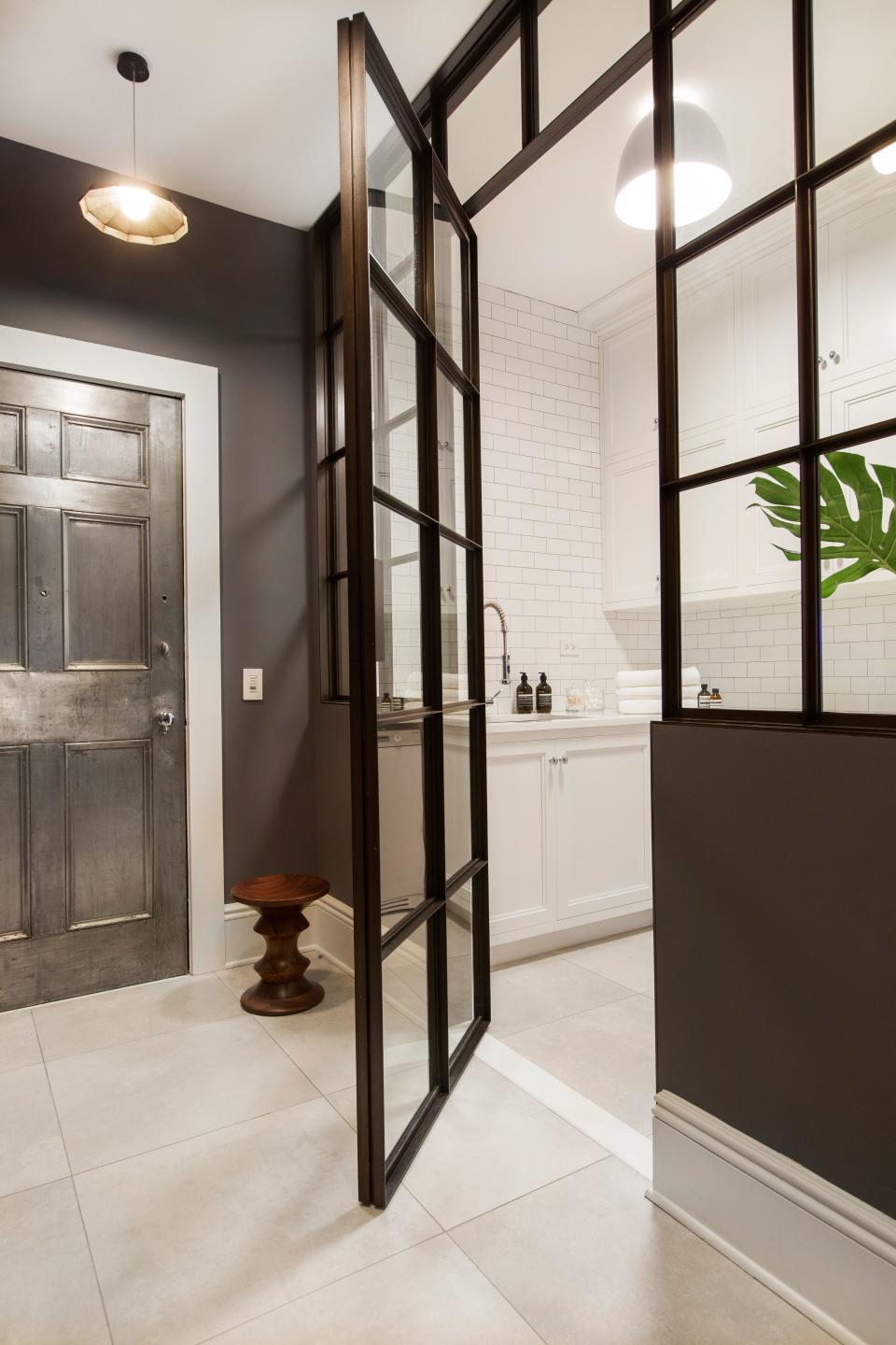
The laundry room, which is near the back entrance of the apartment, shows Grehl’s interpretation of Frank Lloyd Wright’s “compression and release” concept, where dark or narrow central areas lead to larger and brighter areas.
Affluent Americans may want to double-check how much of their bank deposits are protected by government-backed insurance. The rules governing trust accounts just changed.
Jason Fitz, Charles Robinson and Frank Schwab talk about which quarterback rooms concern them and which they find interesting heading into the 2024 NFL season.
Former NBA guard Darius Morris has died at the age of 33. He played for five teams during his four NBA seasons. Morris played college basketball at Michigan.