J.M. Smucker's new corporate logo and branding identity growing beyond jams and jellies

The J.M. Smucker Co. wants the world to better recognize it is more than a maker of its heritage jams and jellies.
In recent years it has added major peanut butter, coffee and most recently pet food brands to its portfolio – with plans to expand into additional categories when the price and timing is right.
And that's why the $7.8 billion food company based in Orrville, Ohio unveiled a new corporate brand identity that, while paying homage to its 123-year history, intends to show that its present and future involve much more than spreadable fruit products typically spooned between a couple of slices of bread.
Employees got a look at the colorful new logo on Tuesday, with the company making its full public splash Wednesday. It aims to separate Smucker the corporation from being totally identified with Smucker's brand food items.
Save better, spend better: Money tips and advice delivered right to your inbox. Sign up here
"It's been actually under development for over a year," said Mark Smucker, the company's president and chief executive officer. "It all stems from the fact that over the last two decades we transformed ourselves from a jam and jelly company to a multi-category marketing powerhouse of brands."
At one point in the process, employees were looking at as many as 50 concepts for a new corporate logo as well as a system that went with it. The company partnered with New York-based branding and creative firm CBX on the project.
Dixie Beer is looking for ideas: Dixie Beer company says it needs help choosing a new name, and you can send in suggestions
Uncle Ben's new name: Popular rice brand will be known as Ben's Original
"What we realized around the year 2000 or so was that what we were really good at was marketing brands," Smucker said. "And even though we were good at fruit-based products, we were really good at marketing brands, which unlocked the ability for us to enter into multiple food categories. And that transformation of our business isn't reflected in our corporate identity."
The new corporate logo and branding are intended to rectify that.
"We wanted to separate the company of Smucker from the brand Smucker's, something that represents more holistically who we are, represents our momentum, our aspiration to continue to grow," Smucker said.
The new logo also is intended to show the company is diverse and progressive, and is reinventing itself and evolving. As part of the design transition, "J.M. Smucker Company" becomes a more concise "J.M. Smucker Co."
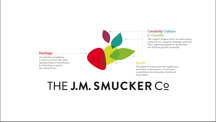
So, out as a corporate logo is the two-strawberry design, the well-recognized logo, which will still be used for Smucker's food products.
And in is a design that features in part a red strawberry-like element – the homage to company heritage – with other bright, colorful leaf-like figures clustered about it that represent "spark," growth, people and culture, and creativity.
The new corporate logo projects energy, Smucker said.
"It sort of has movement in it," he said. "That's supposed to represent different elements of our culture, like creativity and kindness, and just the movement or apparent movement of the image is supposed to represent growth."
The new logo is something employees can rally around, Smucker said. The logo and what it symbolizes should also help the company recruit top talent, he said
"It's definitely aspirational," he said. "It truly is symbolic. I think it's a great representative of who we are. Honestly, I'm so excited about it. I think it does symbolize our growth, our aspirations to continue to ...acquire other brands. Who knows. At some point, we may be in a new category."
The J.M. Smucker Co. gained 3.7 million households that purchased its brands for home consumption during the COVID-19 pandemic, Smucker said. The challenge is to retain those households, using such things as social media and other digital solutions, to help grow their business, he said.
The company has made progress with its pet food and pet snack brands, including overcoming some challenges in its dog brands, he said.
"So, yes we have paid down our debt to a point where we are able to continue to do acquisitions," Smucker said. "We are always looking. And it's all about getting the right thing at the right price, being prudent in making sure we can get a return. We're always looking. It's been a little quiet out there recently. At some point in the future, I would expect there would be some acquisitions. We've got to wait for the right thing."
J.M. Smucker at its core is a food company, he said.
"Strategically, we would be most interested in categories that are growing and where we could acquire a leadership position," Smucker said. "It's pretty simple."
Follow Jim Mackinnon @JimMackinnonABJ on Twitter or www.facebook.com/JimMackinnonABJ.
This article originally appeared on Akron Beacon Journal: New JM Smucker Co. corporate logo aims for the future

