Love it or hate it? New Harris Teeter logo divides customers as grocery store rebrands
Charlotte’s hometown grocery store chain Harris Teeter has unveiled a new logo as part of its rebrand campaign, but not everyone is happy about it.
Harris Teeter revealed the new logo March 10 on its social media sites, showing a video of a cookie with the old logo being broken in half. That revealed another cookie with the new logo underneath.
“Sweet new things are happening at Harris Teeter,” the Matthews-based supermarket chain said with the unveiling.
The new logo is a minimalist design with Harris Teeter letters being larger and all in one, deep red color versus the old bright red Jester-like font with a green-and-white design. The fish, apple and loaf of bread, which were outlined in the old logo, have been colored in.
As might be expected when something familiar changes, many took to social media to blast it: “From a font standpoint, alone, the new logo is uncomfortable. ... It looks more like a trucking company logo than a neighborhood grocery store.”
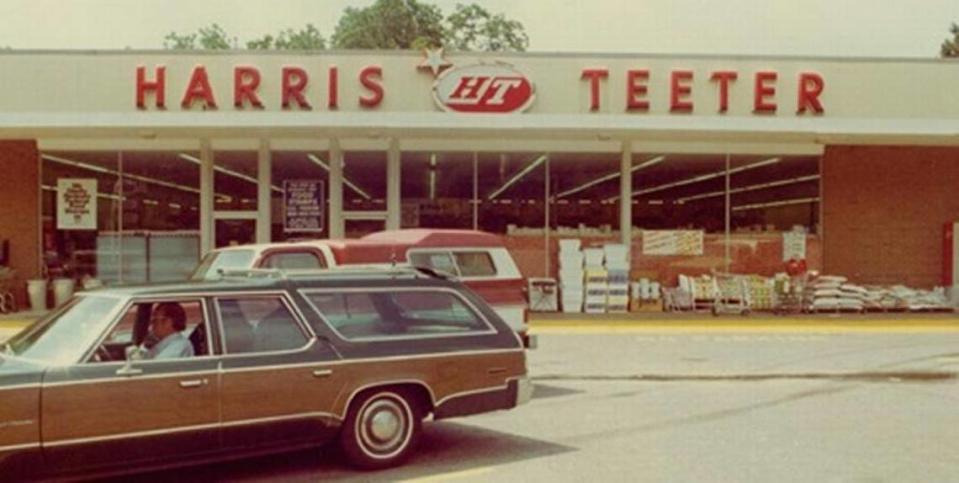
The store’s last logo refresh was in the 1990s, Harris Teeter spokeswoman Danna Robinson told The Charlotte Observer.
Sweet new things are happening at Harris Teeter pic.twitter.com/CsQwGiIKwH
— Harris Teeter (@HarrisTeeter) March 10, 2023
The new logo is meant to reflect Harris Teeter’s growth as a more elevated shopping experience, Glen Hilzinger, chief creative officer for Luquire, told The Charlotte Observer. The advertising and marketing agency in Charlotte is behind Harris Teeter’s marketing campaign strategy.
When considering the new logo, the Luquire and Harris Teeter teams thought: “Let’s not make it a revolution, let’s make it an evolution.”
Making the new Harris Teeter logo
It took three months to land on the new logo design working with Harris Teeter officials, Hilzinger said.
Some of the initial logo designs were “completely unrecognizable,” Hilzinger said. But it was important to maintain a sense of familiarity while signaling that Harris Teeter as a brand has evolved. The new descriptor under the logo name, “Your Neighborhood Market,” better represents Harris Teeter’s persona, too, he said. The prior logo said under the name, “Neighborhood food & pharmacy.”
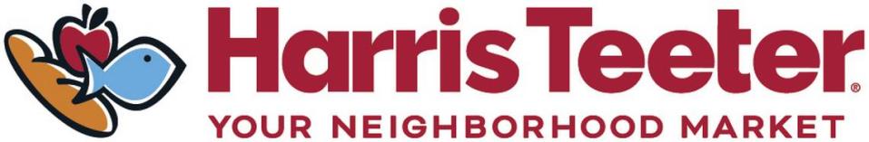
Along with an updated logo is a new tagline, “In Food with Love,” as the company adapts to changes in the grocery industry and the evolving needs of its customers, according to industry publications The Shelby Report and Progressive Grocer. The publications said the rebrand campaign began March 1.
Hilzinger said shoppers will see the new logo and brand campaign rolling out on storefronts, packaging and shopping carts soon.
He hopes when people see the new logo while shopping or on TV and digital brand campaigns, it will make the logo even more likable.
“Harris Teeter shoppers are very loyal. They really love the brand,” Hilzinger said. “I think people get attached to a certain look and feel, it’s something they’re familiar with, and now we’re changing it.”
Harris Teeter logos
Harris Teeter has had several logos throughout the supermarket’s more than 60-year history. Harris Teeter started as two separate stores in the late 1930s — the Harris and Teeter grocery markets — before merging in 1960.
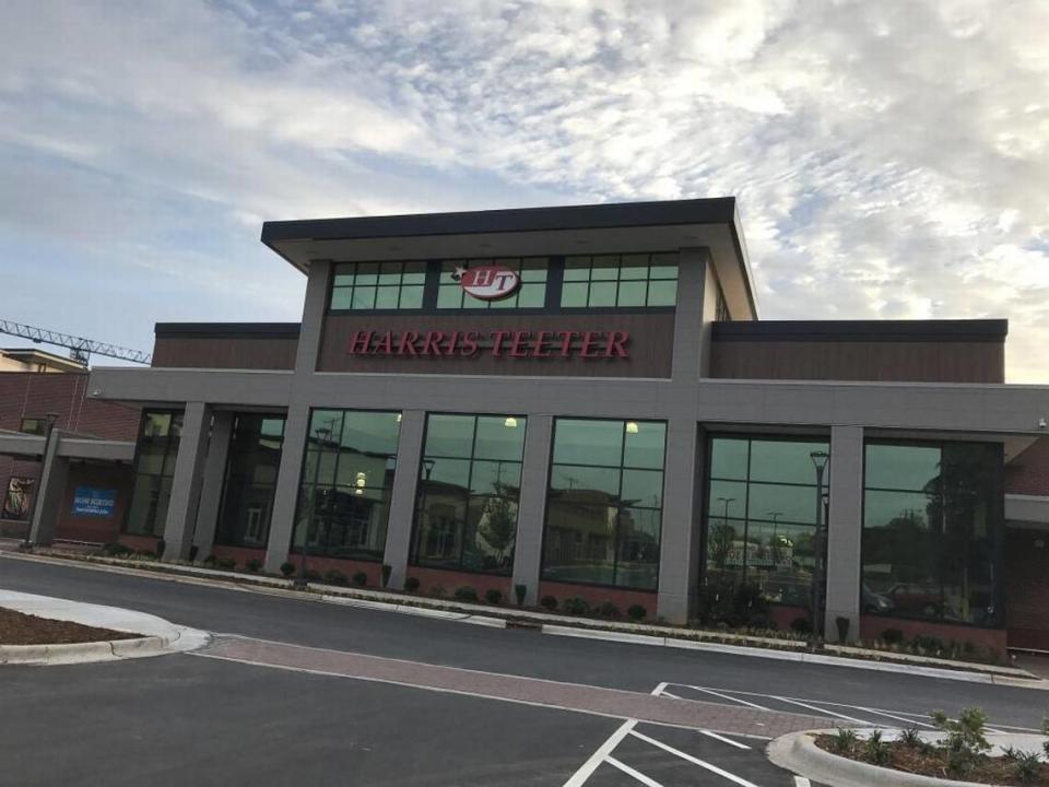
In 2021, Harris Teeter opened its renovated Park Road store using a retro red-and-white “HT” logo.
The store at 2707 South Blvd. reopened in 2017 in the redeveloped Sedgefield shopping center with the same logo the original, smaller store had on the same site in the 1950s, according to The Charlotte Observer archives.
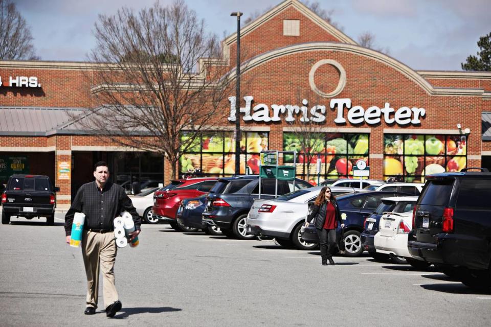
Harris Teeter, a subsidiary of Kroger Co. based in Ohio, has more than 250 stores and 60 fuel centers in North Carolina, South Carolina, Virginia, Georgia, Maryland, Delaware, Florida and the District of Columbia.
Reactions to the new logo
But many people on social media aren’t fans of the new burnt red block letter logo, some even called for the marketing department to be fired or a harsher punishment: “Someone must go to jail for this,” one person said on Twitter.
“The old logo is more cheerful than the new one,” one person said on Facebook.
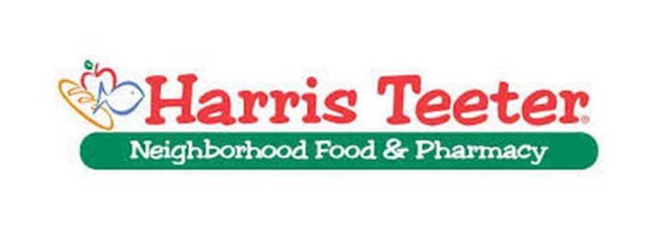
Others said the new logo is “bland and forgettable” and isn’t as “cheerful” as the old logo with Harris Teeter in bright red letters and “Neighborhood Food & Pharmacy” in white letters on a green background.
Several people wanted the old logo back or urged Harris Teeter to just act like it was a joke.
Then there was this customer on Instagram who said it might be time to grocery shop at another Norther Carolina grocery chain: “Y’all about to make me go to Food Lion.”
But amid the onslaught of unhappy comments, at least one person liked Harris Teeter’s new logo on Facebook: “That is so awesome!”

