The New Man Repeller Office Is Inspired by a 1950s English Creative Agency
Imagine transporting yourself back to high school. You arrive, head to your locker, drop off your haul of binders, check your hair in the little magnetic mirror, and make your way to class. Now imagine that, but instead you’re at your dream job, surrounded by inspiring writers, and there’s a full fashion closet in place of all the teen angst. That's the Man Repeller office.
“We have a wall of lockers at the front that are assigned to different employees,” says Leandra Medine, founder of the fashion and lifestyle website. “The way we chose to store our personal belongings is very nostalgic. Only better because there’s no calculus class.” Unlike high school, however, they have removed assigned seating. Instead, everyone rotates desks, so no one gets caught sitting in the same place day after day.
Of course the office was going to go a little off-script. The website's About page describes Man Repeller as “amorphous,” after all, and when the team moved offices, it was important to Leandra to make sure the new space reflected the company's evolution. “I think we knew we had outgrown our previous space when one of us needed to take a call and realized both conference rooms were occupied, the stairwell was being used as a makeshift phone booth, and two employees were strolling the block taking calls,” says Leandra.
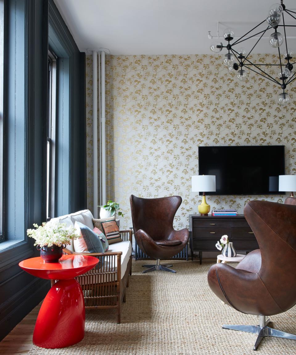
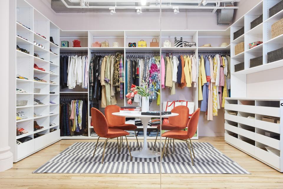
Teaming up with Decorist celebrity designer Chloe Redmond Warner, Man Repeller transformed what was once a “big white box,” according to Leandra, into a space that feels more like a swanky apartment, complete with area rugs, chandeliers, bookshelves, and Farrow & Ball wallpaper. “Then, to that, we added a hyperfunctional layer,” says Chloe,“with an amazing closet and reception area that we created with California Closets; the metal lockers; and soundproof booths, it feels like you’ve been invited for a working breakfast at your boss’s house, and then surprisingly, she has everything you need to work the full day.”
Using just a few sources—Bed Bath & Beyond, Cost Plus World Market, Farrow & Ball, and California Closets—they were able to make the space look amazing. "Our mood board had chalets for coziness, Connecticut-style summer cottages for airiness, and some 1950s English office spaces for creative vibe on it," Leandra explains. Here, she and Chloe give us the deets on our favorite elements and inspiration in the new office.
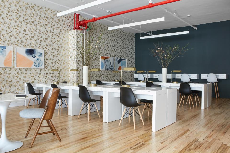
The co-working-space vibe
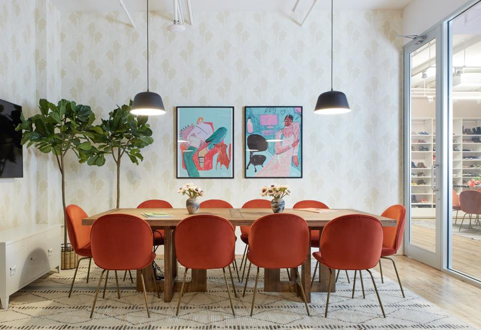
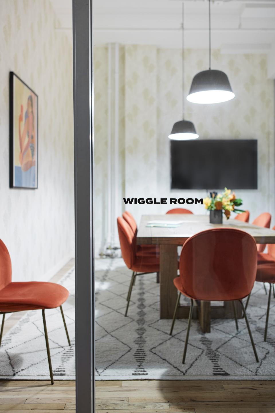
Leandra: I knew after working with Decorist and Bed Bath & Beyond on my own home, they'd turn the empty space into a rocket ship ready for takeoff. We wanted to create a culture, ultimately, that felt more like a co-working space and an extended living room, that got the team genuinely excited to get to the office to work with each other every day. The way we have it structured currently is with a living room area in the back, desks in the middle—where there are also soundproof phone booths to take calls or do deep work—and our conference rooms, creative studio, and fashion closet in the back.
Chloe: We are in a golden-age of members' clubs, and I’ve been very inspired by Fran Hickman’s London Chess Club. We’re known for lush, edgy residential projects, and it was fun to bring that aesthetic to a young office. I worked on this with senior designer Maria Wu from my office. We designed it quickly—in the space of a few months—and the team at Man Repeller was extremely smart, responsive, and super fun to work with.
Leandra: Our head of business development, Matt Little, was very involved in helping this concept come to life—he has sort of taken it upon himself to create a sufficiently successful work culture, and getting the space right was a big part of that. We did a bit of work with the building as well before we were ready to start decorating.
Good design on a budget
Leandra: We splurged on comfort for employees (the conference room chairs, the designated sitting space) and building storage for the fashion team and beyond—California Closets built a very thorough fashion closet for us. But overall, I like to think that we approached the design from the perspective of, the elements of the space don’t have to be so expensive to be inviting and functional. This is one of the reasons we partnered with Bed Bath & Beyond and Cost Plus World Market—they really get that.
A "bigger is better" mentality
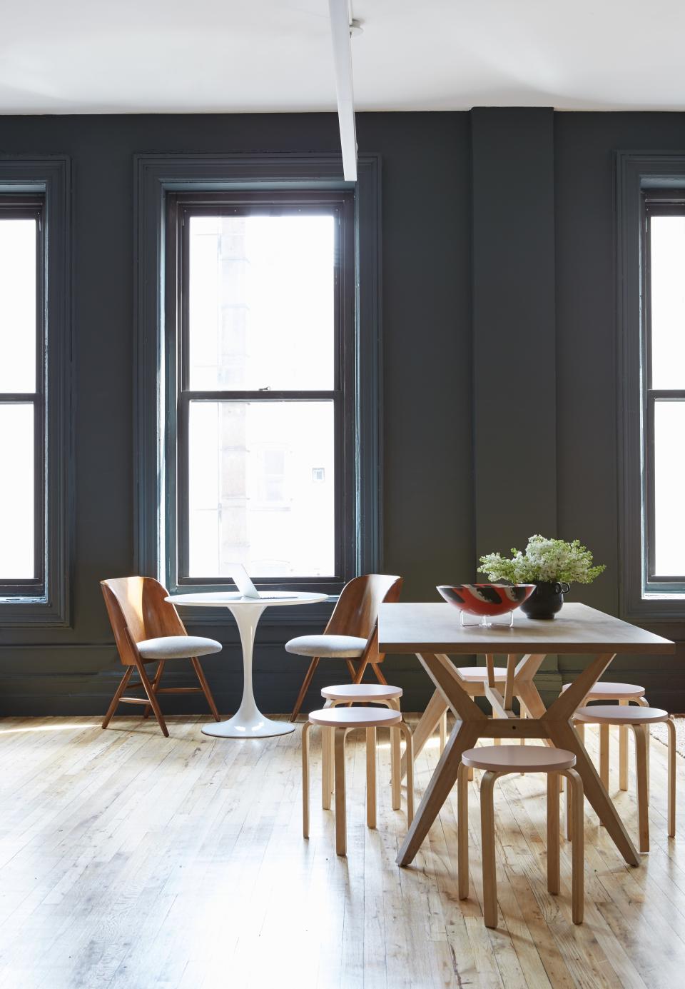
Leandra: We wanted a bigger conference room and more nooks. What we needed most urgently was a better storage place and more privacy for meetings and employees who regularly take calls.
Chloe: The conference rooms are incredible—they are simple, but totally VIP. Pattern, weird color, dramatic lighting, and beautiful art. It all comes together in these two spaces, which are identical but can be combined for an extra large double-table situation should the need arise.
Art with meaning
Chloe: The art throughout is a game changer.
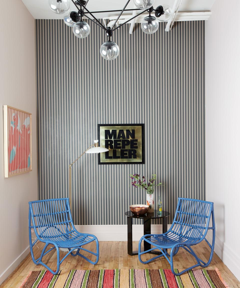
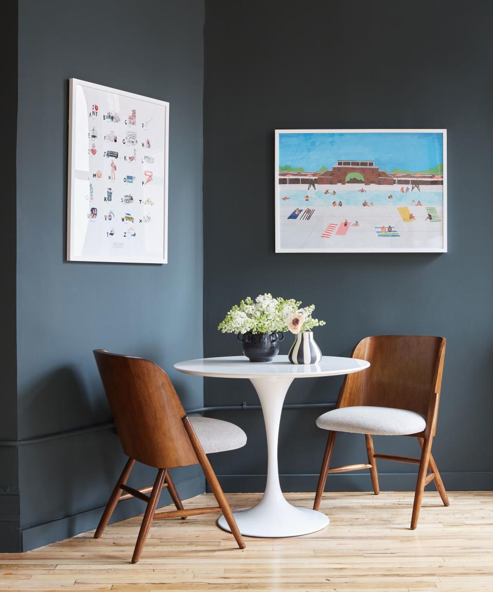
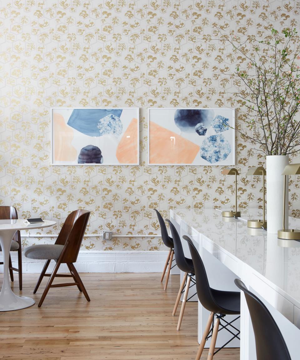
Leandra: We commissioned a ton of art from contributors to Man Repeller. One element that was important to nail when we were imagining this new office was really making it feel like a physical manifestation of the site.
Chloe: It was very important to us to use original artwork—it has the power to elevate a space and can be as potent as architecture and design. The first pieces we selected were by Lindsay Gardner, an Oakland artist. We commissioned four large paintings for the main work area, and then reached out to the Man Repeller staff to find out what artists and illustrators were on their radar—we got such an interesting and inspiring list, and from there we worked with artists Ana Leovy, Joanne Ho, and Amber Vittoria, who provided art for the conference room, the entryway, and the casual meeting area. All the art is by living female artists, which feels so right not just for Man Repeller, but exciting for us, too.
Architectural Digest may earn a portion of sales revenue from purchases made through affiliate links on our site.

