Michigan air quality alert was maroon: How it’s worse than red on EPA color-coded index
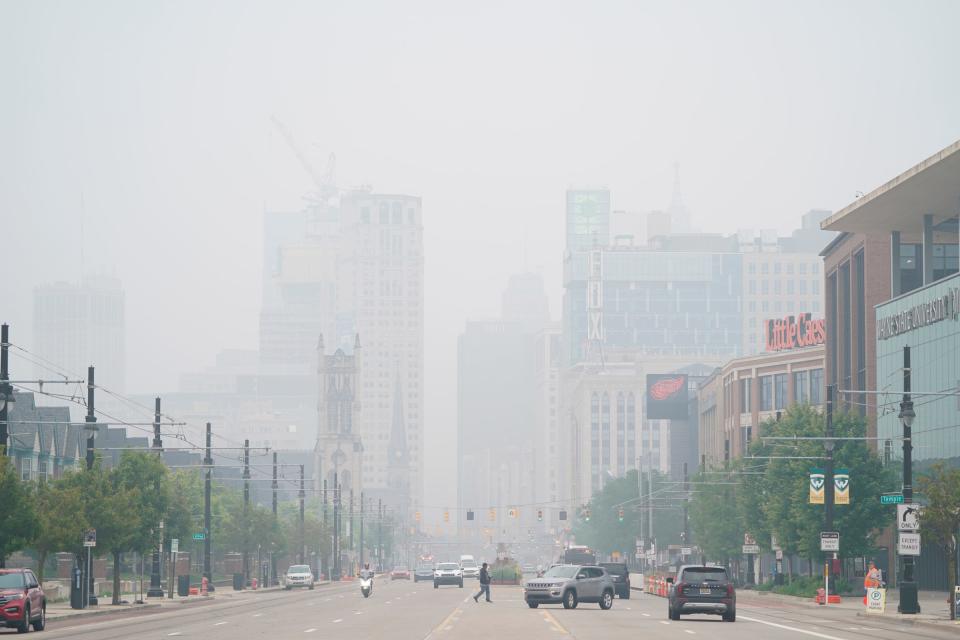
Detroit, we have a code maroon!
With the smoke from hundreds of Canadian wildfires wafting around the globe, millions of Americans are learning that, when it comes to air quality, there’s something worse than a "code red" alert.
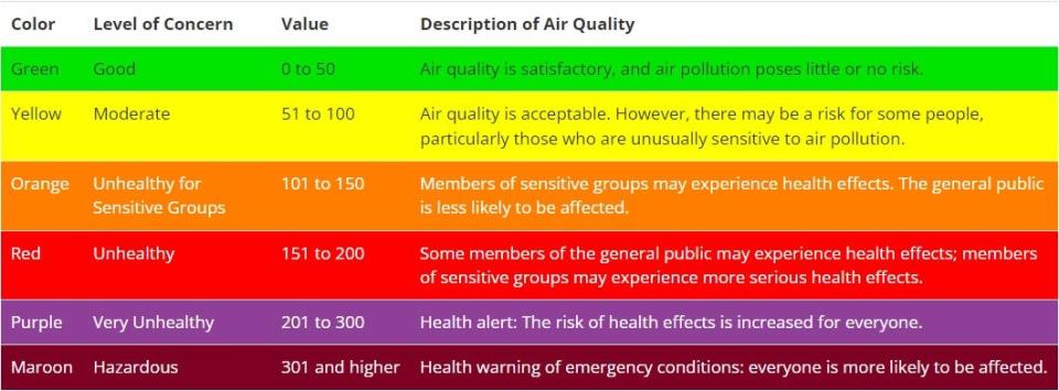
What you probably didn't know is how and why the Environmental Protection Agency came up with its color-coded index, that included, not just the green, yellow, red, colors — go, caution, stop — that you are familiar with, but also orange, a warning between yellow and red, and two levels even worse than red: Purple and maroon.
In truth, many at the EPA didn't really know either, until the Free Press asked this week and officials spent a couple days combing through records to find out.
The answer, it turns out, is tucked in the Federal Register — the official journal of the federal government and a dense record of government agency rules, proposed rules, and public notices — from 1999, and it was a hot topic back then.
Deliberating over which colors
The EPA came up with the color-coded index so there was a nationally uniform system to identify air quality. Other countries use other numeric and color systems, but this scheme was what everyone in the United States would agree to and use.
More: Bad air quality in Michigan has raised pollution, climate change awareness
More: Canadian wildfires are sending smoke to Europe, but it is only sometimes hitting Michigan
The color codes were such a vital issue, the EPA recently said, a special — and contentious — meeting was held in 1998 in Baltimore to sort it out.
"There was quite a bit of deliberation over the colors," particularly what would be considered a code red, the EPA told the Free Press in an email. "Those were the days before the huge wildfires out West, and before we presented particulate matter on the web, so it was extremely rare to get into the hazardous range."
The "hazardous range," which Michiganders know from going into it this week, is the code maroon, which indicates that air quality is toxic, and constitutes a pubic health emergency because just about everyone, not just vulnerable populations, are affected.
By early Friday, Detroit and other cities were back in the red zone.
Back in 1998, the EPA said, the biggest debate was whether red should indicate "unhealthy for sensitive groups" or when the air quality poses a threat to everyone. There was also concern if the public wasn't alerted soon enough, it would be too late for some; but if too many "red alerts" were issued, it would lead to alert fatigue.
Not quite, but worse than red
The register documented that debate in painstaking detail, with comments from meeting participants, who put a lot of thought into it. They considered what parents of active children needed to know, and how doctors would explain it to at risk patients. They worried about alert credibility and whether people would become ambivalent.
In the end, the EPA summarized, the decision was to go with six colors and putting red at the "unhealthy" stage.
Green (the air is good) and yellow (be careful) are obvious. The agency settled on orange, a level below yellow, as "may be a risk," and red as "unhealthy." The two darker, reddish shades — purple and maroon ― indicate something more dire.
Purple and maroon, which were rare back then, also were selected because they'd reproduce well in print.
Since then, the EPA said this week, that public adoption of the index has been "relatively straightforward with minimal education needed," in part, because weather maps have used colors, and color can help people "tell what's going on with quick glance."
But now you know why red isn't the worst color.
Contact Frank Witsil: 313-222-5022 or fwitsil@freepress.com.
This article originally appeared on Detroit Free Press: EPA air quality index colors: How alerts became red, purple, maroon

