MVHS releases new, 'This is for you' branding to reflect its past, present and future
The Mohawk Valley Health System unveiled a new logo, new mission statement and new vision Thursday to reflect changes taking place within the health system and its current relationship with the community it serves.
“We’re not talking about anything bad today,” promised President/CEO Darlene Stromstad, standing in the health system’s construction office in front of a window overlooking the partially built Wynn Hospital. “We're not talking about COVID. We're not talking about finances . . . We are really here to talk about the next step in the transformation of our health care system.”
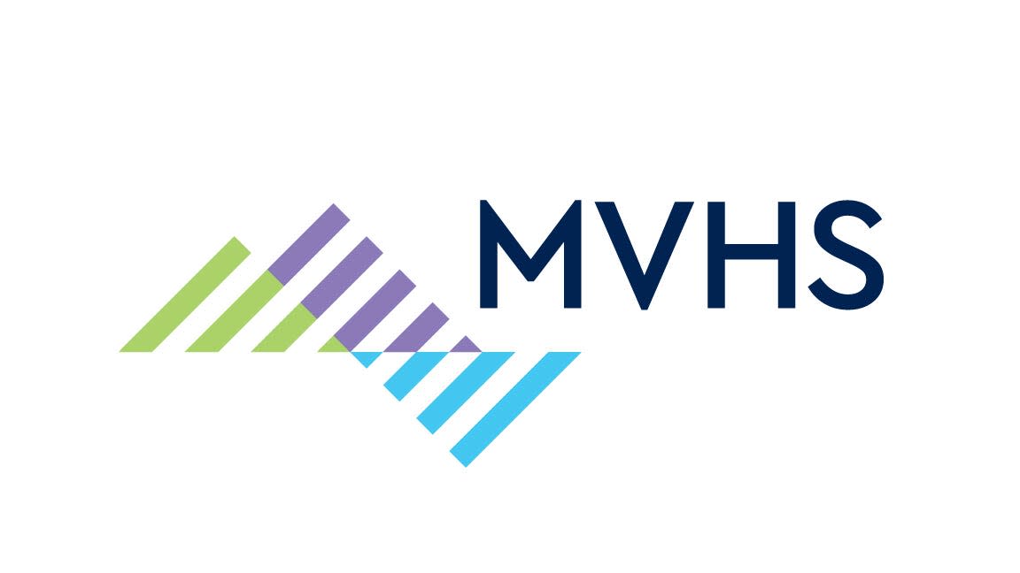
The blue, green and purple logo features three triangles striped with white, one inverted, next to the letters MVHS or the words Wynn Hospital.
Hospital officials expected a lot from their new logo, Stromstad said. They wanted something contemporary to reflect the state-of-the-art care the system provides and its new state-of–the-art hospital; bold colors to reflect strength, transformation, health, trust and hope; a visual connection between the health system and Wynn Hospital; and representation of the heritage and history of the majestic Mohawk Valley, which the health system serves.
More: Your guide to what's staying and what's moving at MVHS once The Wynn Hospital opens in Utica
More: Photos: A look inside The Wynn Hospital in Utica
The purple, she said, reflects the majesty of the Adirondack Mountains and symbolizes strength and royalty. Light blue represents the waters of the Mohawk River and the Erie Canal, which once ran by the hospital’s new site, Stromstad said. The canal opened the country up to the west, she explained.
Blue also symbolizes hope, health and healing. A darker blue, used for MVHS and the word hospital, represents trust and loyalty, she said. In the hospital logo, the word Wynn is in purple.
“The green represents, not just healing and hope,” Stromstad said, “but it also represents what we think is a very important part of the community we serve and that is our agricultural base.”
She also introduced the health system’s new mission statement: “MVHS and our flagship, Wynn Hospital, deliver premier health care to our region, keeping our patients as the focus of all we do.”
And she shared the new vision statement: “MVHS and our flagship, Wynn Hospital, will be the leading patient-centered medical and healing environment, the employer of choice and the pride of Central New York.”
The new hospital, which is expected to open in October 2023, isn’t the only change coming to the health system, Stromstad promised. During the pandemic, health system officials have been busy analyzing the system’s role in the community and its future potential, she said.
Here are the developments she highlighted:
The American College of Cardiology designated the health system a HeartCARE Center: National Distinction of Excellence last year, the first such designation awarded in the state and, at the time, one of only 36 nationally. That designation has since been renewed.
The St. Luke’s Campus has become a comprehensive stroke center, the highest designation in New York for stroke care.
The health system hired six OB-GYNs and three midwives during the pandemic for its maternity and child care center.
The health system is adding onto its existing family medicine residency program with six residency programs planned, three of which already received approval.
At the end of this month, the first batch of third- and fourth-year medical students will arrive from the Lake Erie College of Osteopathic Medicine to complete their training in Utica. Within five years, the health system expects to have 218 “physician learners” on its new campus.
The health system also spent the pandemic running focus groups with employees and doing research out in the community about what employees and area residents want from the health system, Stromstad said.
“We learned a lot,” she said. “And all of that has come together now to what we’re going to show to you today. We are rolling out a new brand.”
That brand will reflect what employees and patients identified as the heart of MVHS, Stromstad said. “The most significant thing about what we do is caring for others,” she said.
So the health system has a new tagline as well: “This is for you.”
Amy Roth covers issues that affect families for the Observer-Dispatch. Email Amy Roth at aroth@gannett.com.
This article originally appeared on Observer-Dispatch: New MVHS logo, branding pave way for new hospital to open next year

