NASA awards medal to worm logotype designer Richard Danne
Nov. 6 (UPI) -- NASA awarded Richard Danne on Monday with the Exceptional Public Achievement Medal for his outstanding work creating and launching NASA's red worm logotype, which made its debut in the 1970s before being retired decades later.
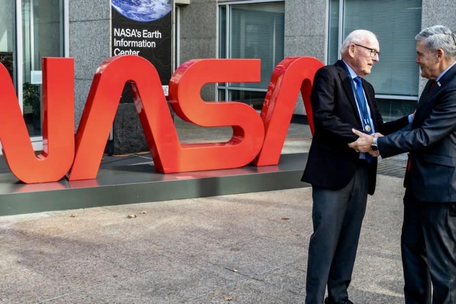
"This event, a culmination of a 50-year trek, is extremely rewarding. Creating the worm for NASA has been a singular achievement in my own career and in the history of design," Danne said, as he stood near a giant NASA worm sculpture outside of NASA Headquarters' Earth Information Center during a ceremony Monday in Washington, D.C.
"It has not always been easy but it was a glorious experience and I feel fortunate to be part of the NASA family and to have helped the agency achieve its missions and goals," he added.
Danne also participated in a panel discussion Monday about "the history and legacy of this iconic emblem of exploration."
Graphic design is literally his passion. Richard Danne, designer of the NASA worm logotype, joins us for a look back at the history and legacy of this iconic emblem of exploration. https://t.co/gYDDzlTgB2— NASA (@NASA) November 6, 2023
"Making the impossible possible through innovation, inspiring through discoveries that transform our knowledge of the universe and our place in it, and providing benefits to all of humanity are what we do at NASA, and what people think of when they see this simple yet striking logo," NASA Associate Administrator Bob Cabana said as he presented the medal.
NASA's red worm logo was part of a new brand identity effort in 1975 as part of the Federal Design Improvement Program. The agency hired New York firm, Danne & Blackburn, which created the logotype and won some of the biggest design awards, including the first Presidential Design Award in 1985.
The retro, modern NASA logo, which is considered one of the "most powerful symbols of the world," was honored by President Reagan for its simplistic and innovative design.
While NASA's red worm logo was retired in 1992, it resurfaced in 2017 on merchandise and again in 2020 to mark the return of human spaceflight on American rockets. It was also used on NASA's first rocket to circumnavigate the Moon in more than 50 years as part of its Artemis program.
NASA's "meatball logo," which features a red chevron wing piercing a blue planet with white stars and a spacecraft, remains the space agency's current symbol.
"Thanks to the worm and the meatball, NASA's brand is one of the most recognizable in the world," said Marc Etkind, associate administrator of the Office of Communications at NASA Headquarters.
"These symbols have inspired countless students in the past, and now inspire the future generation of engineers, scientists, and innovators -- the Artemis Generation."

