NASA dedicates giant 'worm,' honors logo designer Richard Danne
Nearly 50 years after it was first introduced, just over 30 years since it was unceremoniously retired and only three years after making its triumphant return, NASA honored the designer behind its retro-cool, sometimes controversial but now seemingly universally loved logotype.
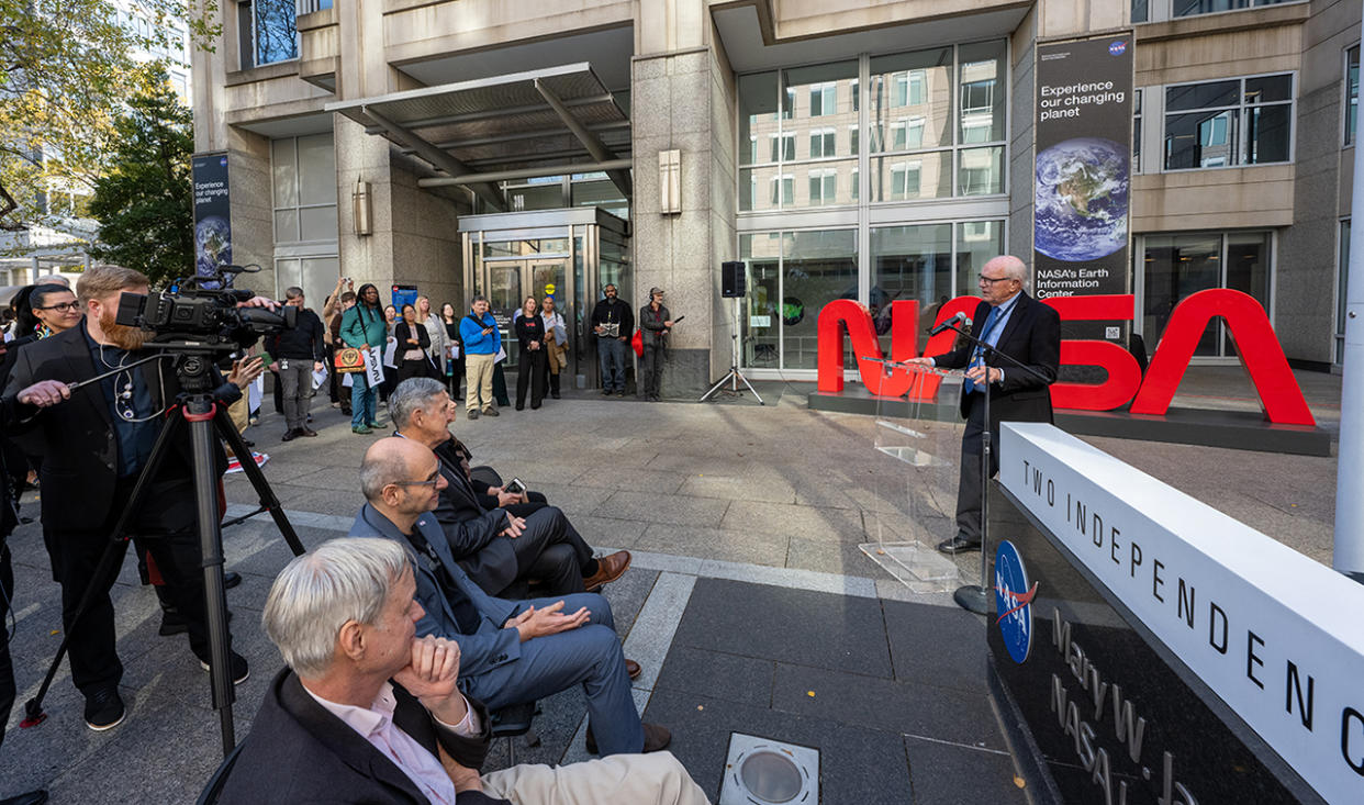
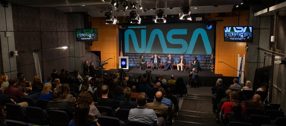
Richard Danne, who in 1975 gave birth to the "worm" — as the simple, red type style of the word "NASA" has come to be known — was invited back to NASA's headquarters in Washington D.C. on Monday (Nov. 6) for a panel discussion about the mark's legacy and to be awarded NASA's Exceptional Public Achievement Medal. The agency also dedicated a large three-dimensional sign in the shape of the worm to Danne and two others who created the worm and first put it into use.
"It's more popular today in the world than it was back then, and that's hard to explain," said Danne. "There's something at the core of the whole thing and the fact it was serious but inspirational in a way. It's hard to do that with very simple things, but that's the way I've lived my life and career, with simplicity, so it works."
Related: NASA marks new era of spaceflight with resurgence of 'worm' logo
Emerging out of a 1974 initiative by then-President Richard Nixon and the National Endowment for the Arts (NEA) to revamp the design identities of all of the U.S. federal agencies, Danne, and his partner at the design firm Danne & Blackburn, Bruce Blackburn, had only about a week to initially respond with their idea for NASA's new look and then only about two months to pull the whole thing together.
"Our firm was only about a year old and Bruce, may he rest in peace, was very involved in federal things before — he had designed the American Bicentennial symbol — [so] we think that's one of the reasons that we got invited," said Danne. "So we decided to propose one symbol, only one, and support it with about 25 demonstrations, and that was radical then and it's radical now."
The worm replaced the "meatball," NASA's official insignia since 1959, that was comprised of a blue disc representing the planets, white stars, a white orbital path symbolizing spacecraft and a red vector borrowed from the shape of an advanced supersonic wing to represent aeronautics.
Unlike the worm, the meatball's design was complex, or as some felt, messy like a meatball atop of a bowl of spaghetti. The worm was just a single stroke.
"From the minute I saw it, I understood all those things that it was meant to represent," said Michael Bierut, a partner at Pentagram, the world's largest independent design consultancy, about the introduction of the worm. "Even things that a normal person like my mom, who was a housewife, might say: 'Well, why aren't there horizontal lines making those A's?' and I would have said, 'Well, Mom, that's supposed to look like the nose cone of a rocket ship. It's modern, it's like one sleek path, right?'"
"Also, in retrospect, I realized that it has this amazing other characteristic, which is, to put it very simply, a four year old can draw it," Bierut said. "If you're talking about seizing the imagination of the next generation and the generation after that, that capacity to inculcate them in the excitement and reduce it to a simple shape like that, it's just really thrilling."

In 1992, after gracing the wings of space shuttle orbiters and being emblazoned across the top of the Hubble Space Telescope, then-NASA Administrator Dan Goldin unilaterally decided to retire the worm and bring back the meatball as his way of revitalizing excitement among the space agency's workforce.
"Somewhere, if you Google me and this subject, you'll find me saying that the meatball was a terrible, terrible, terrible logo. I've revised my thinking since then," said Bierut. "If you understand the culture that it represents, it comes out of the culture of a 'esprit de corps,' out of a group of people that are coming together to complete a mission."
"The idea that that insignia as a patch represents an allegiance to you, your colleagues and to the mission you're serving is really important," he said.
During its years in "purgatory," the ban on using the worm inspired a "wonderful subversive cultural movement," as NASA's entertainment and branding liaison Bert Ulrich described it.
"I think it might have been a little bit of a mistake to completely eradicate one over the other," said Ulrich. "Fashion houses started coming to us wanting to use the worm ... and it just sort of filtered into the popular culture in a way which was really astounding."
By 2020, when then-NASA Administrator Jim Bridenstine and SpaceX decided to emblazon the worm on the first rocket to launch American astronauts from U.S. soil since the end of the space shuttle program, the worm was fully ingrained — not just in the public's view of NASA, but the agency's employees, too.
"Through all of this, even when it was rescinded, it only got more popular," said Danne. "When they reintroduced it, it invigorated everything again."
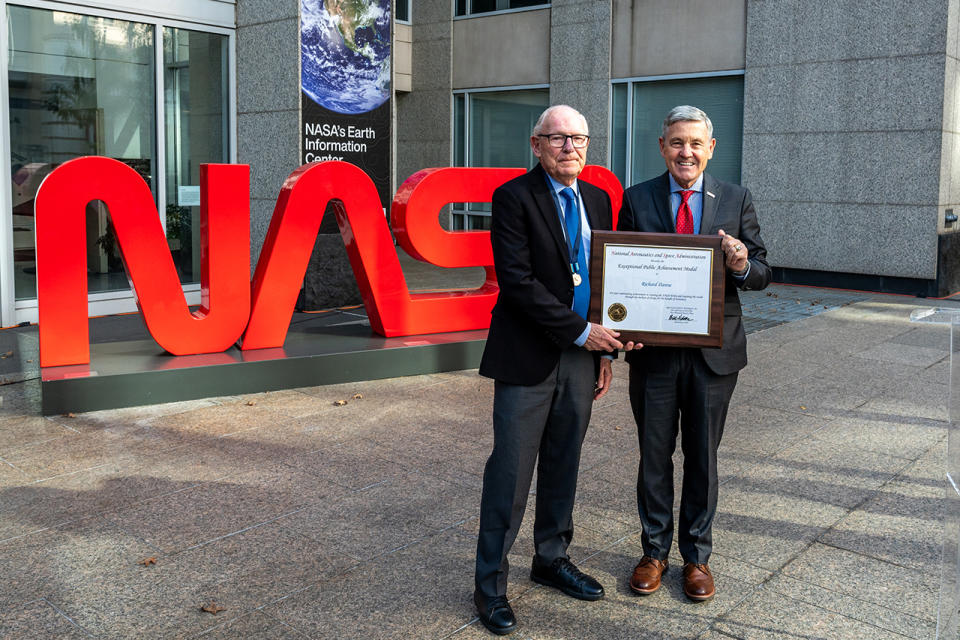
NASA honored Danne, Blackburn and Robert Schulman, the agency's former art director from 1975 to 1994, by dedicating a monument in the shape of the worm that was installed outside of the Mary W. Jackson NASA Headquarters building in June. Associate Administrator Bob Cabana also awarded Danne the NASA Exceptional Public Achievement Medal, which is presented to non-government employees for "specific achievement or substantial improvement in contribution to the mission of NASA."
RELATED STORIES:
— NASA reveals retro 'worm' logo painted on moon-bound Artemis rocket
— NASA's famous 'worm' logo crawls back into action on SpaceX rocket
— NASA re-embraces the 'worm,' its retro-cool retired logo, for new merchandise
"Thank you for giving the agency an image that fit the time and also that continues to endure alongside the iconic NASA [insignia] as one of the most recognizable and popular symbols of what we can achieve when we work together," Cabana said on presenting Danne the medal.
"This event, a culmination of a 50-year trek, is extremely rewarding. Creating the worm for NASA has been a singular achievement in my own career and in the history of design. It has not always been easy, but it was a glorious experience and I feel fortunate to be part of the NASA family and to have helped the agency achieve its missions and goals," said Danne.
Today, the worm and meatball both have a place at NASA, with each being used to represent the past, present and future of the space agency.
"My hope would be that it'll be useful for the foreseeable future," said Danne. "And that it helps power the great programs of NASA that are coming up."
Follow collectSPACE.com on Facebook and on Twitter at @collectSPACE. Copyright 2023 collectSPACE.com. All rights reserved.

