A famous hurricane graphic is set to look a lot more colorful. Here's why.
After years of worry over the way people interpret the National Hurricane Center’s forecast cone graphic, the weather center will bring an experimental new graphic online this summer.
The center is experimenting with changes to its most well-known graphic – commonly called the "cone of uncertainty" – to try to better communicate the risks that millions face from landfalling tropical storms and hurricanes, said Jamie Rhome, the center’s deputy director.
For years, forecasters have struggled for ways to illustrate the size of the area covered by the numerous threats from landfalling storms and to correct potentially dangerous misconceptions about the cone graphic. They've been working with social scientists to come up with ways to help the public understand that hazards extend well beyond the cone, Rhome told USA TODAY on Monday.
The new experimental graphic – to be unveiled later this year – will use the same forecast cone, but layer inland areas under tropical storm and hurricane warnings with color to illustrate the total area.
Weather and emergency professionals say they’re happy to see the hurricane center experimenting to try to help people more fully comprehend the threats they may face from a storm.
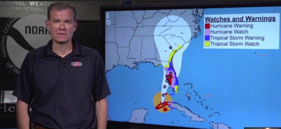
What is the forecast cone?
The "cone" was added to the center’s official track map more than 20 years ago and has been the center’s most well-known graphic. Its roots – the forecast points – date back to the earliest days of forecasting, Rhome said.
It shows the probable path of the center of a storm over the next five days, with points every 12 hours for the first three days of the forecast, then at 24 hours for days four and five.
The cone has steadily been shrinking, as the center’s forecast skill continued to improve, reducing errors in both track and intensity. The cone does not illustrate the size of the storm or the area that could experience high winds, intense rainfall, or deadly storm surge.
Why change the cone?
The graphic has been misinterpreted for years, despite a black label at the top that states it does not show the size of the storm or the scope of impacts.
The misunderstandings of the graphic have been "hotly debated," with no shortage of proposed solutions, Rhome said.
The debate reached a fever pitch in September 2022 as powerful Hurricane Ian approached Florida, and both public officials and private citizens misinterpreted the graphic. Barrier islands on the Southwest Florida coast in Lee County were always in or at the edge of the forecast cone, but residents and officials failed to comprehend that point, delaying critical decisions, experts said at the time.
Craig Fugate, former chief of the Federal Emergency Management Agency and the former chief of emergency management in Florida, was dismayed by the misunderstandings he saw. The hurricane center and NOAA correctly communicated the uncertainty but people weren’t getting it, Fugate said. Afterward, he was among those suggesting the emphasis move to impacts rather than track.
The center's latest effort is "a good move" to represent more of the potential impacts of a storm, Fugate told USA TODAY.
People want easy answers to a very complicated phenomenon, Rhome said. They look to the forecast cone graphic because it’s the most familiar and has the longest history.
But over the years as track forecasting improved, the size of the cone depicting the potential path got smaller and smaller. The hazards spilled farther and farther "outside the cone with greater and greater frequency," Rhome said. That created ever greater concerns.
How do hurricanes form? An inside look at the birth and power of ferocious storms
Is the traditional cone graphic going away?
No. The experimental graphic will appear alongside it, starting around Aug. 15, after the center gets feedback from weather professionals and emergency managers and addresses any concerns, Rhome said.
A mock-up of the new graphic shows just how much color (representing the wind warning) is outside the cone and well away from the center of circulation, he said. It "helps to convey the totality of wind risk, which is exceedingly important because people were just so fixated on, not only where the center of the track might go, but whether they were in or out of these edges."
When it comes to impacts, whether your area is in the cone or out of the cone is "insignificant," Rhome said. It’s the watches or warnings that should prompt citizens to act and tell them what action to take.
Why not add all potential risks to the map?
Concerns will linger because the new graphic won’t yet depict the two big killers: rainfall and storm surge.
The more information that's added to a graphic, the greater potential to clutter the message, Rhome said.
Social scientists told the center any changes to the traditional map "would need to be very gradual" over time, he said. Since the historical warnings shown were coastal wind warnings, "it made sense to add the inland wind warnings" first to provide the complete picture of wind threat.
Several meteorologists and weather experts told USA TODAY they like adding threats to the map, but agreed the center needs to proceed carefully to strike a balance between conveying threats without making the graphic too confusing.
It’s "a great idea to show the inland watches and warnings" on the graphic since the hazards of hurricanes extend well away from the coast, said Jeff Masters, an author with Yale Climate Connections, former hurricane hunter meteorologist and Weather Underground founder. It would be "great if the storm surge watches and warnings could also be included, but that would risk information overload."
Retired television meteorologist Alan Sealls called the experimental graphic "a good attempt." Any graphic attempt to depict all the threats in a tropical system will be messy, Sealls said, because each storm includes "wind, flooding, rain, storm surge and tornadoes in a multitude of combinations."
When does hurricane season start?
Hurricane season starts June 1 in the Atlantic and May 15 in the Pacific basin.
What will the names be for the 2024 hurricane season:
Alberto
Beryl
Chris
Debby
Ernesto
Francine
Gordon
Helene
Isaac
Joyce
Kirk
Leslie
Milton
Nadine
Oscar
Patty
Rafael
Sara
Tony
Valerie
William
Hurricane season 2023 See how the 4th most active season went
This article originally appeared on USA TODAY: The National Hurricane Center to try a new cone graphic: Here's why

