Tacoma unveiled a new logo — and the internet reacted. ‘It looks like a drunk panda’
- Oops!Something went wrong.Please try again later.
Working in communications — particularly in a mid-tier urban city with plenty of big-city problems — isn’t for the faint of heart. If it wasn’t for the pay, benefits and long-term security, people probably wouldn’t do it.
Tacoma’s Media and Communications Office got a reminder of how thankless it can be this week, not that I suspect many residents feel particularly sorry for the modest staff of 12 stationed on the 15th floor of the city’s Market Street HQ.
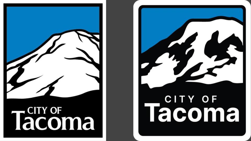
It started innocently enough, with the rollout of what city spokesperson Linda Robson described as a refreshed city logo. Not a vast departure from the city’s previous logo dating back to 2020 — still a snow-covered Mount Rainier against a blue backdrop — the city’s updated version of the art is more square, slightly larger and employs a new font.
Casual observers are unlikely to notice a difference, I’d wager — not that I’m one for gambling.
On the internet?
All bets are off.
‘Sleek’ new logo
According to Robson, the city’s new logo was distributed to various department directors over the last two weeks. Soon, it will begin to appear on city mailers, flyers and official communications, she said.
On Monday, Tacoma’s refreshed logo made its Facebook debut, marking the first time many residents laid eyes on it.
If you know anything about social media, you know where this is headed …
Within 24 hours, the city’s post — which included playful red-siren emojis, introducing what it called Tacoma’s “sleek new logo: a fusion of tradition and modernity” — had garnered more than 100 comments. As of this writing, it’s up to 188.
So far, only three of the replies could be construed as even remotely positive, and that’s being generous.
“Creepy” observed one commenter early on, deploying an adjective that now peppers the comments section. Some have even suggested you can see the face of a demented clown in the mountain if you look long enough.
“Reminds me of an icon out of Windows 95,” proclaimed another Facebook user.
My personal favorite?
“It looks like a drunk panda.”
Asked about the seemingly visceral reaction online, Robson said “diversity of opinion” is something the city “always” welcomes.
“Wouldn’t life be boring if we all liked exactly the same things?” she insisted.
It’s a valid argument.
If nothing else, the torrent of snark, dumpster-fire gifs and pro bono constructive criticism the city’s new logo inspired has been highly entertaining.
‘Nothing was done haphazardly’
In addition to seizing on a golden opportunity to crack wise at the city’s expense — in front of a limitless online audience — Tacoma’s new logo also garnered plenty of valid questions.
Chief among them: Why? Why now? And most pertinent of all, how much did it cost?
On Tuesday, Robsons did her best to provide answers — while assuaging an agitated public’s fears and one-liners.
First and foremost, Robson stressed that Tacoma’s new logo was produced in-house, by a graphic designer on staff. There was no additional cost to taxpayers, she said.
Secondly, the effort was part of a “larger city website redesign project,” Robson said.
The goal, she said, was to update “our iconic logo to a more clear and crisp design that is compatible and consistent with emerging communications formats, platforms and channels.”
“What you see is a more accurate silhouette of Mount Rainier as it appears when viewed from Tacoma and Commencement Bay, an open-source font, plus rounded corners and a more square height-by-width ratio so that it appears larger and clearer when shown as a thumbnail image,” Robson told The News Tribune.
“The changes were made for it to function better and appear clearer and more readily recognizable in our rapidly changing media landscape,” she added.
“In other words, the form followed the function, and nothing was done haphazardly or simply as a matter of personal taste.”
Personal taste aside, Tacoma’s new logo — and its widely lambasted debut — reminds us of two key life lessons.
The internet is a cruel and unusual place. It always will be.
At the same time, sometimes the commenters have a point, even when they’re callous and mean.
In a city with far bigger fish to fry, exercises in rebranding and image polishing elicit a predictable response.
“No good can come from creating a new or updated logo or motto for a city or county,” offered one helpful online observer.
“It will always be ruthlessly mocked, and it should. It’s a choice.”

