How one designer and CBS News fit a story on a postage stamp
As the coronavirus pandemic forces the U.S. to grapple with the state of mail-in voting infrastructure and consumers' attention span continues to shrink, CBS News is boiling down key statistics about the history of mail-in voting in the country into tiny pieces of insight that look like the ubiquitous postage stamps.
Take a look at the stamp collection here
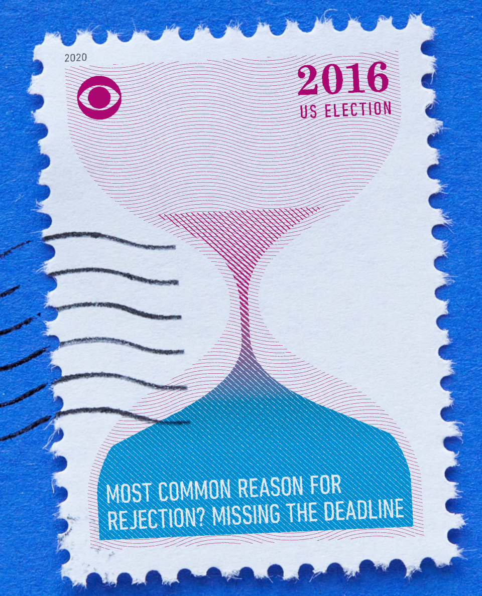
Among the data points highlighted in the stamp collection is the percentage of voters mailing-in ballots at US elections since 1996; the total number of early, absentee and mail-in voters in 2016 compared to those in 2004; and the percentage of mail-in votes in 2016 across states like Oregon, Washington, Kentucky, and Tennessee.
CBS News' "Face the Nation" unveiled the collection of stamps Sunday, September 27 across its Twitter, Facebook, and Instagram profiles. The stamps will also be shown during the broadcast.
We spoke with stamp designer Peter Ørntoft for a closer look at what went into the process in designing the infographic:
Tell us about your approach to designing these stamps. Where did the idea come from? Why the stamp format? The idea of using the stamp as format arose in my search for context. I always begin this type of project by exploring the context of the subject to look for powerful visual elements that can carry the data. I often aim for using real objects and elements to visualise the data because it adds an extra tactile layer of information about the subject creating an emotional connection between the data and people. Thinking of various different objects in relation to the postal experience, the potential of the stamp caught my attention. Apart from being an important part of our communication infrastructure, stamps are small traveling pieces of art and they can give us small glimpses of world history. AND they are very sharable objects. Both in real life and digitally. How long did the project take? The project spanned over about three weeks from starting my research to making the final photoshoot. Fortunately the concept came in place quite early in the process so I had a lot of time to experiment with the design and the photoshoot.
How did you decide which data points to highlight in the stamps? The team at Face the Nation had already done a great job at writing the storyline and creating a longlist of datasets. Content-wise, my job was to select which data was more suitable for the storyline and which data was the best fit for the stamp format and the stamp aesthetic. Had you previously designed something meant for such a small canvas? What were some of the challenges or illuminating moments you faced in distilling a piece of information into a tiny stamp? I have never designed for such a small scale before and it was certainly a fun and interesting challenge. Early in the process I made some test prints and I quickly got an overview of the limitations in terms of design and content. With such a small scale it was all about keeping it simple and the data visualizations had to be as precise and clear as possible meaning not too many variables and not too much text.
Renewable energy industry booming despite struggling economy
Far-right group Proud Boys rally in Portland, Oregon
Breonna Taylor's family demands to see evidence from grand jury

