Pantone's 2020 Color of the Year Is a Hue 'We Can Always Rely On' in Uncertain Times
Feeling blue in 2020 might not be such a bad thing!
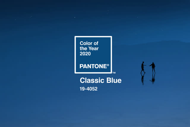
Pantone, the international authority on color trends, just announced its pick for the 2020 Color of the Year: Classic Blue.
The timeless, cool color, coded 19-4052 in Pantone’s universal swatch book, is meant to recall the serene hue of the sky at dusk, and reflect qualities like simplicity and stability, which the forecaster notes are needed now more than ever.
“We are living in a time that requires trust and faith. It is this kind of constancy and confidence that is expressed by Classic Blue, a solid and dependable blue hue we can always rely on,” said Leatrice Eiseman, Executive Director of the Pantone Color Institute.
In a press release, the color is described as timeless, elegant, restful, honest and non-aggressive. But the pick isn’t all about playing it safe.
Eiseman also says that because the color evokes the “vast and infinite” sky, it “encourages us to look beyond the obvious to expand our thinking; challenging us to think more deeply, increase our perspective and open the flow of communication.”
RELATED: Pantone’s Color of the Year for 2019 Embodies Our ‘Need for Optimism’: See the Hue!
Pantone predicts Classic Blue will turn up in all sorts of ways in our daily lives over the next twelve months, from fashion and beauty items to home decor, product packaging and even food. This year, they’re also teaming up with a number of brands like FedEx Office, Adobe, and the trendy direct-to-consumer furniture brand The Inside, to release special items in the 2020 hue.
Last year’s Color of the Year, Living Coral, was a vibrant orange that Pantone said at the time, “embodies our need for optimism.” It’s also almost exactly opposite this year’s pick on the color wheel. (Orange and blue are complementary.) In 2018, they chose “dramatic and provocative” Ultra Violet and in 2017, it was “fresh and zesty” Greenery. In 2016, Pantone broke the mold and named two colors of the year: “Rose Quartz,” a soft pink, and “Serenity,” a pale blue.
T-minus 12 hours till the #Pantone2020 reveal. 📹: @hugeinc
A post shared by PANTONE (@pantone) on Dec 4, 2019 at 4:03am PST
RELATED: Property Brothers’ Jonathan and Drew Scott Say Never Paint Your Walls These Two Colors
Most years the announcement draws at least a small backlash from the design community, wary of being pushed beyond what’s considered on-trend and tasteful at the time. Some felt the dual pink and blue winners from 2016, for example, were too evocative of a nursery. The reaction to 2017’s “Greenery,” however, was more neutral, perhaps due to the calming quality the leafy color is meant to evoke.
It’s hard to imagine a more universally beloved color than Classic Blue. And if it does have the power to calm and stabilize, as Pantone predicts, it may just be the perfect pick for the year to come.

