This Playful Brooklyn Brownstone Has a Kitchen Floor You’ll Definitely Want to Recreate
It’s a pretty regular occurrence that we come across a space and think, “Hey, how’d you do that?” From custom built-ins to expert styling to genius pattern combinations, pros in the interior design business know just what to do to make a room or a home or even a coffee table stand out. So with this series, we’re asking them to let us in on their secrets in the hope that we can take our own spaces to the next level.
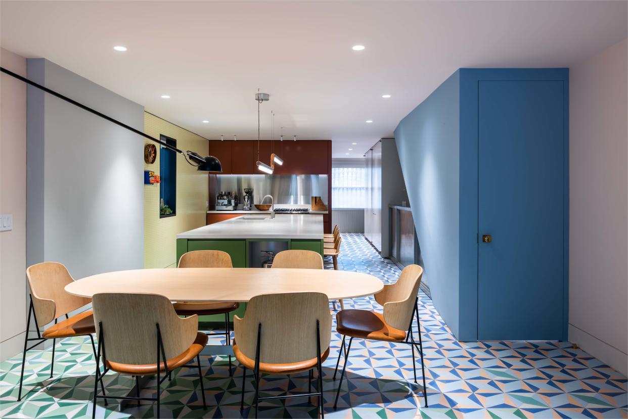
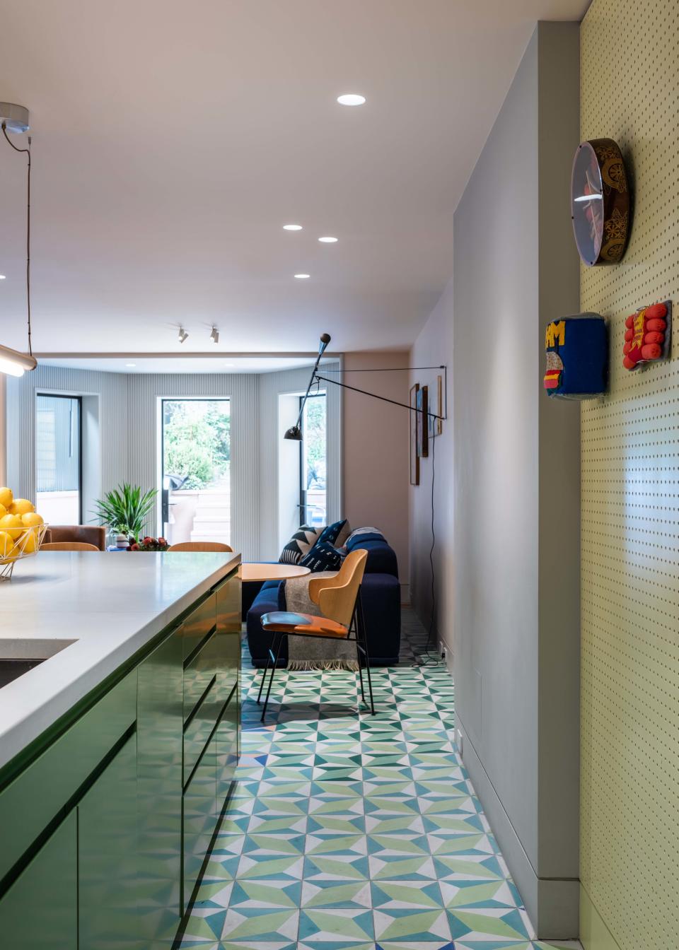
From the second we first saw this kitchen, we were utterly enthralled. Situated in a historic Clinton Hill, Brooklyn, brownstone, the graphic, gradient-hued floor stands out. We sat down with architect and designer Michael K. Chen of Michael K. Chen Architecture to hear about the influences behind the design, how he brought this unexpected vision to life for his clients, and how you can create the look too.
Clever: What were some of the initial inspirations for the space?
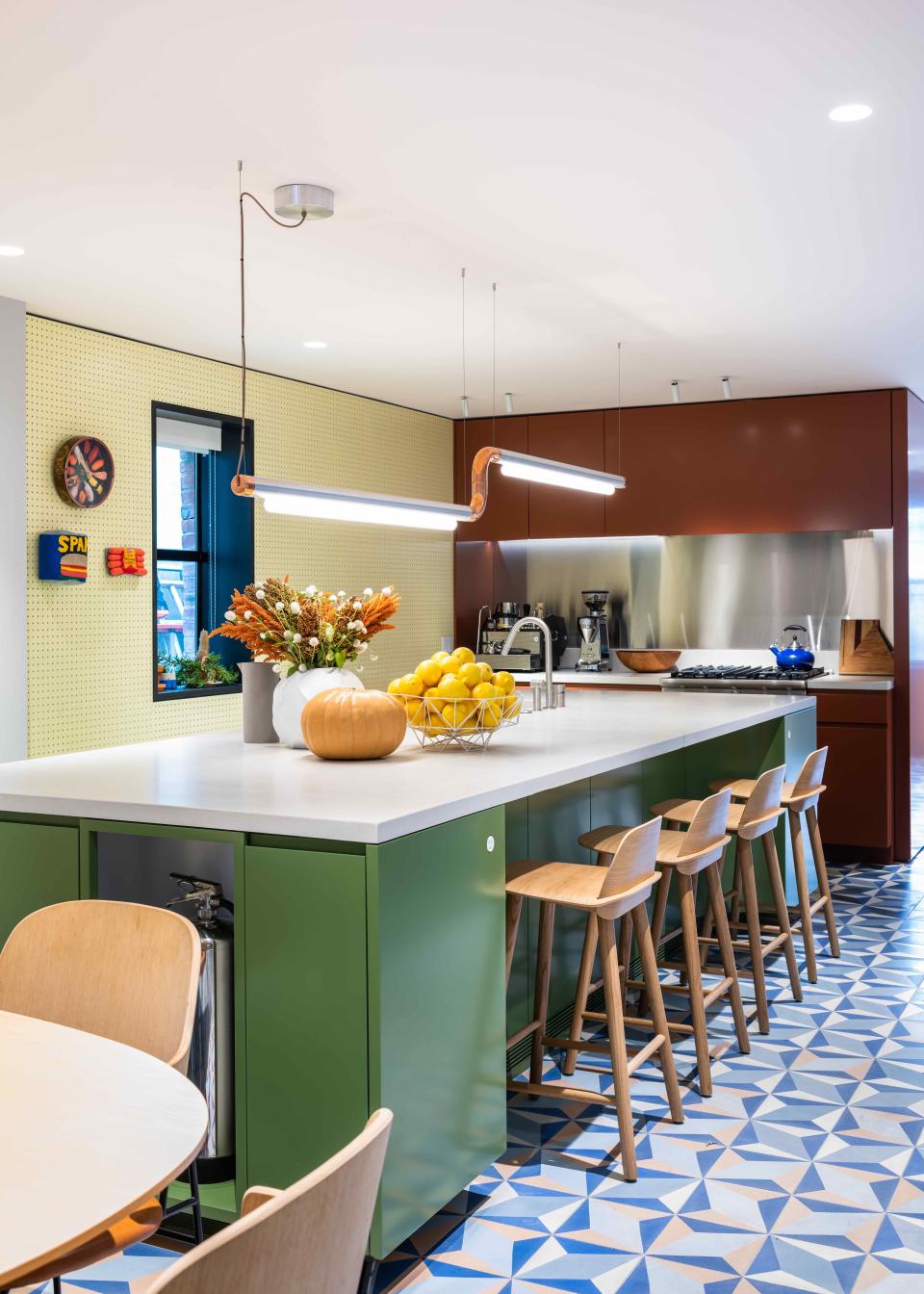
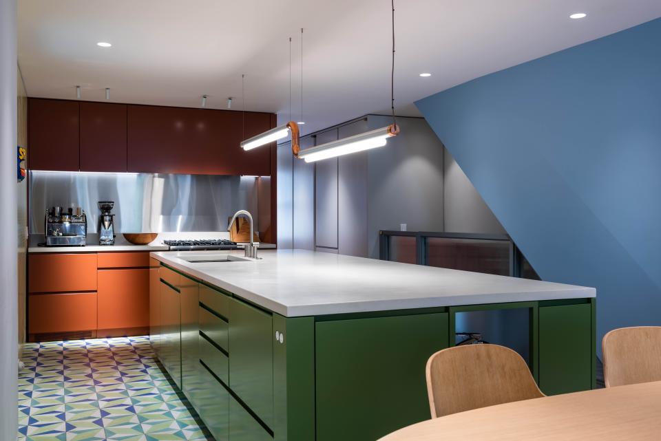
Michael: The clients had a vivid memory of vacations in Mexico, and always loved the look of multicolored Mexican ceramic tile. That was the starting point. The clients brought a kitsch sensibility to the table—they’re young and playful. Because the floor was ‘the thing,’ we wanted the rest of the kitchen to be blocks of color. Each volume of the kitchen became its own color, and the walls and ceiling became another color.
How did you select the color palette?
We had epic color meetings. We looked at really large paint samples and just kept playing around with them. It almost seems quaint now: four people sitting around a table, just mixing and matching colors. It was sort of like kindergarten, in the best way.
What are your tips for executing color blocking?
It’s so important to see the colors working together and with the other materials. You want to see the colors repeatedly and over a certain amount of time, because color changes with light. We’re always thinking about the light, and how color is a vehicle for feelings and emotional states. We wanted a cheerful energy here.
Also, the way we usually think about color blocking has a lot to do with scale. The volumes in this space are somewhere in between the size of the furniture and the architecture.
There’s one wall here that is padded out because there’s a bunch of plumbing in it, serving upper floors. We painted that wall its own color, while the rest of the environment is a barely-pink color. And it allowed us to introduce this fluorescent yellow pegboard. We took something that was bothersome to us (there was no other way to hide the plumbing in the open floor plan) and utilized it to break up surfaces; it became an asset. Now, you get the sense that these volumes are floating and free.
Talk to me about this amazing floor.
It’s encaustic cement tile, and the top layer of the tile is an integrally colored cement. The company makes these patterns out of what are essentially giant metal cookie cutters. They fill each section of the sheet metal pattern with a different color, and when they lift the “cookie cutter” out, the liquid cement meets the adjacent color and creates a crisp line.
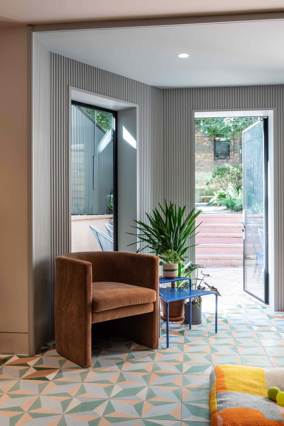
The material is suitable for both indoors and outdoors, and we knew we wanted to run it continuously and flush from indoor to outdoor. The idea was for the coloration to shift in a way that follows the pattern of occupation: It grows from more muted near the entryway and bathroom to more and more vibrant as you move through the kitchen, dining area, lounge, and exterior terrace.
Because of the way the tiles are made, you can make any color. To order a custom color, all you have to do is buy one box. We have 17 unique colorways here. It was a lot of digital design trickery and versioning. Because we created the pattern ourselves on the computer, we were able to give the installers a very clear and easy-to-follow map—so it wasn’t any more expensive than installing a regular floor.
How were you able to keep the aesthetic so seamless, hiding many of the functional kitchen items?
We always tend toward integrated appliances to reduce visual noise. Because this is the ground floor of a brownstone, the ceilings aren’t very tall. We knew we wanted to banish all upper cabinets; we didn’t want the kitchen to visually present like a kitchen, which is why it’s mostly an island—you get this low-slung geometry. The rest of the full-height appliances are distributed around the island, making it the main hub. The wall facing the bathroom houses a pantry, overflow storage, and the fridge.
You’ve also added some texture through the pegboard wall and corrugated panels. How does that balance out the flatter, more monochrome moments?
As much as I love color blocking, painted Sheetrock is more of a background material—we’re always looking for other ways to add dimension. On the upper floors of the house, many of the 19th-century details were carefully restored. Though this ground floor is much more modern, we didn’t want it to be completely incongruous.
We liked the ribbed wood for the added benefit of being more durable around the doors leading to the exterior. And the pegboard just felt like such an unpretentious and familiar thing to find in a kitchen. Both of the clients had memories of grandmothers with pegboards in their kitchens. The couple hangs some cookware there, but they have some art displayed as well. It allows them to constantly restyle.
What’s a budget-friendly takeaway from this kitchen that someone could implement in their own project?
In the grand scheme of things, encaustic tile is not that expensive. It’s on par with other ceramic tiles, certainly less expensive than stone. It’s not necessarily a “budget” material, but it’s not extravagant.
And lastly, what’s the most impactful element that readers inspired by this space could use to transform their own homes?
Something we’re thrilled about in this project is that we allowed one thing to run away in a big way. A single element used with a bit of quantitative excess can be hugely effective and take pressure off other elements in the space. As designers, we’re not really interested in accents—we like total environments. That’s the case with the floor here. And something simple we do all the time is paint the walls, the ceilings, and the trims all the same color. This way, you inhabit the color as opposed to looking at it. It makes spaces more lively, moodier, and more responsive to the natural changes that occur over the course of a day or the cycle of seasons.
Originally Appeared on Architectural Digest

