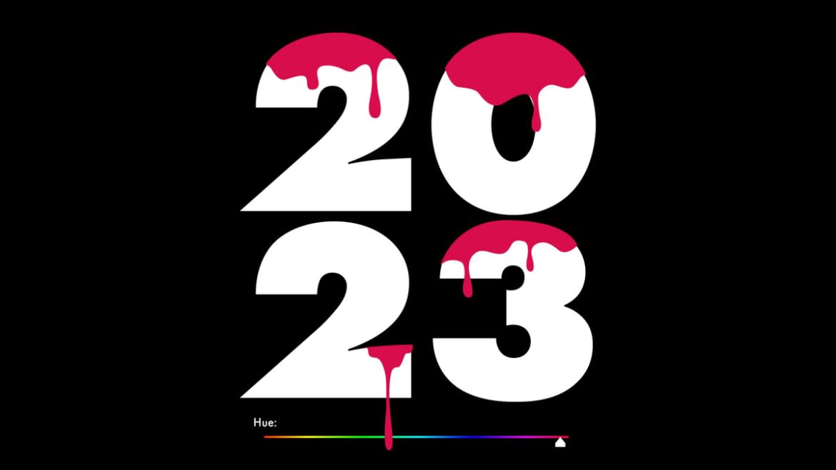
Please Know That Viva Magenta, Official Color of 2023, Is Red, Not Pink
Laurie Pressman, the vice president of the Pantone Color Institute, is adamant that Viva Magenta, the company’s selection for the 2023 Color of the Year, is not pink. “I can understand on screen how it could appear pink, but it’s a warm and cool red,” Pressman told The Daily Beast. “But it’s not a red that’s aggressive, it’s a red that’s assertive. It’s a red that’s playfully disruptive.”
The nuances of color, mood, and societal shifts all go into the decision-making process that determines which hue will be crowned Pantone’s annual color of the year.
The company’s first time predicting the color of the year was in 1999, wherein they named cerulean blue the color of the millennium. This kicked off a chain of events that eventually landed cerulean in the halls of cinematic history forever via a particularly iconic scene in 2006’s Meryl Streep vehicle The Devil Wears Prada.
Anne Hathaway and Anna Wintour Bring ‘Devil Wears Prada’ to New York Fashion Week
“That blue represents millions of dollars and countless jobs, and it’s sort of comical how you think that you’ve made a choice that exempts you from the fashion industry, when in fact, you’re wearing a sweater that was selected for you by the people in this room… from a pile of stuff,” Streep’s character, Anna Wintour stand-in Miranda Priestly, intones to a terrified Anne Hathaway.
Viva Magenta was originally added to the Pantone color palette by the company back in 2019, but it only really started to take off more recently: the magenta hue popped up on fuzzy Gucci sweaters in their fall 2022 ready-t0-wear show, on baggy shorts at Dior Men’s resort 2023 show and within eyelashes and eyeliner trends in recent months.
“Pantone is creating inks directly from recipes that are proprietary to them,” Susan Farnand, an assistant professor in the Color Science Program at the Rochester Institute of Technology, told The Daily Beast. “For a big offset printer, they can get specialty inks from Pantone. Along with cyan, magenta, yellow and black, they can get this exact color that Pantone has announced as their color of the year. It will be an ink that you could buy and add to your palette.”
Nevertheless, some aren’t so enthused about Pantone’s pick. “Horrible colour of the year,” one tweeter wrote. “Hardware store ass colour 2003 kitchen ass colour tk [sp] maxx ass colour.” Oh, well. Trends don’t require universal consensus.
In order to determine which color will define each new year, Pantone turns to a global network of color experts and trend forecasters who collectively analyze recent runway collections, new home furnishings and new products to come towards a consensus on the next big thing, Pressman said.
“The trend world is very closely knit, and it’s a very unique skill,” Pressman said. “We’re working with people who are also color experts. They may be teaching color at a university. They may be contributing to a color trend forecast for Premiere Vision, which is the preeminent global trade show for materials. This is not commercial. These are not marketers. People on the marketing side are not the ones who are coming up with the trends. They’re turning to trend services, and we work with clients up to five years out.”
Another of those clients is Valentino—Pantone worked with the brand to develop PP Pink, the ‘Barbiecore’ hue that memorably popped up on Anne Hathaway at Cannes this year.
“Pantone is a really well-known, reputable brand in the industry—it has a color system that is meant to hit standards so that the factory can make the color you’re trying to hit,” Leslie J. Ghize, EVP of the fashion retail consulting company Donager TOBE, told The Daily Beast. “This concept of understanding color and what colors people are using for the clothes they are making: Pantone has a very clear read because their standards are bought by manufacturers to be sent to the factory. For the 2023 selling period, we’re in agreement with Pantone. We had magenta as a lead color for spring and fall of 2023, and those projections were done over a year ago.”
“I don’t know why designers would follow Pantone’s color chart,” Amanda Sanders, lead stylist for New York Image Consultant, told The Daily Beast. “My assumption would be that Pantone does not predict and designers follow, but rather that Pantone gets a sense of the designers’ collections and picks a color that’s a thread throughout,” Sanders said. “Fuchsia has been very popular and it wouldn’t surprise me if it carries over into spring, but I’m not sure about the fall of 2023.”
Pantone’s Color of the Year call for pandemic-riddled 2020, incidentally, was classic blue, highlighting “our desire for a dependable and stable foundation on which to build as we cross the threshold into a new era”—that didn’t go well!
In anticipation of 2021 there were two Pantone picks: rock gray and yellow to convey solidity and optimism, respectively. While basic gray is a reliable color that never goes out of style and yellow could be seen all over the 2021 runways, the sunshine-y hue didn’t pick up nearly as much street style steam as Barbiecore hot pink did last year.
Viva Magenta, an exuberant color that, if it were a person, seems like it would be a well-heeled globetrotter with money to spend, represents “courage, fearlessness and bravery,” Pressman said, “and that’s what people are looking for as we went through this whole experience with COVID over these last couple of years.”
“I feel like having forecasted trend for almost 25 years, I think that we’re seeing a longer lifespan on particular colors,” Ghize said. “We’ve had a little bit of a speed bump in the trend cycle with the health crisis, so that slowed the pace of trends and gave them more longevity.”
“I don’t know that there were other colors in the running [for 2023 Color of the Year], per se,” Pressman added. “I think once we zeroed in on the red family, it’s really just about getting to the right shade of red. And if you look back, we’ve seen a lot of red over these past years on the runway, but it was much more orange red and much more true red and much more about power, and that’s very different. We wanna feel empowered. It really is about giving ourselves the permission to be seen and allowing ourselves to feel good about it.”
“Pinks are beautiful on everybody, and people are looking for optimism right now—it’s a very marketable color,” Ghize said.
Pantone doesn’t just announce a new color and run: it also offers a series of products, like ceramic cups made in partnership with Copenhagen Design, key chains and aforementioned printer inks, to reinforce the color’s staying power. Another partner this year is Motorola, which is offering an edge 30 fusion phone in Viva Magenta.
Pantone also partnered with ARTECHOUSE for the fourth time to stage an immersive exhibition celebrating their color pick; the “Magentaverse” launched at Art Basel Miami Beach this year.
The color selection process “is really about a team going back and forth," Pressman said. “Because remember, you have some people in Spain, you have some people in the Netherlands, you have some people in Asia; you have people in different areas around the world weighing in with what they’re seeing and what they’re feeling the mood is.”
“People don’t want to be so somber anymore, so if people throw magenta into the mix of their all-black wardrobes, it adds something unexpected and more modern,” Sanders said. “We’re tired of being sad and sick and inside.”
Get the Daily Beast's biggest scoops and scandals delivered right to your inbox. Sign up now.
Stay informed and gain unlimited access to the Daily Beast's unmatched reporting. Subscribe now.

