PPG Gives Us a 2021 Palette of the Year
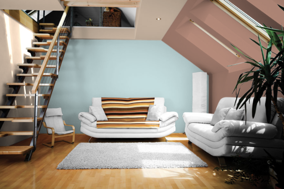
We’ve reached that time in the year: the clock strikes September and there’s suddenly talk of the holidays and new year—especially 2021 trends. So, getting us primed for looking to the future, PPG announced today not just a color of the year, but an entire palette. Called “Be Well,” the three hues consist of soothing, comforting neutrals (Transcend and Big Cypress) and a pop of freshness (Misty Aqua).
The POTY is made for embracing mindfulness and intention, and we thank PPG for giving us an emphasis on compassion and optimism (something we could all use). Transcend, a grounding, mid-tone oatmeal color, gives us an earthy sensation; Big Cypress, a ginger-persimmon hue, has that soothing autumnal vibe; and Misty Aqua, a cool cerulean blue, is like jumping into a refreshing pool. Sand, sun, water, hugs…. The palette is here for our mental wellness.
So how should you use the color palette? The PPG experts say the colors pair well with “greenery, blonde or natural brown-toned woods, and layers of texture in the form of rattan, linen, velvet, and woven textiles like pillows, blankets, and rugs.” Comfort all around.
“When the world experiences events that cause unrest, anxiety, and grief, we tend to naturally gravitate toward compassionate colors that allow us to create a personal retreat from the world,” says Dee Schlotter, PPG senior color marketing manager, architectural and industrial coatings.
Plus, if you’re feeling like you don’t need that kind of comfortable palette, the PPG color experts gave us two additional color stories for 2021, both anchored with the calming Transcend. “Be True” includes jewel tones (Enchanting Eggplant, a rich maroon, and Gargoyle, a glass-bottle green) and “Be Wild” is made for mood boosting with playful hues (French Lilac, a nice periwinkle, and Mediterranean Blue, a marine aqua-blue).
Originally Appeared on Architectural Digest

