‘Squid Game’: How the Show’s Larger-Than-Life Set Design Came Together
- Oops!Something went wrong.Please try again later.

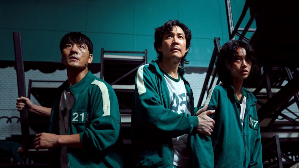
Ten years in the making, Netflix’s “Squid Game” quickly became a phenomenon that even the streamer couldn’t predict. While the M.C. Escher-like staircase in the game’s deadly arena (pictured above) has been the focus of much discussion already, there was far more to the creative process. The physical sets were built on a massive scale to accommodate the story’s 456 contestants and everything else progressed from there.
Series production designer Chae Kyoung-sun shares some of the subtleties audiences may not have picked up on, including the Korean cultural references that contribute to the tension and crushing anxiety that resonate throughout the show.
More from Variety
What set do you think contributes most successfully to the tension on screen?
All spaces in the game world are built in sets. The art teams had to think like a designer who created the games. At the initial design stage, we imagined how the world of Squid Game would unfold across this remote island and arranged the spaces accordingly.
The tug of war set was really built way more than 10 meters above the ground, so some staff members felt quite afraid of heights. As for the glass stepping stones set, director Hwang and the direction department wanted it to be bigger in size so that the actors would have to jump real hard to move forward, but the depth had to be adjusted for the actors’ safety. I think the actors actually felt scared and afraid when they played this game. Of course, their acting skills were phenomenal, too.
The show has become a phenomenon and much has already been written about some of the most elaborate sets, like the Escher-inspired staircase and how much of a maze it really was for actors and crew. What set hasn’t received as much attention, but took a significant amount of work that audiences may not fully appreciate?
The large dormitory space is designed with the keywords “people who are abandoned on the road.” The raised platform in the middle is designed to look like a tunnel entrance and the walls are covered with white tiles, which are commonly used in a tunnel. The beds are stacked up against one another like goods in a warehouse, and they are taken out as the participants get eliminated. When the mayhem breaks out, these beds collapse and get destroyed to look like broken ladders or stairs, which signify the hopeless reality of not being able to move upward.
The VIP room [in the final episodes] is where I had to think through until the very end, and the design of this space was finished last. I looked through a large array of images to form a concept. There are so many amazing places around the world, and I feel thankful that I live in a time when good references can be easily found on the Internet and in books.
The images I found were all very great, so it took a long time for me to conceptualize what the VIP room should look like. In the end, I decided to create the world of animals. The VIPs are the kind of people who take other people’s lives for entertainment and treat them like game pieces on a chessboard, so I wanted to create a powerful and instinctive look for the room. Every animal mask these VIPs are wearing, and every prop in their sitting area, comes with hidden meanings.
The forest-like space was worked on by the best scenic artist, and the large forest was created with the greens team through rounds of drafting and testing. As such, quite a lot of budget went into this room. I also had multiple meetings with the body painting artist to bring the art team’s design to life.
Netflix
A question about that staircase set, though — it almost looked like the sides of the stairs, and what would normally be just a railing, were lower than usual and hit in some places just around the actors knees. Did I imagine that or was that actually the case?
There are some pieces of art that served as major inspiration for me when I was designing the spaces in “Squid Game.” I particularly remember two illustrations among many.
One of them was an illustration of a child who is sitting next to a tall wall. Next to the child, there is a ladder leaning against the wall, and the child is making a fire with some wood taken from the ladder while looking up at the wall. During the process, I hoped that art would help the show to deliver the questions that it intends to ask and the themes it intends to highlight. Even when making a single prop or deciding a finishing material for a certain set, I almost obsessively put in intentions behind them so that they can contribute to the wider themes.
The staircase that looks like the sides of the stairs also stems from the image of a ladder. The structural composition of a ladder and stairs is used heavily in the show. The maze-like stairways are done particularly well, and I am glad that they are well received.
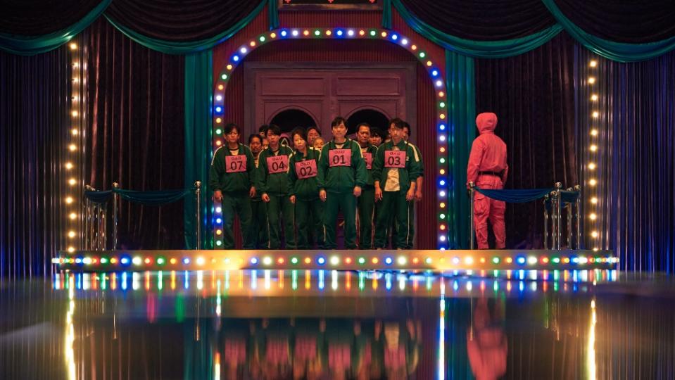
There are elements of cultural overlap — the Red Light Green Light game, for instance, that has counterparts in multiple cultures, and the giant piggy bank where the money is collected for the contestants. What are the design elements or details — and culturally significant colors, numbers or other references — that a South Korean audience may recognize but an international audience may miss?
Some of the design elements may have felt unfamiliar to the international audience because they come from Korean textbooks from the ’70s and ’80s. The main colors of the show — mint green and pink — also come from the colors often used in children’s school supplies back then, so they were very effective in evoking the childhood nostalgia from the Korean viewers. The participants are wearing a green tracksuit, which is the most common color for a school tracksuit in Korea, while the masked staff are wearing a pink jumpsuit. This color contrast also carries a double meaning to portray the brutal world.
Color plays a significant role: There are dizzying shades used throughout. How did you, the director and the costume designer work together to balance all of the hues and to set a working color palette for the show?
Director Hwang first decided on the pink color for the costume. It was an excellent decision and a perfect start of a fun journey. The color contrast between pink and green was used to represent the status of the characters and where they belonged. It extends beyond the colors of the costume to the colors of the space. The maze staircase that the participants have to walk through is predominantly pink-colored. Naturally, for the participants in green, the pink color becomes a symbol of danger, fear and terror.
The waiting area is colored white to convey the feeling of extreme fear that the participants feel when they are put in the middle of the complete unknown. The color shows that this space is where the participants are forced to wait without knowing what the next game is and what lies ahead.
Courtesy of Netflix
Would you walk me through some of the design inspiration between the sets for each of the games?
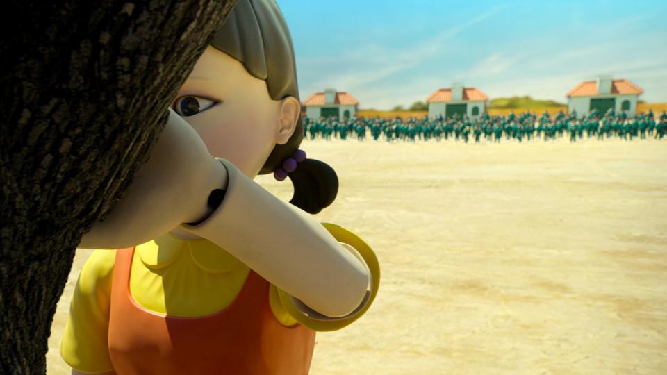
The first game: Red Light, Green Light
I wanted to fill the set for the first game with fantasy and fairy tale-like images. The robot doll was designed after one of the duos from the ’80s textbook “Chul-soo and Young-hee” and an ominous tree was put in as an object. This juxtaposition evokes both the memories of childhood and the sense of fear at the same time. The walls are decorated with the fields of reeds and the clear sky, the kinds of which you would see in a storybook. But the fields and the clouds are not real, and once the game is over, the ceiling closes over the confused faces of the survivors and those who are dead.
The second game: Honeycomb
The participants are asked to take on the honeycomb challenge like the children in the ’70s and ’80s who gathered in small groups in the playground to play the game. They must have played the honeycomb game as a child, so they are invited to immerse themselves in the old childhood memories. In the past, the playground was where they played with friends and had fun, but now, it has turned into a space for a deadly game. I am sure that everyone has the experience of looking at the playground as an adult and thinking that the playground equipment looks so much smaller than what it looked like as a child. That experience of changes in scale is a defining element in the set design for the second game.
The objects in the playground such as the slide, swing, and merry-go-rounds are magnified threefold in size. And the walls are decorated with the crayon cloud drawings to add childlike and fairytale-like touches.
The third game: Tug of War
The main concept of this design is “people who are abandoned on the road.” The same design concept goes into the large dormitory in the form of an arch-shaped tunnel entrance. As for the set of this game, the concept is realized in the form of a road. The road-shaped game ring is set up on top of the 30-meter steel structure to imply the hopelessness the participants feel as they lost their ways and were thrown onto the road, and to maximize the dramatic impact of their being thrown down to the asphalt floor. The physical set was made to the maximum height necessary for filming, and the scenes were completed with the work of the computer graphics team.
The fourth game: Marbles
This game is built on the theme of “Gganbu.” Gganbu means close and trusted friends, and you can make Gganbu friends with each other by making a finger promise. The set for the fourth game is designed to tell the story of the memories of one of the participants. The small pieces of memories are brought in as different sides of the alleys, each of which are like the stage for a play. The key to this design is to create the feel of depth by layering flat surfaces. The objects such as the common roof design or the gate design of the old multi-family houses were used as the flat surface elements.
The fifth game: Glass Stepping Stones
Unlike the other games, the glass stepping stones game is watched by the audience. The participants have to cross the dangerous glass bridge as if they were walking along a rope. It’s as if they were in a circus to perform a glamorous aerial show in front of the spectators. That is why this set is designed with a circus stage in mind. The bridge is located in the middle of a huge tent surrounded with layers of curtains. The color palette includes vivid green and purple from the 70s and 80s, and the bright-colored lighting that is commonly used in the amusement park adds to the splendor.
(Details of game 6 have been withheld due to spoilers.)
Netflix
Best of Variety
The Best Pop Culture Halloween Costumes for 2021: From 'Squid Game' to 'Cruella
Best-Selling Celebrity Memoirs: Stanley Tucci and Dave Grohl Join the Ranks
Sign up for Variety’s Newsletter. For the latest news, follow us on Facebook, Twitter, and Instagram.

