The Top 10 Best-Selling Valspar Paint Colors

As a purveyor of paints in America for over 200 years, Valspar has a history as colorful as its products. The company was founded by Samuel Tuck in Boston, Massachusetts, in 1806 and expanded globally under the name Valentine & Company by the turn of the century. The brand produced the world’s first varnish that would stay clear when exposed to water—called Valspar—in 1906, and the product made a major splash on the market. Charles Lindbergh's Spirit of St. Louis was coated in Valspar for its 1927 intercontinental flight and it played a role in Admiral Robert Peary's expedition to the North Pole in 1909. In 2017, the company was purchased by Sherwin-Williams, ensuring that the company will hopefully be around for another 200 years.
While clear varnish may have put Valspar on the map, the company has since become known for its paints, including its Reserve interior paint. The line is a favorite of designer Jennifer Post, who list Lemon Twist as a go-to paint color for bathrooms. Another high-profile fan is designer Michael S. Smith who used a Valspar paint in the dining room of the U.S. Ambassador to Spain’s Madrid residence,
The company has kept up with design times as well, offering chalky finish paint for DIYers and chalkboard paint. Color strategists keep an eye on trends and release their list of hot shades each year. In 2017, they selected 12 lively hues, including a botanical yellow-green, baked terra cotta, vivid ultramarine blue, and deep violet black. The company's Ask Val site has tips and quizzes to help you pick the right shade and even offers a tool that analyzes your Pinterest boards to create a palette based on your pins. Customers can also request a color consultation to help narrow down their choices for a project.
While Valspar offers thousands of colors, its list of best selling shades proves that its customers are wild for its classic neutrals, from warm whites to cool grays.
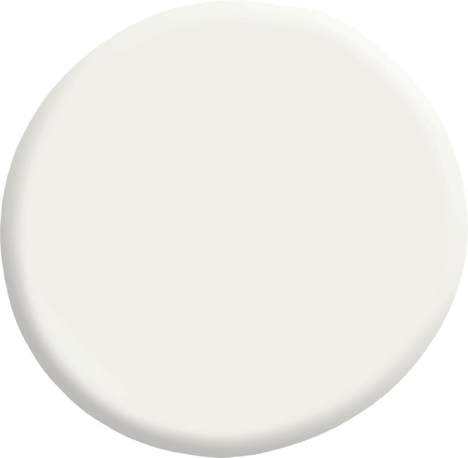
7002-6 Du Jour, Courtesy of Valspar
Du Jour
Du Jour is a warm white that works well in any room and pairs well with other neutrals, pastels, or even brighter colors.
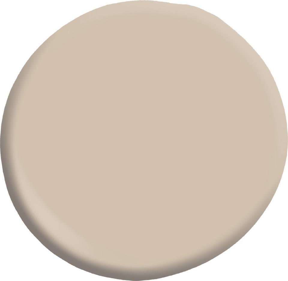
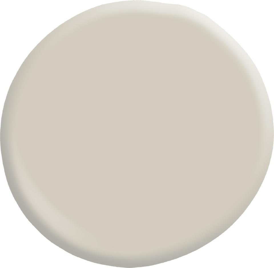
3003-10B Hopsack, Courtesy of Valspar
Hopsack
Hopsack is a versatile neutral with warm yellow undertones.
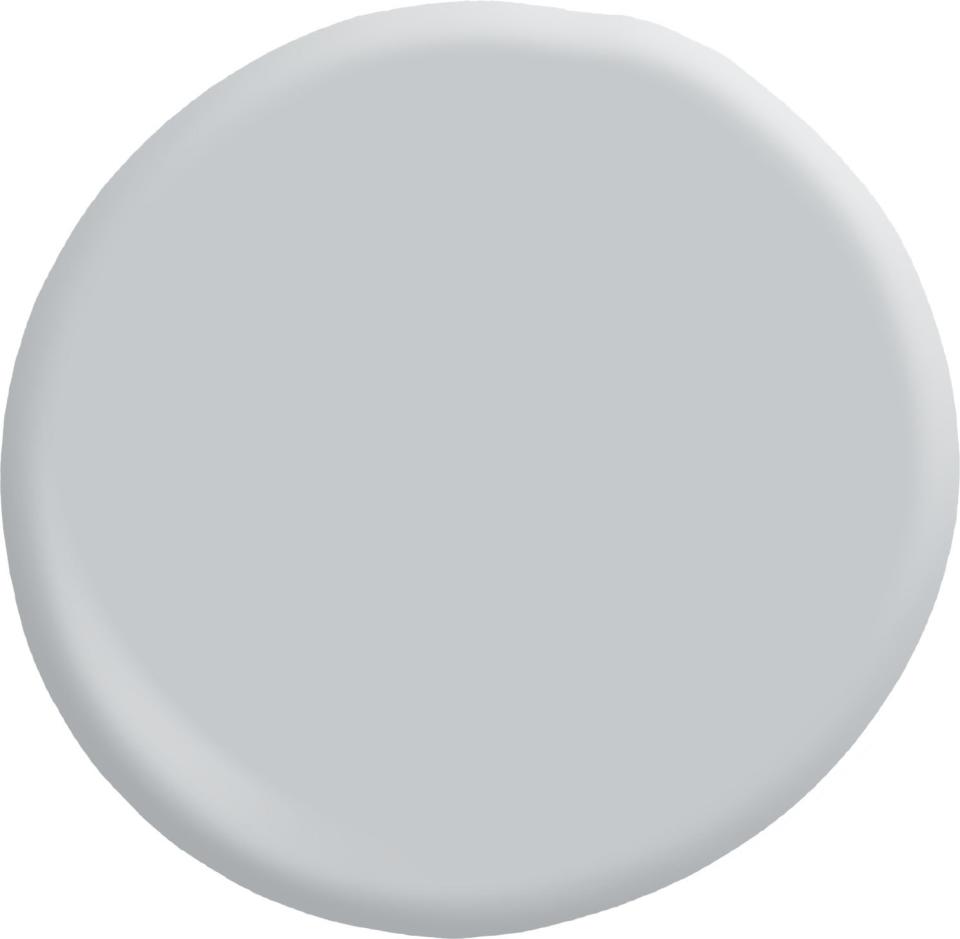
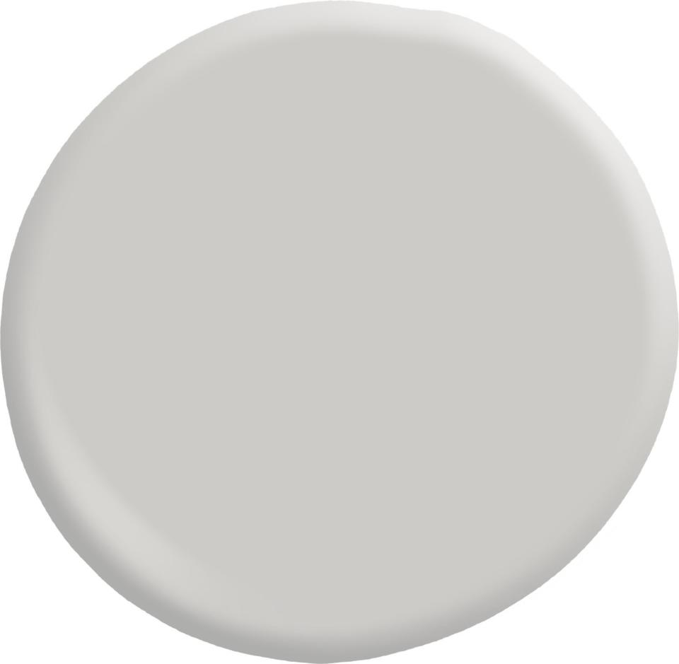
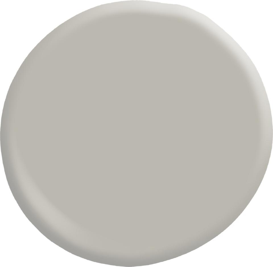
4005-1B Gravity, Courtesy of Valspar
Gravity
Gravity is a cool gray that’s right on trend—in fact, it was one of the company’s colors of the year for 2016. Valspar suggests using it in a palette with blue-grays and navy.
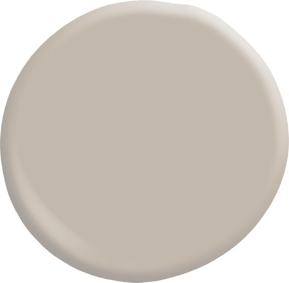
2006-10B Gallery Grey, Courtesy of Valspar
Gallery Grey
If you’re looking for a warmer gray, Gallery Grey could be your perfect shade. The paint looks great with chocolate tones, sandy pinks, and pale blues.
4003-1B Filtered Shade, Courtesy of Valspar
Filtered Shade
Filtered Shade is another of Valspar’s most popular warm whites.
6005-1B Villa Grey, Courtesy of Valspar
Villa Grey
Villa Grey compliments shades like minty greens, soft lilacs, and leathery browns.
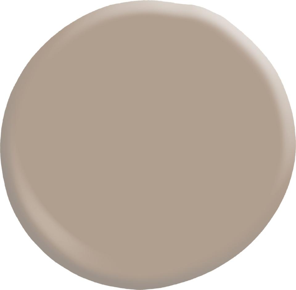
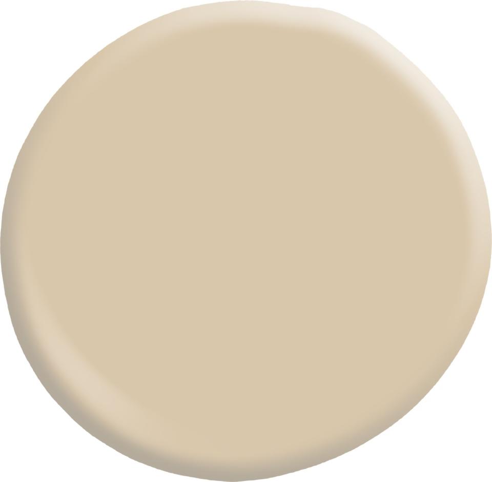
2007-9C Woodland Stone, Courtesy of Valspar
Woodland Stone
Woodland Stone, an orange neutral, has a rustic beauty that would complement natural materials such as linen textiles and sisal rugs.
7002-12 Quail Egg, Courtesy of Valspar
Quail Egg
Quail Egg is a warm white that would look beautiful in a kitchen or bath.
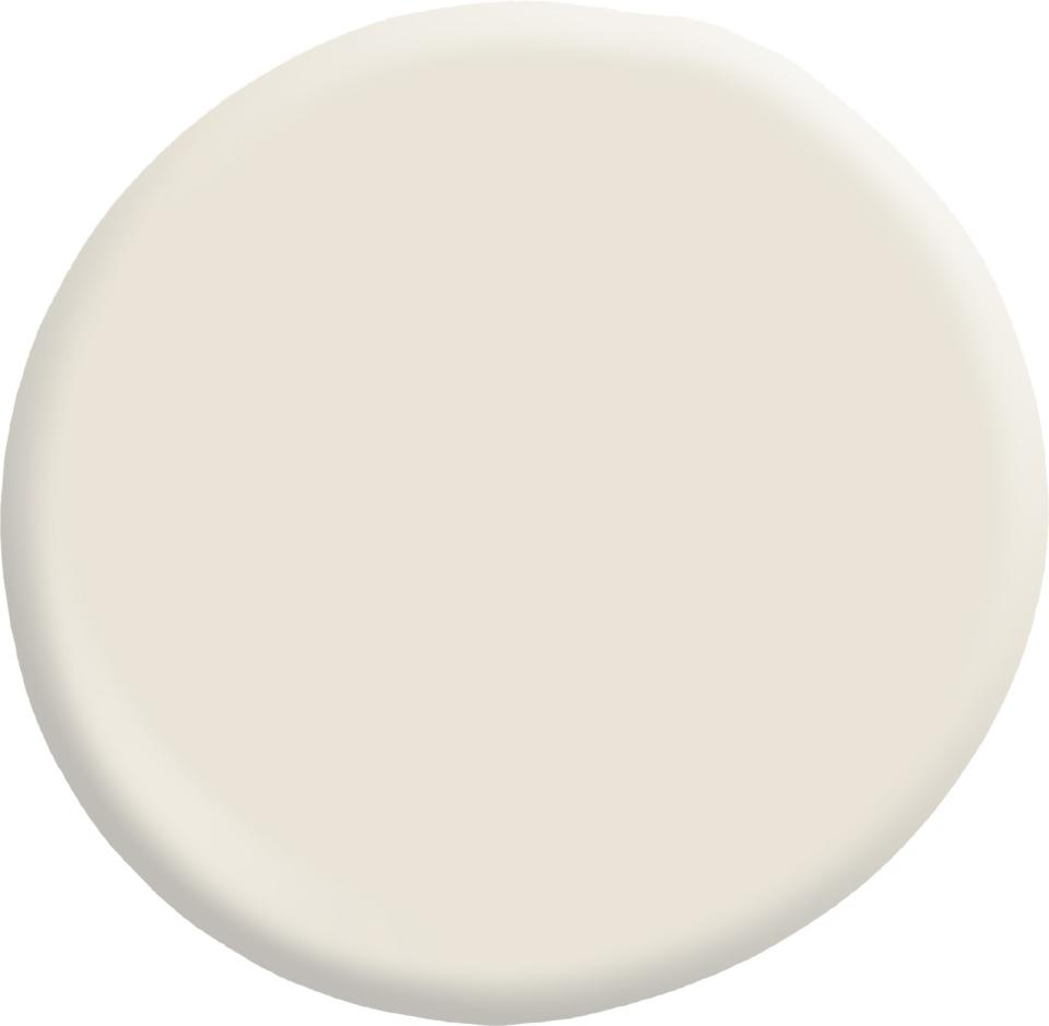
3005-10B Gardenia, Courtesy of Valspar
Gardenia
If you want to create a cozy family room or refined dining room, give Gardenia a try.
6004-1B Soulful Grey, Courtesy of Valspar
Soulfull Grey
Soulful Grey is perfect for living rooms, bedrooms, and even nurseries. It also is the perfect partner to Du Jour.
Related: AD’s Guide to Decorating with Color
