The Top Paint Trends of Autumn Are Here—Just in Time for a Fall Refresh
Break out your paintbrush!
Swapping out all your furniture or diving into a remodel can certainly make a splash, but both can be consuming and costly. Painting, on the other hand, is one of the quickest and most affordable ways to give your home a proper refresh. Even the slightest paint transformation can totally change the spirit of a space while adding a touch of modernity. Whether you've been toying with the idea of repainting for a while or are simply craving an impactful home makeover, try one of these top paint trends for fall 2022.
:6 Top Home Decor Trends of Fall 2022
Contrasting Black and White
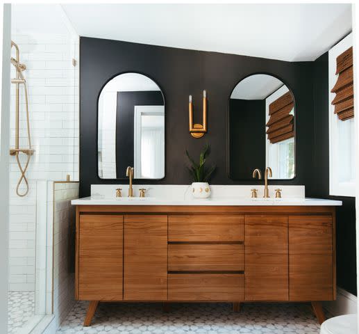
For polished sophistication, lean into a contrasting black and white color scheme. "The black and white trend isn't going anywhere," says Ashley DeLapp, founder and principal designer of Ashley DeLapp Interior Design. "I love using a soft black—like Benjamin Moore Wrought Iron—to really make a room pop. It's great as an exterior paint color, painted on a dining room ceiling, or in a bathroom with lighter wood tones."
Interior designer Sandra Asdourian agrees, noting that the density of black offers a sense of grounding and permanence. Contrasting with a crisp white adds lightness and creates balance.
Rosy Brown
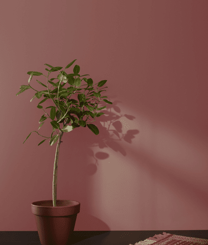
If black feels a bit too severe for your taste, try painting your walls a rosy brown hue instead. "This color is grounding and down to earth and signifies comfort, maturity, and strength," says interior designer Margarita Bravo. "This color would be fabulous in wallpaper or as an accent color in your office. You can also put in an accent rug to draw this color in."
Soft Earth Tones
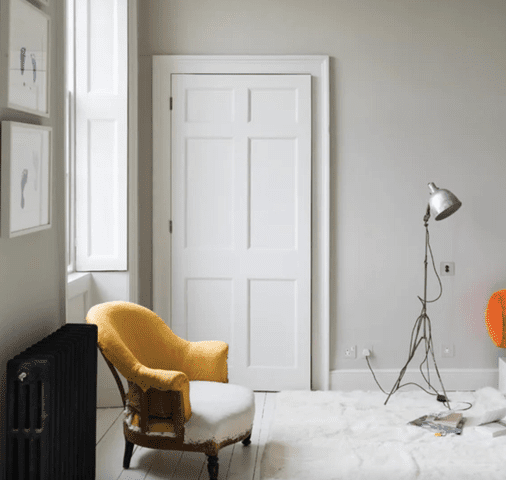
On that note, soft, earth-inspired hues are very much on-trend for autumn. "The palette we are seeing for fall 2022 is all about natural tones that reference a new kind of coastal warmth," says celebrity interior designer Thom Filicia. "It's no longer just about the summery bright white with coral and aqua. Think shades of sand, blush, soft grays, inviting taupes, and rich browns."
L.A.-based interior designer Jaqui Seerman seconds this trend, calling out rich taupe a la Farrow & Ball's Skimming Stone as one of her favorites for autumn. "Its deeper tones create a dreamy bedroom suite that's still light enough for late fall mornings," she says. "We love this as a full envelope moment—paint your ceiling, walls, base, and casings for a modern twist on an early '90s classic."
Pale Purple Accents
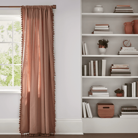
Painting your walls a pale purple can instantly soften a space and foster serenity. Bravo says, "In this crazy world we live in, this color grounds and soothes us." To avoid going too sweet, she recommends using this color for accents. Try it on a singular wall in your bedroom, give an old piece of furniture a fresh makeover, or simply introduce the hue via throw pillows and blankets. For the perfect pale purple, try Valspar's Gentle Violet, one of its 12 colors of the year for 2023.
Soft Blue
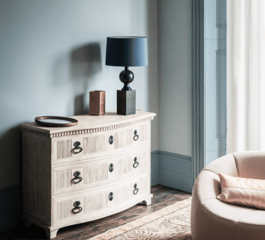
Along with pale purple, soft blue is enjoying some popularity. It's a more neutral alternative to the former, and tends to work best in bathrooms. Bravo says, "This color inspires the elements of water and air and brings a sense of wellness." Consider painting the entire bathroom pale blue, or just the cabinets for a simple makeover. Easier yet, Bravo says you can incorporate soft blue accents with bath mats, towels, or art. Check out Breath of Fresh Air by Benjamin Moore or Bluebird by Paint & Paper Library.
Saturated Hues
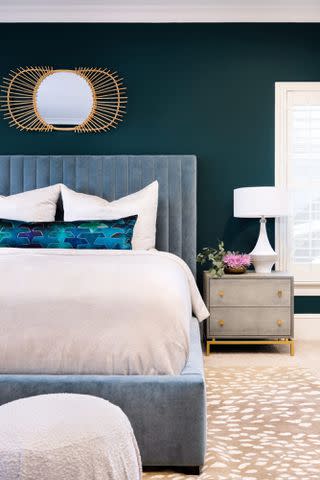
While pale paint colors are trending, saturated hues are enjoying popularity, too. Think rich and earthy greens with complex undertones and bold, dark blues. "I think people are trending toward saturated colors again to make their spaces stand out," DeLapp explains. She adds that these bold colors work particularly well in a dining room to add drama or in a bedroom to create a moody vibe. Her favorite is Benjamin Moore's Polished Slate.
Warm Cream
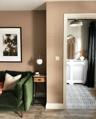
A warm and creamy hue—like Happenstance by Portola Paints—feels modern but will also stand the test of time. "It looks great with everything and is an easy backdrop to curl into as we ease away from those warm summer nights," Seerman says. For a chic tone-on-tone statement, she recommends pairing warm cream with trims and casings in Dead Salmon by Farrow & Ball.
