After a Tragic Fire, This Barcelona Apartment Was Rescued by Color Blocking
When Marta Klinker and her family decided to purchase an 800-square-foot pied-à-terre in Barcelona, Spain, the California-based interior designer channeled the work of architects Andrea Serboli and Matteo Colombo of CaSA as inspiration. Being a native of Barcelona—where CaSa does much of its work—Marta felt connected to their style. “Then, unfortunately, the work was lost with the fire,” Andrea says.
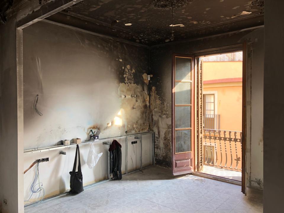
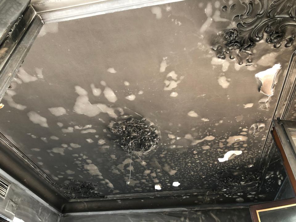
As Marta was renovating the property, an explosion occurred. Some of the apartment’s antique details were destroyed, as was much of the modernized work that Marta was overseeing. The budget, too, was equally in shambles. After a year had passed, Marta called CaSA from California asking if they could fix the damage that had been done. “We didn’t have details of what exactly happened, but when we arrived, the property was in bad condition,” Andrea continues. “It was partly charred and blackened with cracked windows and stained floors. Most of it was empty with installations that were halfway done.”
Andrea and Matteo opted to take on the challenging project in concert with Marta—looking to find inspiration in the midst of a disaster. The biggest challenge? Creating a lively yet calm oasis, while committing to a very tight budget. They couldn’t touch the layout or swap the previous installations, and they needed to find a way to repair or replace the charred materials as they stood. Andrea, Matteo, and Marta also agreed that historical features, like the high ceilings and their decorative details, had to stay. “Nevertheless, we wanted to change the use of the spaces, and their meaning,” Matteo says.
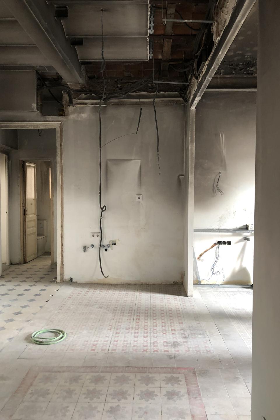
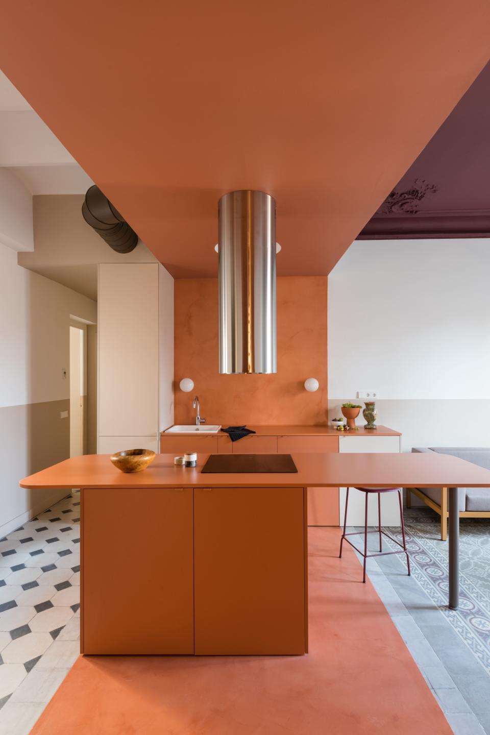
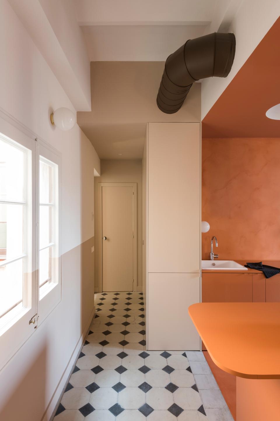
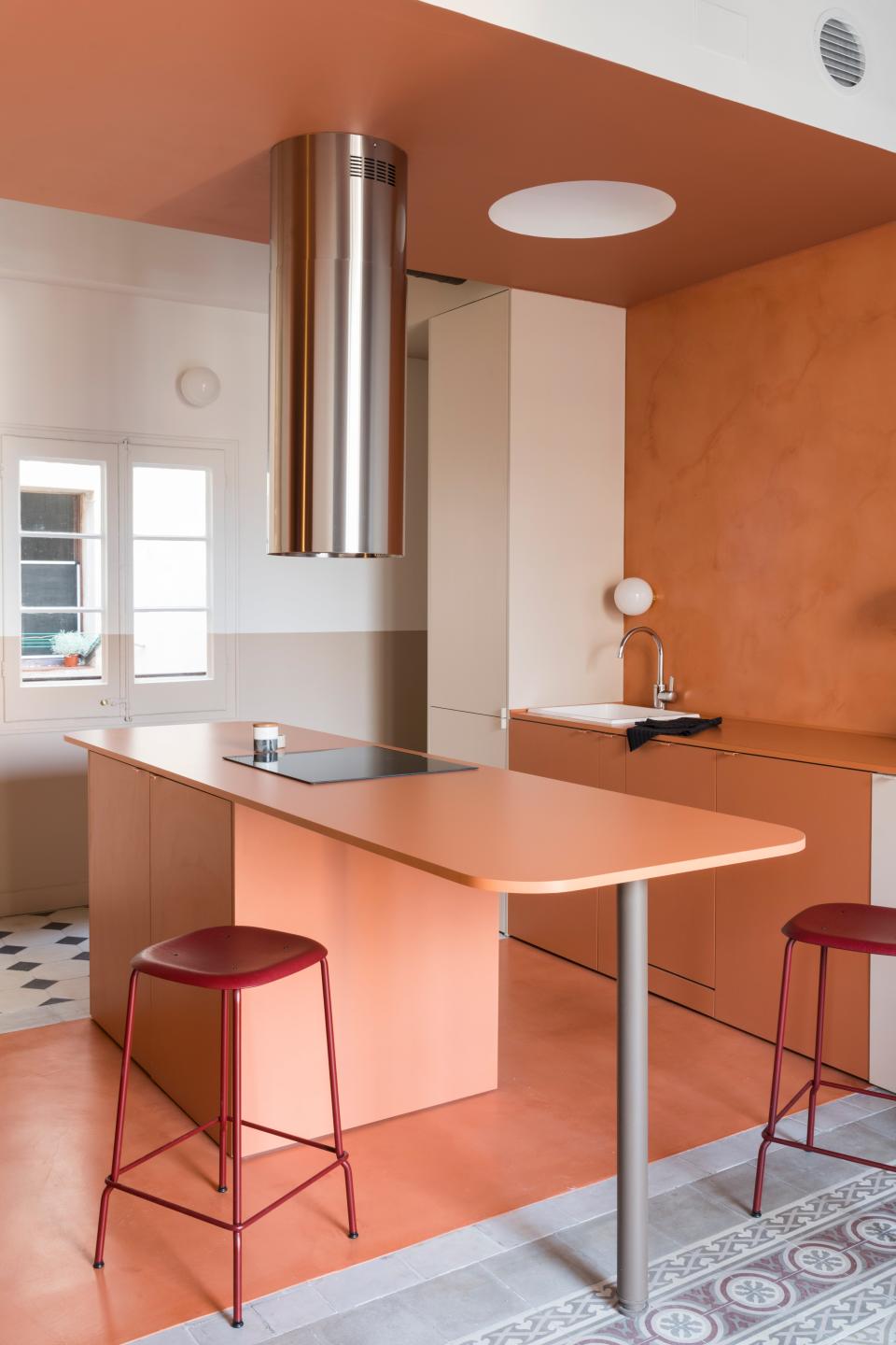
Thankfully, the existing apartment already included an open-concept kitchen that blended in with a living space, as well as two bedrooms and a bathroom that were enough for the family of four. But that was it for silver linings. The entrance, kitchen, and living area had a patchwork of five different flooring materials, and the kitchen’s ceiling had a clunky structural beam on one side. Andrea and Matteo wondered how to effortlessly unite the central areas of the home, while also complementing the private ones. That’s when they came up with the idea to color-block, specifically around a bold terra-cotta shade.
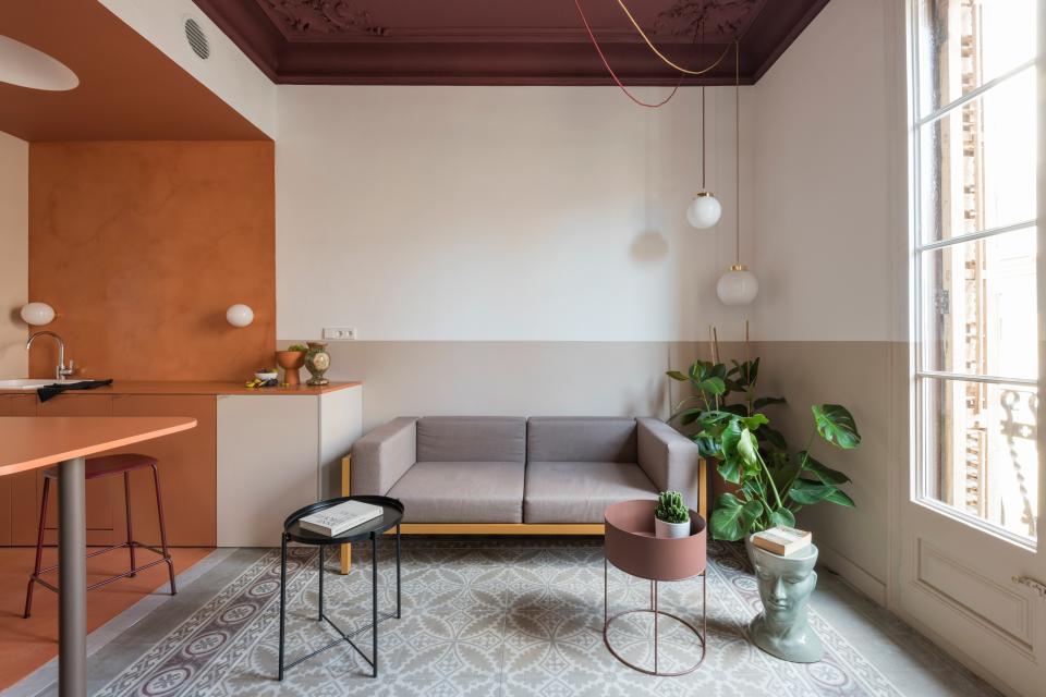
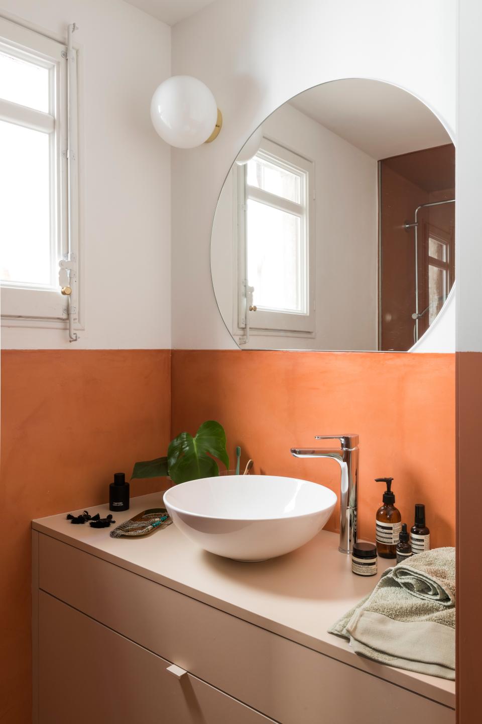
“We came up with terra-cotta as an inexpensive solution for the kitchen countertops,” Matteo says. “We found this color in formica, and it did not look like a laminate. So we decided to use it as a color-block in the kitchen and living area, to order the rest of the space.” The duo covered the patchwork floors in microcement to further highlight the rich color, and then used the same material on the backsplash. And to bring in a little dimension, they looked for lightly contrasting hues to use on the surrounding walls for a unified finish. A matching island doubles as a dining table, and its position under a striped ceiling was intended to make the room feel longer.
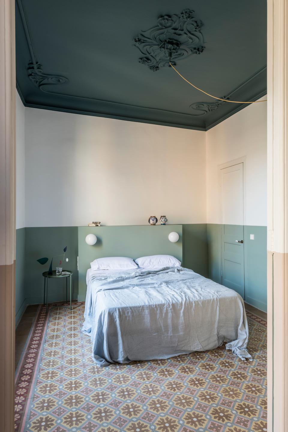
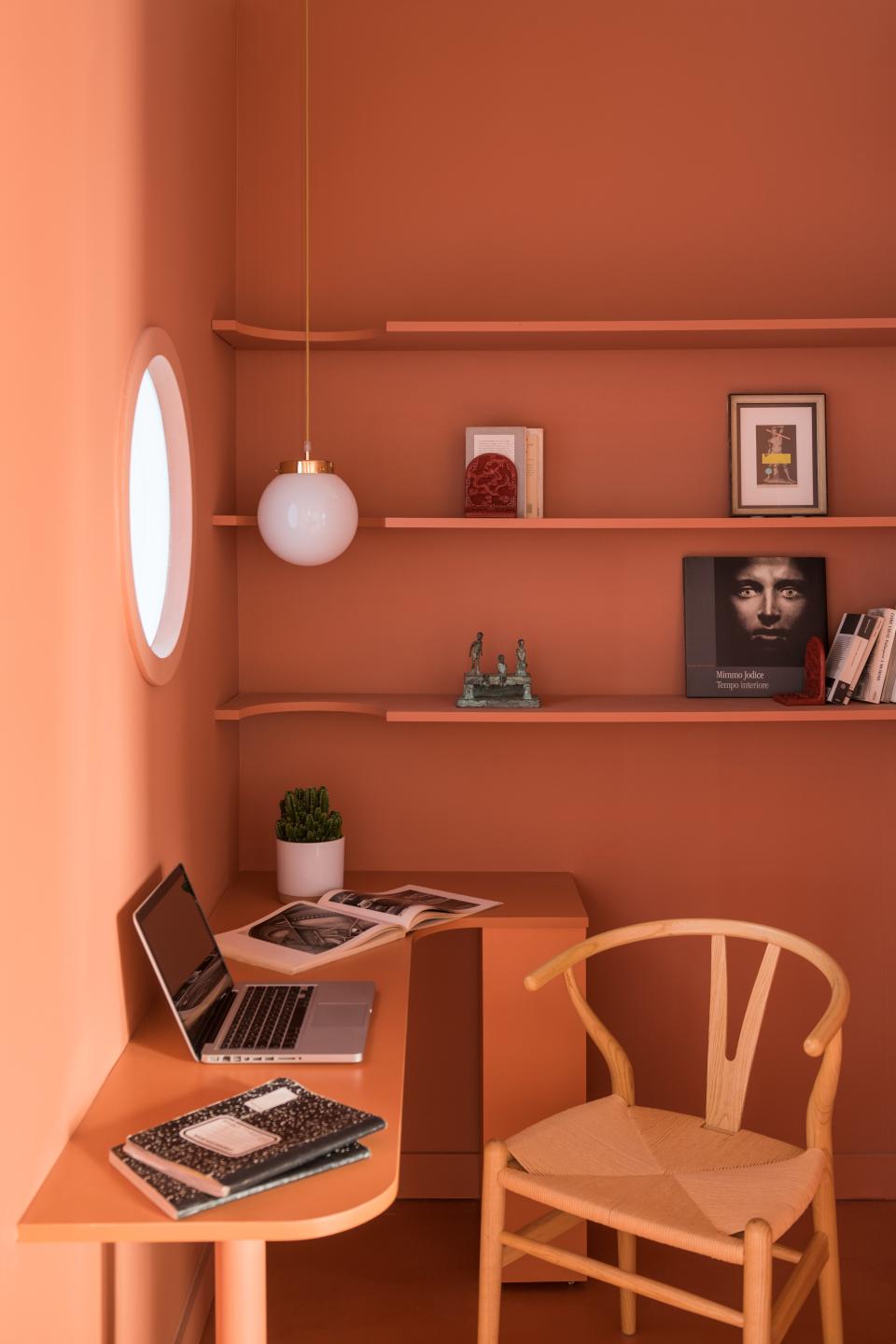
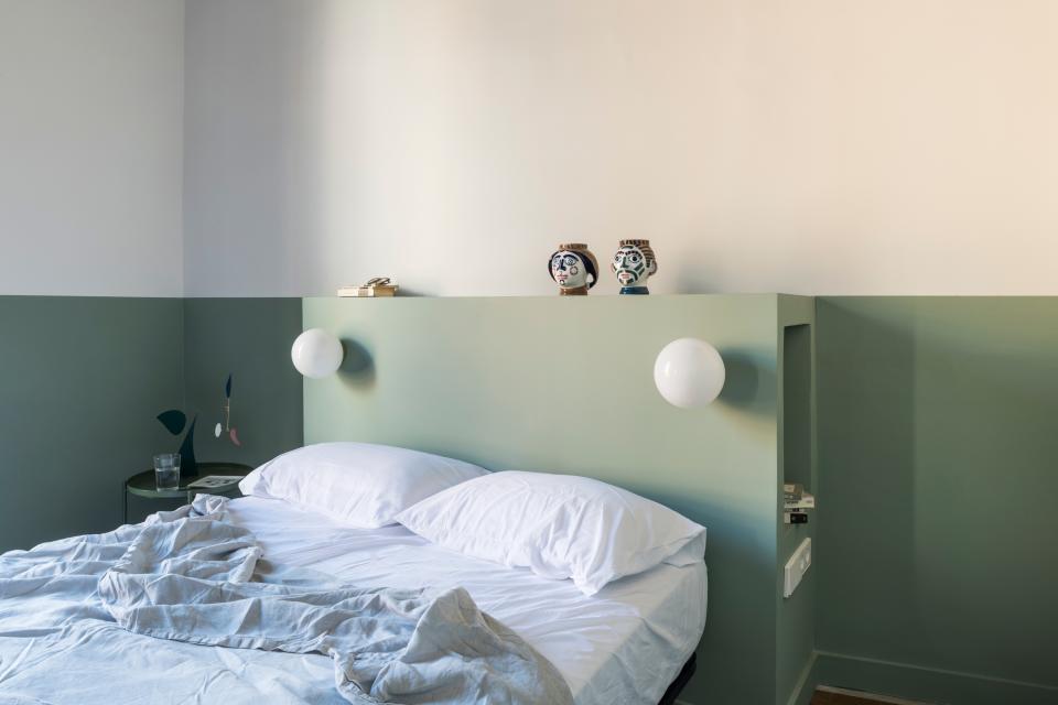
Off the kitchen sits a small area that the team refers to as a “studio,” which features a desk and shelving in the same earthy tones. The adjoining living area, on the other hand, is a structured blend of dark blush and green. The green ties in with the mint hues used in the bedrooms, and all three spaces have a two-toned color blocking that is seen as a “horizon.” Much like the visual effect in the kitchen, this detail helps the rooms appear wider, Andrea notes. “We opted for burgundy on the living room’s ceiling and a dark teal on the bedrooms’ ceilings to enhance the original features of the plaster motifs,” he adds.
In the end, the project was finally completed last August, and Andrea and Matteo had everything to do with its success. “She came to us for help,” Matteo says. “We like to think that this is a special place, because of all the color.”
Originally Appeared on Architectural Digest

