True story: It took me nearly 4 years to learn how to turn off my car radio | Opinion
In my somewhat narrow world, knobs have always been for turning.
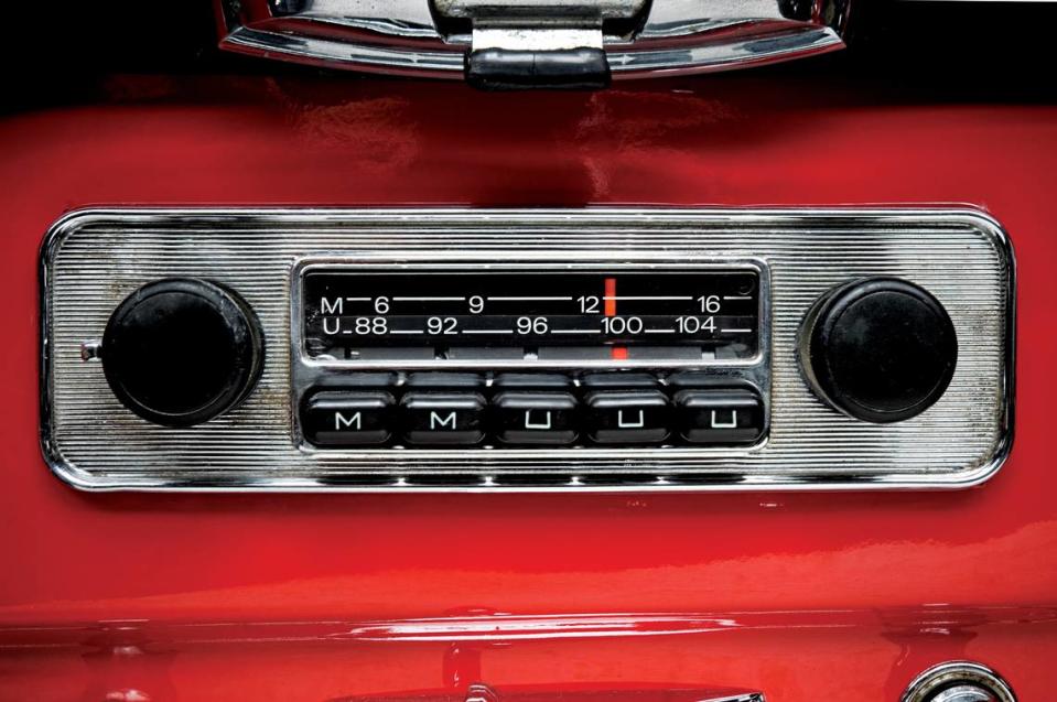
So when I got a Chevy Bolt, I turned the radio knob all the way to the left, expecting it to shut off. It didn’t.
I rationalized that it must be some odd quirk common to electric cars — which I now realize made absolutely no sense — but I lived with it by turning the volume all the way down when I wanted silence.
This went on for nearly four years, until I happened to be a passenger in a (non-EV) Honda Accord and watched the driver push the volume knob. Viola — no more music!
A few days later, I was back in my own car and noticed the Bolt radio knob looked exactly like the Honda’s. I pushed it and ... silence.
It’s not me. It’s the designer.
Initially, I blamed my mechanical ineptitude on my boomerhood.
If I have a hard time turning off the subtitles on Hulu, shouldn’t it stand to reason that I might also struggle to turn off a radio?
But then the title of a book popped into my head: “The Design of Everyday Things” by Donald Norman, who is a cognitive scientist and usability engineer.
This is a book that sat on my shelf for years.
Occasionally I would pick it up, but never managed to get past the first couple of chapters. Eventually, I gave up and donated it somewhere.
But its fundamental principle stuck with me. It’s well summarized on a website called 4 Minute Books: “You’re not stupid if you can’t figure out how to use a product; the designers just did a poor job designing it.”
In other words, it’s not me. It’s them.
Things like doors, coffeemakers, stove tops, remote controls, vacuums, automatic cat litter boxes, aerosol cans, laundry detergent pouches, chainsaws, cell phones and, yes, car radios can all be victims of poor design, leaving users in a state of hair-on-fire frustration.
OK, but what about the user manual?
Unfortunately, the user manuals that come with such devices can be worse than the actual products.
Here’s what the manual for the 2019 Chevy Bolt has to say about the radio knob:
“Turn to increase or decrease the volume. Press and hold to enter the Clean Screen Mode. The radio will be in a low power mode with infotainment display turned off. Press to cancel the Clean Screen Mode or to mute/unmute the audio when the system is on.”
Huh? Couldn’t it just say, “Press (or push) the volume dial to turn the radio on or off”?
This symbol is not in my universe
l should note that the radio volume knob is marked with an intriguing little symbol:
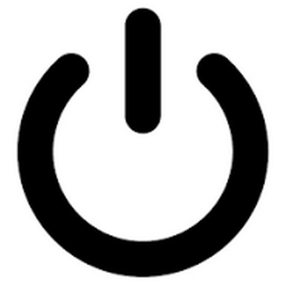
This is the universal symbol for power — an on/off button, if you will.
I have a few questions: When did this symbol become universal? How many people are in this universe? And did somebody forget to tell me about it?
Hamburger hell
Here’s another example of a symbol that was lost on me: The “hamburger icon,” which is often used to designate hidden menu options on websites.
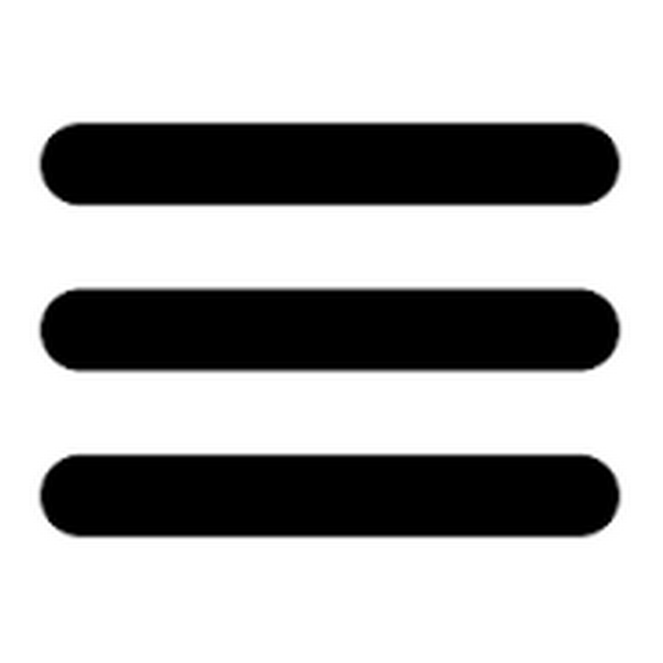
Does this look anything like a hamburger?
No, it does not — which explains why I was so flummoxed at a recent training session when the presenter spoke about the “hamburger” on the screen.
There is no rounded bun topped with sesame seeds. No lettuce hanging out. No French fries on the side to give us a clue.
If anything, it looks more like a sad bologna sandwich on two thin slices of bread — the kind 1950s moms packed in school lunches. (Sorry moms.)
At one point, there was even some debate in computer circles over whether the hamburger icon was a good idea.
Josh Constine, a former editor-at-large at TechCrunch, wrote a 2014 article headlined, “Kill the Hamburger Button.”
“That little three-lined button is the devil,” he wrote.
True, his argument had nothing to do with the fact that three lines look nothing like a burger. He was anti-burger because he thought it was “bad for engagement.”
“Any navigation options you hide behind the hamburger will be forgotten, or at least used a lot less,” he wrote back then.
Apparently, he lost that battle because the hamburger is still around.
So is the universal “on-off” symbol.
Look for it wherever car radios are sold.

