Kathryn McAdams Goes Glam in a Trusting Client's Marietta Home
You can never underestimate the significance of a client with an infinite amount of trust. “I was so excited,” says designer Kathryn McAdams, co-owner and lead designer of Atlanta’s Meriwether Design Group, about the home she recently designed in Marietta, Georgia. “It's not that they never said no to an item, but they were always open to the process. The overall look is almost exactly what I originally presented.” The key ingredient in the relationship? “I think this came down to me listening and learning who they are and what they wanted from their house,” she says. In this family home, McAdams was able to get more adventurous choices across the finish line simply by keeping the channels of communication open.
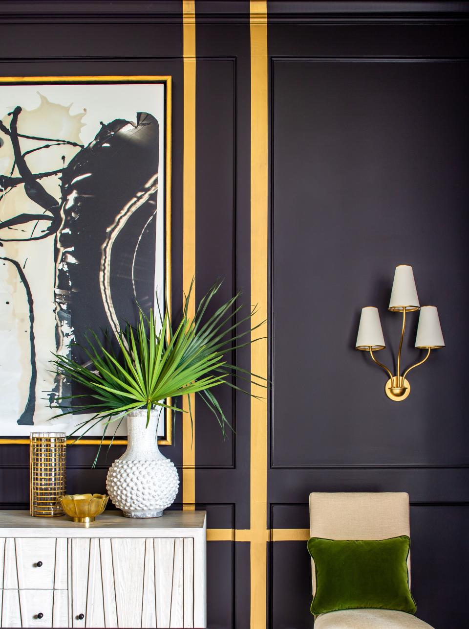
This dining room feels very urbane for the suburbs. How did the design come about?
It all started from the lighting fixture and the drapery pattern. [The homeowner] is a little bit glam, and she wanted a sexy black dining room that reflected her personality. I designed the paneling, but felt like the room needed something more. It was fun because she really trusted me to push the envelope.
You’re talking about the gold stripe detail.
Yes. I had been really dwelling on the idea of painting a metallic zigzag around the room, but it took some guts to call her on Saturday, about two weeks before the project was scheduled to be completed, and ask, “Hey, can I paint some stripes on your perfectly finished wall?” Most people wouldn’t say yes, but once I presented the idea, she really got the vision. I wanted to create some interest and depth, and this was totally unexpected. We weren’t playing it safe. The paint even has some real gold in it, so it is really glam.
How did you balance that kind of drama throughout the house?
We made such a big statement with the dining room. I tried to create a space that would excite the homeowners when they walk by it each day, so we needed a visual rest. My goal when designing the keeping room was to keep it relaxed and easy to live in. In terms of palette and finishes, the room is open to a lot of different areas in the house, which is why it features mostly neutrals, giving it a calming effect. But between these two rooms, there are several connecting touches, including the use of statement art, the addition of architectural paneling, and the large-scale lighting. These details help the rooms relate without creating the same feeling in the spaces.
What do you think ultimately made this house come together aesthetically?
I'm grateful that my clients had me come in early enough in the building process to help shape the function and aesthetics of the rooms. Not only were we able to make the right architectural choices, but we were able to change things that would have been impossible to alter later on. For example, the keeping room was originally meant to be the TV/hangout area because of the size. When I took a look at it in the plan, it made all the sense in the world to switch the spaces and make the keeping room a cozy spot for the family to curl up together in, while the current open-plan living room was much more suited to use for after-dinner drinks and larger gatherings. Those kinds of changes can make or break a project.

