Are You Using the Right Shade of White Paint?
The fashion world might declare white after Labor Day a no-no, but in interiors, the color is a design staple 24/7, 365 days a year. "It’s timeless, it’s trendless," says designer Leanne Ford, host of HGTV’s Restored by the Fords. "Trends come and go, and white is on an entire plane by itself." That's not to say decorating with the neutral hue is easy; white might go with everything, but certain shades of it will look better or worse depending on what else is going on in the room. This is especially true with paint. So, which white should you choose? Leanne recently partnered up with paint company PPG to highlight three white paint colors she loves, and where you should use each:
1. PPG Pure White, a true white
PPG Pure White in action.
If you're one of those lucky people living in a place with lots of natural light, Pure White is for you. It's a perfect middle-of-the-road shade: not blue, not yellow, just white. Because it's so bright, Leanne says painting the walls this hue will make it feel like daylight no matter the time of day, an especially lovely quality when it's winter and gets dark at 5 P.M.
2. PPG Natural White 50YY 83/029, a warm white
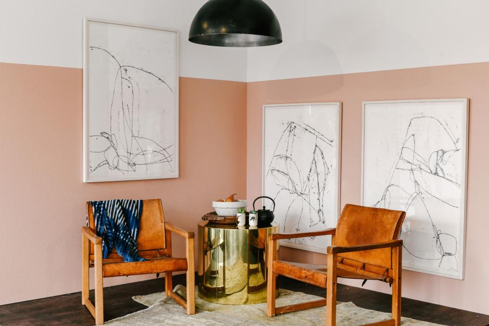
PPG Natural White pairs perfectly with similarly warm-toned PPG Londonderry Coral, in case you were wondering.
Don't confuse this shade with the dreaded yellow-tinged "renter's white" every apartment seems to be doused in. With whites, says Leanne, the smallest change in tone makes a huge difference. "There's renter’s cream, and it’s dingy and dumpy and depressing, and the tiniest difference of a tint makes it cozy and warm," she explains. Natural White is one of those good warm whites. Leanne recommends using it in a minimalist space that's in need of some homeyness. Add dimmable lights to up the hygge factor even further.
Pssst . . . if you are dealing with renter's white, Leanne has a story for you: "When I lived in this little tiny house in Nashville, it was all renter’s cream; it was so dumpy. What I did was paint the walls bright white but keep the trim and doors as is. The bright white made the renter’s cream look warm and buttery. It’s the best renter’s hack I’ve ever done."
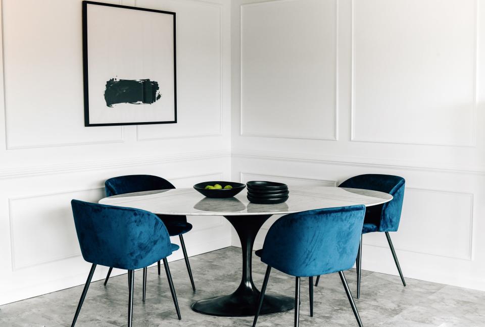
3. PPG White On White 30GY 88/014, a cool white
PPG's 2019 Color of the Year, Night Watch, really pops in this living room thanks to cool white molding.
Blue undertones give white a more formal feel, says Leanne, so White on White is great for lending gravitas to a dining room or a big vintage cabinet. Small-space dwellers take note: This airy shade also makes dark, cramped rooms feel bigger and brighter. Leanne suggests warming it up just a bit with mixed metals and natural wood details.
Now let's talk application. "My biggest trick is to bring in texture on the walls," Leanne says. "White drywall can feel stark, but not whitewashed wood or white brick, where you're keeping that texture and painting over it. I also love painting old doors and seeing the chippy old paint come through, seeing the levels, the dimension." Then there's the sheen to play with. "I’m kind of an extremist when it comes to design. I’m either all into the flat, matte finish or I go to the ultra-high-gloss finish. They live really well together, too," Leanne says. "High gloss makes it modern; matte makes it more traditional and classic." We can't believe we ever considered white to be boring.

