The Venn Diagram: How Circles Illustrate Relationships
There are lots of ways we can represent data in visual ways: a bar graph, a pie chart, an interpretive dance if you're into that sort of thing. But one fun way to present information is through a Venn diagram, which tells you the ways in which things are different and similar by placing them in overlapping circles.
What Is a Venn Diagram?
Venn diagrams, also known as a set diagrams or logic diagrams, visually represent the relationship between two or more subjects consisting of two or more circles that overlap in the middle.

The classic two-set Venn diagram consists of two circles, but you can compare more than two things with a Venn diagram: a three-set Venn diagram has three overlapping circles, a four-set has four overlapping circles and a five-set Venn diagram has five.
A Venn diagram shows the similarities and differences between items in a data set. The shared characteristics go in the center of the intersecting circles, and all the elements that are different go in the outer circles.
History of Venn Diagrams
The use of Venn diagrams was first formalized by English philosopher and mathematician John Venn, who wrote a paper in 1880 entitled "On the Diagrammatic and Mechanical Representation of Propositions and Reasonings."
In this paper he suggested that formal logic could be presented in diagram form using what he called Eulerian circles, or Euler diagrams (after Swiss mathematician Leonard Euler), which are actually a bit different from what we now call Venn diagrams.
While it's certain Venn wasn't the first to use overlapping circles to represent the relationships between data sets — and he didn't purport to have invented them — people began to refer to them as "Venn diagrams."
Venn Diagram Example
A Venn diagram is possibly the easiest type of diagram to understand — you can look at it and immediately see what's going on.
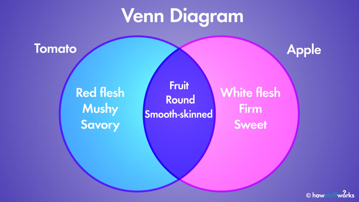
Let's just say you want to make a Venn diagram looking at the relationship between tomatoes and apples. First, you'd just make lists of descriptive terms about each:
A tomato is red, mushy inside, red in the middle, round, savory tasting, smooth-skinned and a fruit.
An apple is red, firm inside, white in the middle, round, sweet tasting, smooth-skinned and a fruit.
The next step is to draw two interlocking circles — in fact, you can use as many interlocking circles as you like, depending on how many things you want to compare.
One circle will be the tomato circle — listing all the traits of the tomato inside it — and the other will be the apple circle. The football-shaped place where the two circles overlap is where the traits shared by both will go: They're fruits, round and smooth-skinned.
Outside the middle section, the tomato side will include mushy insides, red in the middle and savory tasting, while the apple side will list the other apple traits: firm insides, white in the middle, sweet.
And that's a simple, slightly fruity explanation of the classic Venn diagram. Time for a snack!
Now That's Interesting
John Venn was also an inventor — he and his son invented a cricket bowling machine.
Original article: The Venn Diagram: How Circles Illustrate Relationships
Copyright © 2023 HowStuffWorks, a division of InfoSpace Holdings, LLC, a System1 Company

