When the Web Was Weird
In 1997, the web got weird.
That was the year designer Ben Benjamin created Superbad.com, a website that was as much performance art back then as it is a functional museum of evergreen web design today. In 2019, the most engaging and vital interactive features on the internet wouldn’t be possible without Benjamin’s work, or that of the other “weird” web designers who came to prominence in the late ‘90s.
Legacy media has dragged its feet and stayed traditional to the point of skeuomorphing, but nowadays, it’s starting to look like that weird aesthetic—capitalizing on the web itself, and how technology has changed our visual and navigational vocabulary—is slowly clawing its way back into the mainstream. Today, weird withstands. Here’s why.

The Birth of Weird
In 1992, Benjamin began his senior year at Earlham College, a Quaker school in Indiana with barely 1,000 students. He earned a degree in psychology, and in his senior year, the college finally got access to the text-based form of civilian internet.
“We had been on ARPANET,” Benjamin says. “Then a friend of mine who was a computer guy was like, ‘We’re getting internet. It’s a big deal. We’re gonna be connected to a lot more computers.’” Like the rollout of Facebook, colleges and universities picked up internet access before the general public.
This first internet had limitations. “It was a big deal, but it was still before the web,” Benjamin says. “It wasn’t visual yet. You could go on newsgroups, and I was looking at chess matches. This was before Mosaic.”

Mosaic, the first graphical internet browser, was released later in 1993. To add pictures and sound to websites, experts found ways to shave off large fractions of data to form new file formats that could be sent over 14.4k modems.
There was still a sizable gap between the release of Mosaic and when regular, non-university-affiliated people got internet access. During this time, Benjamin moved to California, where he attended the Academy of Art in San Francisco. “I was learning to be a graphic designer,” Benjamin says. And something else was on his mind: “My last year of college, the first issue of Wired came out,” he says. “I was really excited about the web.”
With the release of Mosaic for PCs, Benjamin understood that a gigantic new audience was about to get online. “It was a new way for humans to communicate that we’ve never had before,” Benjamin says. “I'm in a position to really explore new possibilities within this new type of human communication. This is amazing."
Benjamin dropped out of art school and got a job at CNET, which launched in 1994. There, he rapidly learned data-conscious, browser-friendly web design. “There’s this mindmeld, where when people [were] trying to figure out how to do something, and there would be somebody in the room who would know how to do it,” he says. “So I learned to make web pages really quickly. And at CNET, we’re pushing to be efficient [and] very consumer friendly: 20K limit per page, keeping files really small, keeping pages really cross-browser compliant for the 90s.”
At CNET, Benjamin learned many of the tricks that he used to make Superbad so visually rich and interactive, but still fast-loading. A 1996 CNET feature on cable modems breaks information into pages by topic, and the intro page weighs in at 40K with the code and images combined. And these thoughtful tweaks worked: By 1999, CNET was one of the most visited websites on the internet.

During his time at CNET, Benjamin learned the limitations and best practices of ‘90s internet, and when he left after a year, he began a freelance career. He read Dr. Lev Manovich’s influential essay “On Totalitarian Interactivity” and wondered if the idea that hypertext—the jump-around interactivity of Wikipedia—only created the illusion of democracy. In Manovich’s essay, he laments the disconnect between traditional visual art and the weak Xerox copy we’ve recreated online. “All classical art was already ‘interactive,’” Manovich writes. “[W]e are asked to mistake the structure of somebody else’s mind for our own.”

Superbad Breaks Through
Superbad began as a simple, related thought. Benjamin worked all day making websites for corporations and other clients.
“How could I do something that’s interesting to me, that more or less follows these rules, that makes it a web page that works as a web page?” Benjamin says. And as a result of his training in psychology, graphic design, and the nitty gritty of web design, Benjamin was uniquely positioned to build this dream project.
“Since it loads really quickly, have it reward people who are just looking at it,” he says, thinking back to that initial brainstorm. “It’s very lush and visual and surprising and intriguing, so it rewards the casual visitor. But then also have it have enough depth and hidden material,” he says. “So casual acquaintance with it or more in-depth exploration both would be satisfying.”
Looking at Superbad today, I’m surprised by how fresh it looks, but it was wildly special in 1997. My slow, rural modem was adequate to to fully explore it in the late ‘90s. Benjamin was building the site’s 200 pages and linking them together at a time when the New York Times homepage was still one static image map of that day’s news, the way restaurants still upload entire PDFs of their menus. The code and this full-screen image map were over 60k, and that was before you interacted.
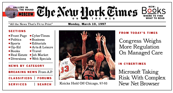
By 1997, HTML had the guts to support elaborate text styles and page structures, but the world’s leading newspaper still relied on a near-photograph of what was above its frontpage fold. Choosing the “low graphics” option took you to a plaintext bullet-list sitemap. And not much has changed: Legacy newspaper sites like the Wall Street Journal and Dallas Morning News have homepages that tip the scales at 2.7 MB and 1.3 MB, not even including images. And these sites look almost identical, with representations of analog newspaper headlines and subheads on white backgrounds. The only legacy site I saw that stood out was the Financial Times, which is pink, like its real-life counterpart.
The innovation Benjamin used—not just on his personal art website, but also as part of the CNET design team—did not trickle into legacy media. In a 1998 scholarly survey by then-Ph.D. candidate Xigen Li for Journalism and Mass Communication Quarterly, Li monitored homepages of three major newspapers over 10 days. Despite its one-image homepage, the New York Times had pictures alongside just 13 percent of its full news stories. “Web newspapers do not take full advantage of the available technology,” Li concluded. Newspapers’ over-reliance on text drove users to wander aimlessly, and not in a good way.
Benjamin understands this balance. Superbad drew a wide audience after it won awards and was featured on MetaFilter-like recommendation sites, and Benjamin received polarized feedback that varied by which pages visitors were looking at.
“Images have broad appeal, they can be interpreted in a wide range of ways, they transcend language—so anyone, anywhere in the world can connect with them,” he says. “The words, it takes longer to build an audience, and they’re not appreciated as much as the images because they take longer to [figuratively] download, decompress, understand? But the audience is more specific and gets it more.”

The Mainstream Catches Up
It’s this idea that finally took hold in online news and feature presentation. Vox News, the SB Nation rebrand-spinoff that launched in 2014, has visual DNA in common with Matt Drudge’s pioneering, contrarian design for Drudge Report from the late ‘90s. In its coverage of Vox’s launch, the New York Times quotes founder Ezra Klein: “We were badly held back not just by the technology, but by the culture of journalism.”
Today, the code for Vox.com is just 300KB, despite its high-impact, high-contrast design. The Intercept is mentioned in the same breath as Vox by the New York Times and has an even more design-forward homepage, which is still just 350KB.
But the Grey Lady herself hasn’t been left behind completely. The New York Times’ online features have won five Peabody Awards since 2008, including for the revolutionary 2012 piece “Snow Fall.” In this multimedia feature, images fade in and out as you scroll and “fall” in a sheet over the screen, all using the simple JavaScript concepts Benjamin and others used beginning in the ‘90s. You never forget that you’re reading the New York Times, but this marriage of text not just with photos and video but with the playful, changing page itself is something new.
Since then, the paper has earned praise for many more interactive features, but these are still sporadic. “Snow Fall” was so influential that art critic Alex Bigman posted a roundup of copycat designs in 2013. On the other hand, my favorite piece of design at the Times is the Style section’s 2018 Royal Wedding FAQ, covered in floating starburst effects, birds, and flowers. “My bosses were cool with the pixel squirrel and stuff as long as we only used Cheltenham [the typeface],” visual designer Tracy Ma tells me over email.
Over time, Benjamin’s maze of interactive art has come back into the mainstream aesthetic. Users of Neopets, MySpace, and LiveJournal could use HTML and CSS to wildly alter their pages, and YTMND, which launched in 2001, pioneered the meme culture of funny, ugly images and bizarre text that we can’t live without in 2019.
Eventually, the media caught up. During a brief period of experimental cover features, Pitchfork wrote about Daft Punk and included animated blockquotes that spliced with zeroes. Polygon, a videogame and culture site, let its belt out a notch for a 25,000-word case study of Red Dead Redemption 2 by a writer known as Film Critic Hulk.
Film Critic Hulk says the process of publishing basically a novella of game criticism and design theory was pretty straightforward. “We really walked through a lot of points inside it,” he tells me over email. “But the discussions were never about length or stereotypical concerns one might assume. It took so much work from so many people and everyone did great art for it, too. But it also felt painless in a way.”
Two pieces really stand out as exemplars of the “weird” aesthetic brought forward in time. First, Jon Bois's 2017 feature “17776” is a sprawling, postmodern story that exploits text effects, infinite scroll, low-fidelity graphics, and the daily seriality of blogs to tell a fictional story. Like “Snow Fall,” “17776” pushed SB Nation outside its content management system to accommodate a sprawling, multipage project with wall-to-wall images and integrated YouTube videos.

SB Nation’s Graham MacAree, then a developer but now editor-in-chief, made the “intro page-exploding sequence,” says Bois over email. “I felt like genuinely surprising people was the best way to suck them in, especially since so much of our readership is made up of sports fans who might not otherwise go for this sort of thing,” he says. Bois coded much of the rest himself.
The second example, a Highline feature on the realities faced by millennials, is a traditional piece of longform reporting set off by a shocking design of pixels, glitches, and a neon CMYK palette. Jason Wong’s eclectic lettering work leads each chapter, and Highline’s creative director at the time, Sandra Garcia, worked from an outline of the final 10,000-word piece.

“I had to lean on what the emotional content was gonna be, and it was gonna be really dark,” she says. “In my background, I do not design things that look like this. I worried, is it too ugly, is it too cheesy? I did not show anyone. It was like my deep dark secret.”
Garcia tells me that trying to balance the dark payload of Highline’s millennial piece with at least some humor was one of the biggest challenges. It’s not satire, but parts are satire-adjacent, and the piece is canny, not pandering, in its appeals to millennial interests. Like Bois, Garcia used the element of surprise as an entry point.
The morning after the package went live, the wave of attention surprised her. “I thought this would go into the bowels of the internet and no one would care,” she says.
I laugh and explain that I’m writing about an exigent website from 1997—the internet’s bowels are way deeper down than anything we’re talking about.

The Rules Will Be Broken
Ben Benjamin tells me he’s been ambivalent to press in the past. “Should I do this interview? Does it ruin it for people to know who I am?” he says. “Early on I thought that, and tried to keep my image off the web. Now I’m like, ‘Who cares, it’s 2019.’”
Besides, Benjamin is shifting away from web design. Early on, he decided he wanted to only work for organizations he believed in, and he’s been able to do that for a long time. But in 2016, he had a crisis of faith.
"I’m designing for the campaigners for these issues, but I felt disconnected from it,” he says. With the support of a fellow “old school internet person” who changed careers, Benjamin began a master’s degree program in counseling in 2017, and he began seeing clients this summer.
His friend “convinced me that marriage and family therapy was a good route, more than just whatever psychology, because it deals with systems in a way that someone that works doing web stuff and technology is gonna understand. It seemed like such a 180° turn from what I was doing,” Benjamin says. “But it was really clear that it was the right path.”
That’s not to say Benjamin doesn’t still think about weird web design and his own importance in the internet’s evolution. He explains my own thesis back to me, but better.
“I’m wondering if it’s like Tim and Eric [Awesome Show, Great Job!] where people are so familiar with different ways of presenting information that, when somebody messes with that, people get it. [They’re] making fun of that.”
“People know the web so well now,” Benjamin says, “that those rules can be broken.”
You Might Also Like
