Expert answers why all beauty brands look exactly the same: 'It's [something] people find very appealing right now'
It feels like we’ve reached a point of no return with all the new skin care brands out there. In the last nine months, more than 18 celebrities have launched their own skin care lines — and that’s not counting influencers or established beauty brands.
Everything that’s come out within the last few years seems to blur together with its minimalist packaging: monochrome containers, simple logos and brand names written in a familiar font.
Prep your skin like a pro for a flawless makeup application:
Turns out, it’s true. Thousands of brands are using the same fonts, style and even text spacing on their products.
Jennifer Carlsson, a Stockholm-based beauty brand strategy consultant, has been into beauty for years. Her master beauty spreadsheet organizes over 25,000 brands listed in different tiers, with information on each brand’s products, packaging, logo style, aesthetic and marketing terms — to name a few of the factors at play.
“I’ve been trying to build an objective database on what brands are doing well, to look at the patterns,” she explained. “Industry insider information is really numbers-based.” Sales numbers, she said, don’t tell the whole story: “I’m looking more at the visuals and presentation of the brands, rather than just focusing on the sales.”
Carlsson said she usually has her spreadsheet open on one of her monitors throughout the day to refer to as she takes calls with clients. With her extensive research, she has the data to back up what distinguishes today’s look.
In September, Carlsson self-published a 22-page report focusing on beauty brand logos and statistics, to single out what makes the aesthetic of most beauty brands so similar.
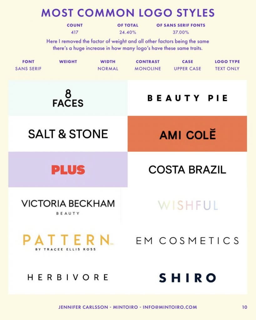
“Designs are very simple compared to before,” she said. “A ton of brands have one color, no patterns, no extra design elements, simple typography and just the brand name or image on the product packaging. It’s clean and simple.”
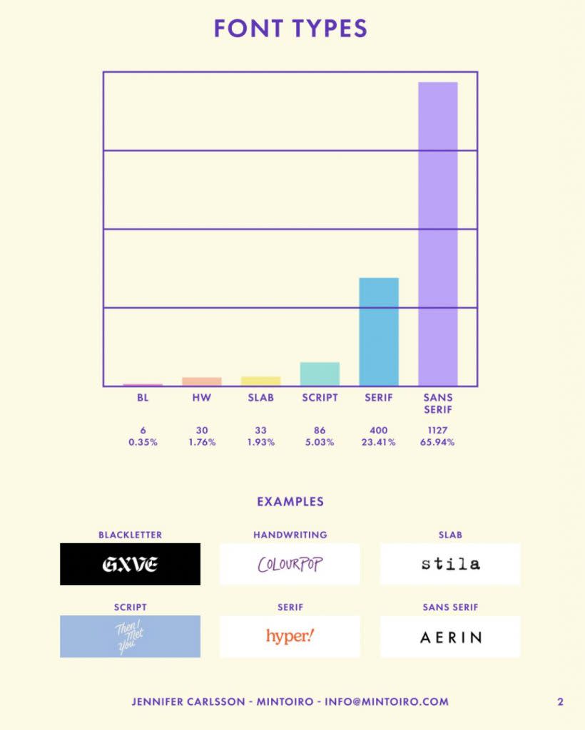
In her study, Carlsson found that 1,127 brands use a sans serif font. The font is typically either normal or bold, with normal spacing between the letters, and 1,055 brands use all uppercase for their names.
In another report, Carlsson credited the start of the minimalist packaging trend to a Swedish brand, Byredo, which was launched in 2006.
“I can find pictures dated as far back as 2008, but they launched in 2006, and I can’t find any indication that they had a different design earlier,” she wrote. “This also seems consistent with many referencing the aesthetic being inspired by ‘Scandinavian minimalism.'”
Carlsson explained to In The Know that this trend isn’t limited to the beauty industry. She said she’s noticed that fashion has adopted a monochrome look and pointed out that website UIs fall into the same minimalist trends beauty brands are following.
“If you look at logos at most companies, you’ll see the same thing,” she said. “Overall, [simple logos are] something that people find very appealing right now.”
Why does everything — packaging, logos, etc. — look the same?
For one thing, a lot of big beauty brands use the same design agencies.
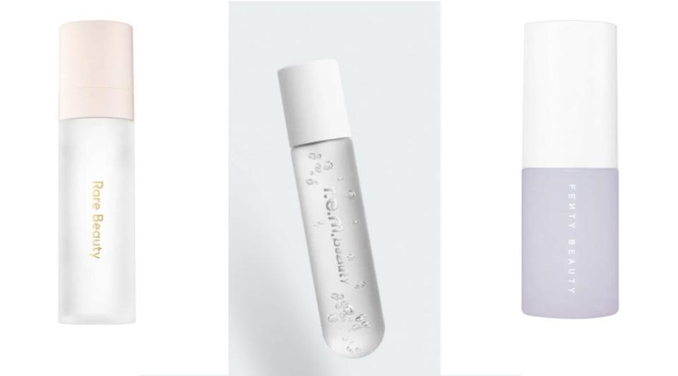
“Fenty Beauty, R.E.M. Beauty and Rare Beauty all are packaging designed by Establish,” Carlsson pointed out. Establish, a New York City-based agency, also works with Beautycounter, Marc Jacobs Beauty, H&M Beauty and Face Gym.
Naturally, when an agency finds success with a certain look or marketing, it’s going to refer back to it for other brands. Another big factor in the transition toward minimalistic packaging is that now, more than ever, people are buying and researching beauty products online.
“The information is on the site, it doesn’t have to be on the packaging,” she said. “So brands can [instead] focus on the design looking really good and being Instagrammable.”
Carlsson concluded from her research that the priorities for packaging involve striking a balance between looking like everything else and standing out. She pointed to the rise of “skinfluencers” — skin care influencers — and “bathroom shelfies” as an indication that brands want to have their products displayed alongside other beauty brands on Instagram. They want products to look similar enough to be included in the photo, but different enough to stand out from the rest of the pack.
“It gets the attention on social media,” she explained. “People see that and [say], ‘I want my bathroom shelf to look like that.'”
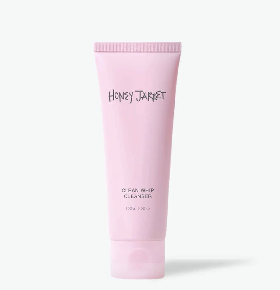
Not every brand is able to tap into the “simple and clean” feel. Carlsson pointed to Honey Jarret, which was launched as a clean beauty brand in 2020, as an example of a brand that tried to go the minimalist route, but didn’t find the same success as other similar-looking brands.
“They didn’t quite get it,” Carlsson said, referencing Honey Jarret’s product packaging and website. “The design is not quite there: The font is weird, the spacing is odd, the logo is just weird. It feels stock image-y on the platform.”
A major difference between Honey Jarret and Rare Beauty, for example, is that Rare Beauty has a familiar face attached to it too — Selena Gomez. But Carlsson doesn’t believe that having a celebrity face trumps the importance of packaging.
“[The] celebrity brand thing is such a big debate within the industry too right now, people miss the point of it. Madonna has a beauty line, Carmen Electra has one — did you even know that?” she said. “With celebrities, they have a lot of money behind them and they can afford to work with the best agencies to make custom packaging and get connections to get their products into Sephora at launch. … But [these brands] would still do well without the celebrity [face].”
Carlsson speculated that a lot of brands assume a celebrity or influencer is necessary for branding, but she argued that the crucial ingredient is having a face that consumers trust.
“We trust people more than we trust companies, and we trust people who are familiar to us,” she explained. “There’s more respect that there’s someone from the industry or a specialist being the person behind [the brand] — just there being someone who is accountable, who they can trust, is more important than [the person] being a celebrity.”
Why do so many beauty brands advertise that they’re ‘clean beauty’? What does that mean?
The “clean beauty” movement is misleading. As of now, there is no specific regulation around what does or does not have to be in a product to be considered “clean.”
To Carlsson, labeling something as “clean” is not as important to the consumer as some brands or retailers may think. To her, “clean” is just a popular marketing term that is ultimately meaningless and, despite what the influx of “clean beauty products” may have you thinking, isn’t necessarily a hit with consumers.
“People just want to know what’s in their products,” she said, dismissing “organic beauty” and “natural beauty” as two other misleading marketing terms commonly used in the skin care industry. “Clean beauty is the worst with greenwashing. Also, none of it has to do with being a sustainable brand.”
Sustainability is huge with beauty consumers. “Greenwashing” means that a company or brand outwardly promotes environmentally friendly initiatives but doesn’t necessarily practice them.
Carlsson does not use “clean beauty” as part of the organizing system in her database. She argues that there’s truly no way of knowing how popular clean beauty brands are.
“If anyone gives you statistics on clean beauty, I’d be skeptical. Who are they counting?” she asked. “Do you include the brands that call themselves ‘clean’ but don’t follow the strictest standard? Do you count brands following the standard but don’t call themselves ‘clean’? And which standard [are they following]? They’re all different and contradicting.”
So, what’s next?
Carlsson doesn’t know how long the minimalist, monochrome designs and logos will be around. But, as she’s noted with multiple trends over the years, there are always outliers that go against the grain and still find their niche in the market.
“With any trend, you’re always going to see people going in a different direction, to stand out from it,” she said.
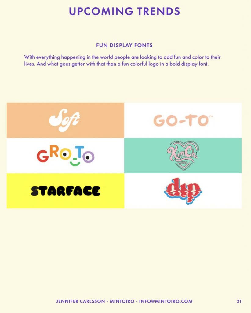
Carlsson pointed to brands like Starface, Topicals and Herbivore as a departure from the simple logo trend, without entirely deviating from the minimalist look. Starface, for example, uses a fun font in its packaging, but sticks to solid colors on its products — mostly bright yellow.
Ultimately, Carlsson argues, the packaging is super important — but not as important as the effectiveness of the product itself.
“Still, what’s important is what’s in the product,” she said. “How much you enjoy the product determines if you buy it again.”
See this Manhattan apartment get an unbelievable maximalist makeover with just $1,000:
The post Why does all beauty packaging look the same these days? You’re not going crazy appeared first on In The Know.
More from In The Know:
Why are people mad at TikToker Mikayla Nogueira? A since-deleted video from 2021 recently resurfaced

