New Yorkers outraged as city tries to replace iconic ‘I Heart NY’ logo
- Oops!Something went wrong.Please try again later.
The city of New York has unveiled an updated version of the iconic “I Heart NY” logo, but native New Yorkers are less than happy about the rebrand.
On 20 March, a committee of elected officials and community members launched the “We Heart NYC” campaign to “inspire optimism and civic action” in a post-pandemic New York City. Governor Kathy Hochul, New York City Mayor Eric Adams, and the Partnership for New York City – a nonprofit organisation composed of corporations and business executives – have spearheaded the campaign which celebrates New Yorkers making a difference.
In doing so, they unveiled the campaign’s “We Heart NYC” logo, a take on the classic “I Heart NY” logo created in 1977 by Milton Glaser.
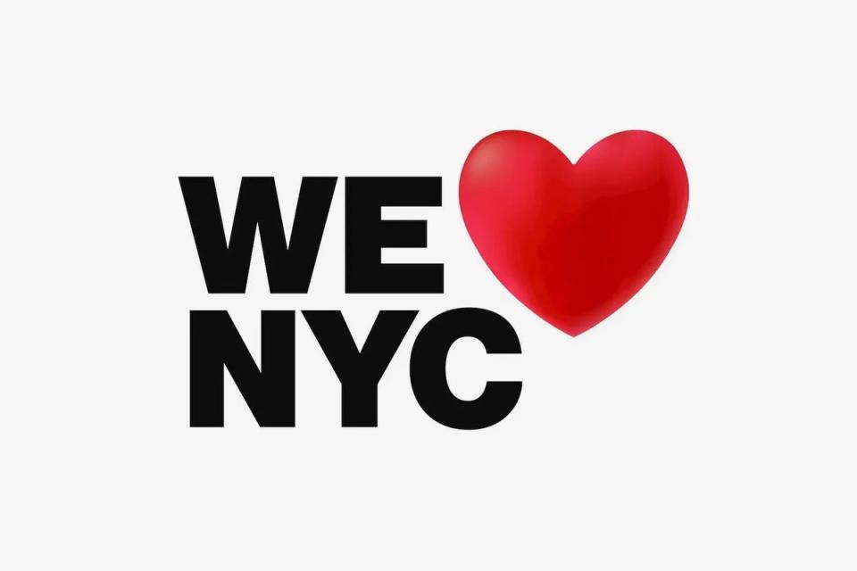
The updated logo features the same black, capitalised letters as the original, but this time opts for a more contemporary sans serif typeface rather than the initial typewriter-style font. According to the New York Times, the new “We Heart NYC” logo was meant to invoke the same Helvetica font used by the city’s subway system.
“We wanted to reference the original mark but push it in a different direction,” Graham Clifford, the art director who oversaw the new logo’s design, told the publication. “The subway system is the veins or the beating heart of the city.”
As for the classic heart at the centre of the logo, this new campaign features a rounded three-dimensional heart that’s almost reminiscent of an emoji. While the original Milton Glaser design had a same-sized heart sitting next to the word “I” and on top of the letters “NY”, the updated version made the emoji-like heart noticeably bigger and floating above the letters “We” and “NYC”.
In addition to the new logo, the “We Heart NYC” campaign will “support the post-pandemic resurgence of the city and its neighbourhoods” – including an Earth Day celebration of the city’s parks, promoting small businesses, and leading community cleanups continuing through 2024.
“This city overcame the darkest days of the pandemic because of the selfless work of everyday New Yorkers, and if each of us gives just one hour a week in an act of service, the result will be transformative,” said New York City Mayor Adams in a statement.
“That is why I am proud to announce the launch of ‘We Heart NYC’, in partnership with Governor Hochul and the Partnership for New York City. The ‘We Heart NYC’ campaign asks everyone who loves the greatest city in the world to show it by lending a helping hand and spreading that love to every block across all five boroughs.”
New York Governor Kathy Hochul added: “This We Heart NYC campaign will help to capture that energy and preserve the city’s spirit by encouraging New Yorkers of every background to come together, get involved, and make a positive change in their community.”
Kathryn Wylde, the president and chief executive of the Partnership for New York City, told the New York Times that the “We Heart NYC” campaign is also meant to “cut through divisiveness and negativity” that accompanied the pandemic. It aims to remind people that “we don’t have to maintain these divisions that have grown up between business and labour and rich and poor.”

Despite the positive efforts behind the campaign, the new “We Heart NYC” logo sparked outrage from New Yorkers who had grown to love the nostalgic “I Heart NY” logo. When New York Times reporter Emma G Fitzsimmons asked her Twitter followers their thoughts on the new logo, she was instantly flooded with a flurry of negative reactions.
“Don’t mess with perfection,” replied the official account for the Bowery Boys History Podcast.
“Milton Glaser got it right the first time,” said writer and actor George Hahn.
“REJECT MODERNITY EMBRACE TRADITION,” read another impassioned tweet.
Don't mess with perfection. pic.twitter.com/LaVELlyGed
— The Bowery Boys Podcast (@BoweryBoys) March 20, 2023
Milton Glaser got it right the first time. pic.twitter.com/aQJolahYOh
— George Hahn (@georgehahn) March 20, 2023
REJECT MODERNITY EMBRACE TRADITION https://t.co/sLZz3fZ3Yd pic.twitter.com/nteypyWEWa
— salma (not hayek) (@saalmakalife) March 20, 2023
Not only were critics fuelled by nostalgia over their hatred for the updated logo, but they also believed the “We Heart NYC” campaign was simply a failure in graphic design.
“Feels emoji-like and lacks anything that feels timeless or iconic,” said designer Scott Belsky. “Why not engage some long-time NYC designers to explore more possibilities?
“My intro to graphic design professor in college would have absolutely dunked on the student that tried to submit this for a grade,” said reporter Rebecca C Lewis.
“Hmm. A third grader could do better,” tweeted author Isa Watson.
feels emoji-like and lacks anything that feels timeless or iconic. why not engage some long-time nyc designers to explore more possibilities?
— scott belsky (@scottbelsky) March 21, 2023
My intro to graphic design professor in college would have absolutely dunked on the student that tried to submit this for a grade https://t.co/DXnigr3uop
— Rebecca C. Lewis (@_rebeccaclewis) March 20, 2023
Hmm. A third grader could do better 🥴
— isa watson (@isadwatson) March 21, 2023
In 1977, Bronx-born graphic designer Milton Glaser was commissioned by the State of New York to promote tourism amidst a rising crime rate, an economic crisis, and high levels of unemployment. Glaser sketched the iconic design with a crayon on an envelope while sitting in the back of a taxi cab. His rough sketch has since become the official symbol of New York, having been printed on thousands of T-shirts, mugs, hats, and souvenirs.
Both the “I Heart NY” and the new “We Heart NYC” logos are owned by New York State’s Department of Economic Development. The new campaign is led by marketing company MaryamB, along with the Founders Agency, Grain Group, and Graham Clifford Design.
