You'll Want to Pin Every Room of This Delightfully Colorful House

For Kelly Finley, owner and principal designer of Oakland-based firm Joy Street Design, color is one of the biggest pulls in a home: ”I love to mix and match patterns, because I think it adds a playfulness,” she elaborates. She was lucky, then, to have clients that loved pattern and color just as much as she did when it came to her newest project, a 1920s Tudor-style build located in Oakland Hills. “They were very receptive to intricate colors, and they didn’t want anything cookie cutter,” she elaborates. “They were open to suggestions to make things lighter and brighter.”
The clients, a young family that had recently moved from Brooklyn to the Bay area, were looking to incorporate some of their roots into the home, while still maintaining a fun, coastal feel. Initially, Finley was contracted to simply design the kitchen, as the clients were dealing with a dull, drab, and not entirely functional one. However, the two soon realized their similar design styles, which led to Finley soon taking ownership of the entire house, all while adding her signature style to the mix.

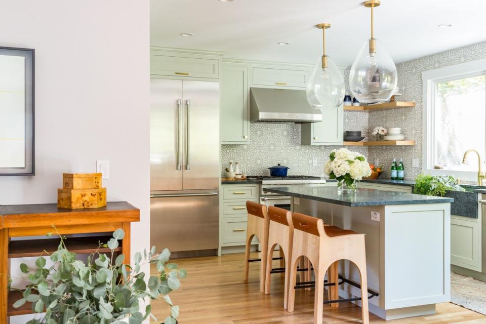
“When we started out with the kitchen, I wanted to add in some fun tile, since the wife loves tile,” elaborates Finley about her inspiration behind the space. “The home gets some natural light, but not enough for a darker color like navy, so we settled into this fun teal instead.” She accentuated the bright color with a gorgeous custom backsplash and jeweled green inset cabinetry, making sure that the various shades played off one another to add emphasis to different features in the space. “I also really wanted to make sure the home could have a semblance of indoor-outdoor living, so the soapstone countertop was extended to the exterior kitchen and dining area, making it a true family-friendly space.”

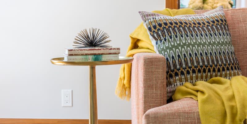
As the lower level had a cornered-off nook that was kind of a family room-come-den, it served as a sort of faux-open floor plan that needed to somehow tie in with the rest of the home. “I used a coral sofa because the showstopper in the dining room, the wallpaper, had bits of coral in it. When you’re in the den, you can see into the dining room, so I wanted to make sure the spaces went together,” explains Finley. “When I match colors, I like to make sure the key colors are reflected at least once, but everything doesn’t have to be the same shade or color. This makes it look cohesive, without being overly matchy.”
Lighting also plays a huge role in the home, with Finley describing it as “the jewelry in a room.” She therefore made sure that she sourced some truly interesting pieces, including the sconces for the kitchen and copper-toned fixture for the dining room. “The ceilings in the home were so high, we had to make sure people’s eyes went up,” she insists. “I also wanted some industrial pieces to make sure the look was updated craftsman, even though we went a bit more West Coast with the color scheme.”
Speaking of color schemes, nothing is as bold as the daughter’s room, which has color, texture, and pattern all at once. “I like to think of color as organized chaos for a kids’ room,” says Finley, who went above and beyond to really have some fun in the space. The teal daybed, for instance, was positioned as such because that side of the home was actually a recent addition to the build—which means Finley had to play with quite an odd room construction in order to make sure it fit everything the daughter desired in her bedroom.
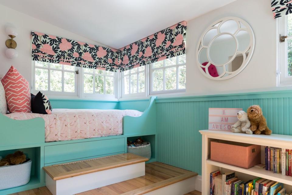
“We used a lot of built-in storage in the bed and shelves to make room for all her toys, and then repeated colors found in the window treatment and bed around the space,” she says. “We chose to compartmentalize the areas.”
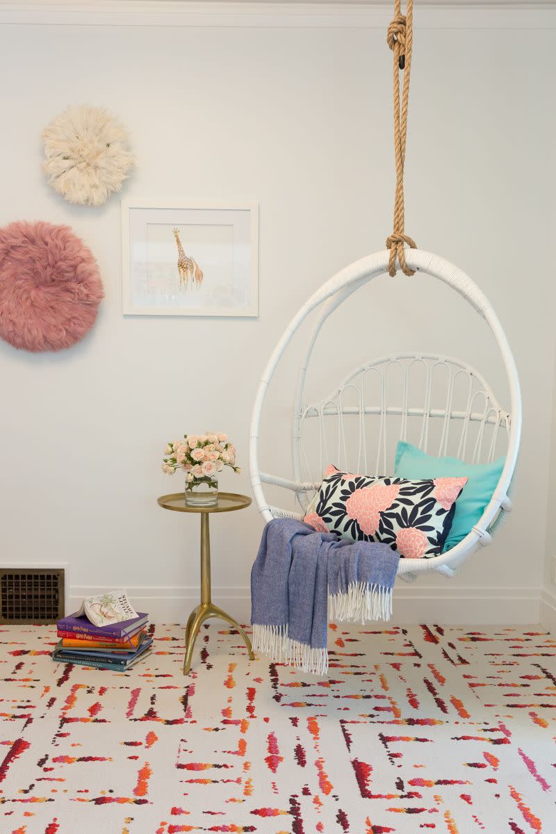
It was also a fun trick to use the dividing wall as a makeshift desk, thus separating the work station from the sleeping quarters. “We couldn’t remove that wall—the ceiling would fall down!” laughs Finley. “Instead, we added a swing chair in the corner of the home that could support it, creating a little nook where she could read, since she loves to do that. I just tried to make it seem like everything was put together over time, since that’s how kids live. I would want the room to grow with her.”
The family had a lot of old furniture from their old home that they wanted to repurpose, so Finley made sure that the items they chose would go with their new digs appropriately. For instance, in the dining room, the table was from their old home, but Finley found new chairs and reupholstered them with a dark brown fabric that matched the legs. “They were really open to suggestions, like going darker in the more formal living room since it has more light than the rest of the home,” says Finley. “They have taste, and it wasn’t hard to have conversations about design with them.”

More color and pattern come alive in the powder room and main bathroom—the latter actually having been expanded at the last minute, leading Finley to run out of tile. “We picked some tile from Sweden at first, but then, we didn’t have enough for the enlarged bathroom. So, we just picked some complementary tile and hoped for the best!” she said. “It’s part of the problem solving part of the job, and makes it more fun, in a way.” By placing tile both on the walls and floors, she made the bath and shower look like a sectioned off area in the bathroom, which led the fairly large space to look like two separate areas, as opposed to all one note.

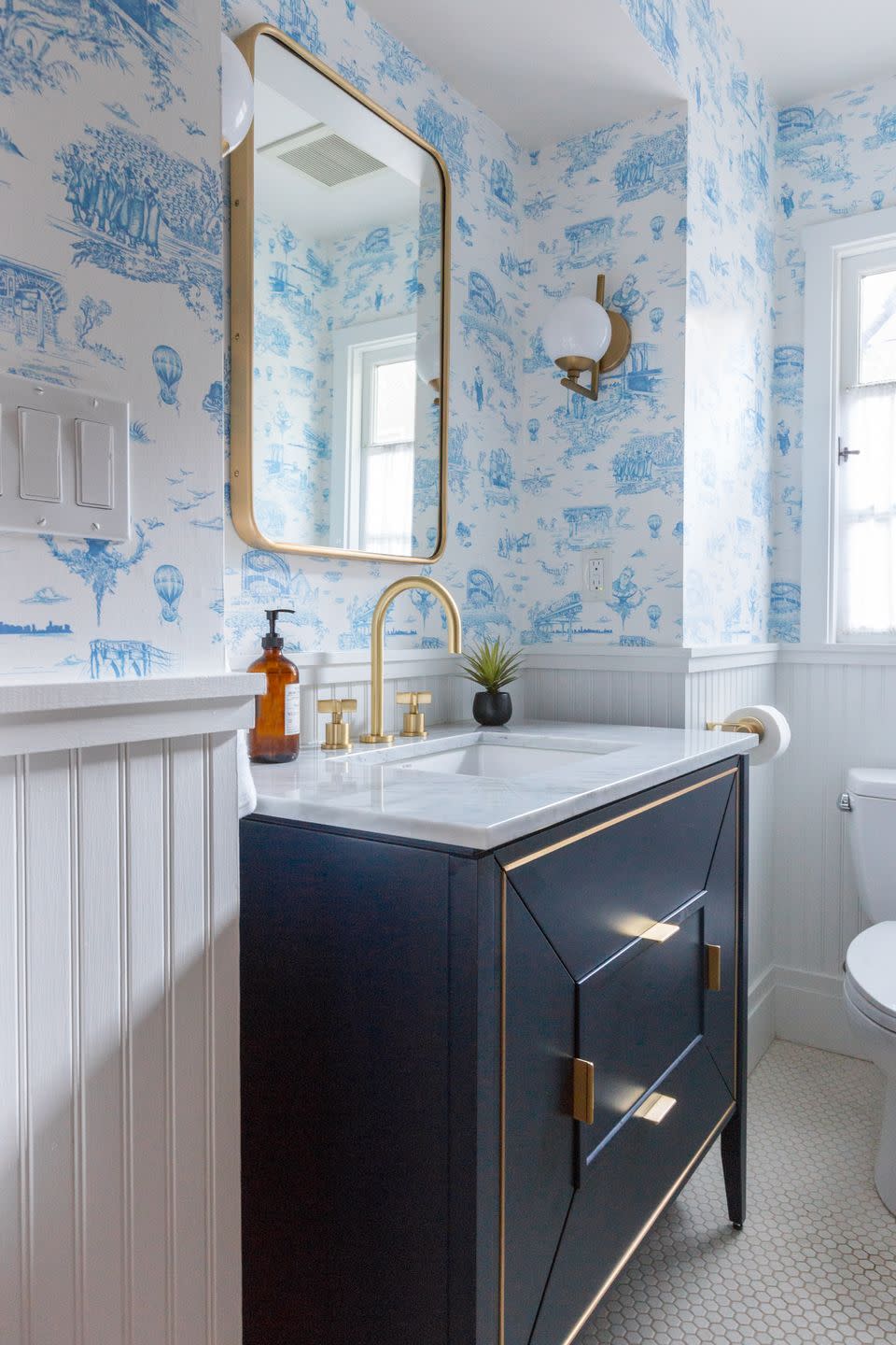
“Alternatively, I think for the powder room, we could use such wild wallpaper because it was such a small space,” says Finley. She wanted to pay homage to the family’s origins in Brooklyn with that wallpaper choice, which features Brooklyn toile that includes legends like Notorious B.I.G. and several New York bridges.
“I typically love to put wallpaper all the way down to the floor, but in this case, I wanted it to be more subtle than that, allowing for the industrial design to really speak for itself,” says Finley. She coordinated the wallpaper with brass and metal accents, along with a navy blue vanity, in order to make sure the room had a modern spin to it. “I think overall, my vibe was to move away from the idea that everything has to match perfectly,” says Finley. “I wanted to go bolder with my choices, since we can always change them up over time.”
See Even More of the House:
Follow House Beautiful on Instagram.
You Might Also Like

