New "Yukon" signs to replace old wood ones in 2024

New "Yukon" signs will be greeting people entering the territory in 2024.
The territorial government is doing away with nine of the wooden place markers that have welcomed visitors along the Yukon's highways and outside the Whitehorse airport since the mid-90s, and replacing them with a modern design.
The new signs, according to government tender documents seeking a contractor to make and install them, will be approximately three-and-a-half metres tall, featuring four jagged, overlaid panels.
"Yukon" will be displayed across the top two panels — the first one, a deep yellow, and the second, a dark blue — followed by a third panel that can either be left a solid colour or filled with local art. The fourth panel will also be a solid colour, to be picked from an approved palette that includes "Dune" grey, "Fir" green, "Glacier" blue, "Pink sunset" and "lazulite."
The mock-ups do not include any other writing on the new signs, including "larger than life" — the slogan on the current ones.
Yukon tourism minister John Streicker, in an interview, said it was time for the old signs to be replaced.
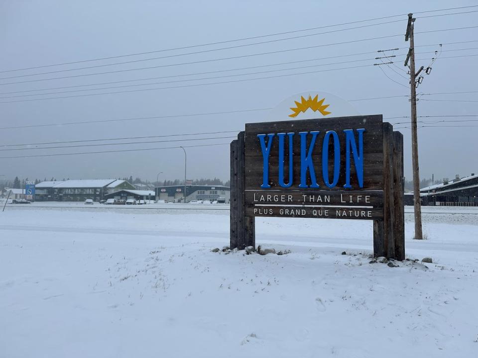
The "Yukon" sign outside of Erik Nielsen Whitehorse International Airport photographed on Dec. 29, 2023. (Jackie Hong/CBC)
"They've been there for decades and we heard from… the tourism industry that some of them are getting a little beaten up, and so under our Yukon tourism development strategy it was one of the actions, to try and refresh the signage," he said.
The new design, Streicker said, lines up with the "Yukon Place" brand, created to help represent and market the territory to potential visitors. Local committees, he added, will be struck to help pick what art goes on each sign, and the art can be changed out "in a few years time" to "focus on something new."
Tourism Industry Association of the Yukon president Tyler Rose told CBC News that he thought the new design was "exciting" and a long time coming.
"It's good for a change and tremendous opportunity, and I think once the entire process is complete, I think people will be very pleased as it comes out," he said, though he also acknowledged that "updating things is always hard."
'People are gonna make fun of us on Instagram'
Members of the Yukon's opposition parties, however, aren't necessarily fans of the new look.
Yukon NDP leader Kate White, shown a mock-up of the new sign by CBC News, sighed and groaned heavily.
"This just, like, reminds me of, I had a bicycle once that was a very current colour and it was hideous and it only survived the one year as being current and then it was just awful. Like, how is that supposed to stand the test of time?" she said of the design.
"People are gonna make fun of us on Instagram. People are going to take photos of this and they're going to be like, 'You can't believe this is like the welcome sign.'"
Yukon Party MLA and tourism critic Geraldine Van Bibber, meanwhile, said the new design was "different."
"I don't think they're my favorite," she said.
"When you hit the border you see the huge blue 'Yukon' on a brown background… it's quite lovely to see," she continued.
"I think totally redesigning them with the new modern concept just doesn't represent Yukon… Perhaps that's the problem. Maybe I just like the old style better."
"If this is what the industry has decided they would like, then yes, let's go for it," Van Bibber added. "But my first reaction was no, let's just perk up the ones we have and that would also save quite a bit of money."
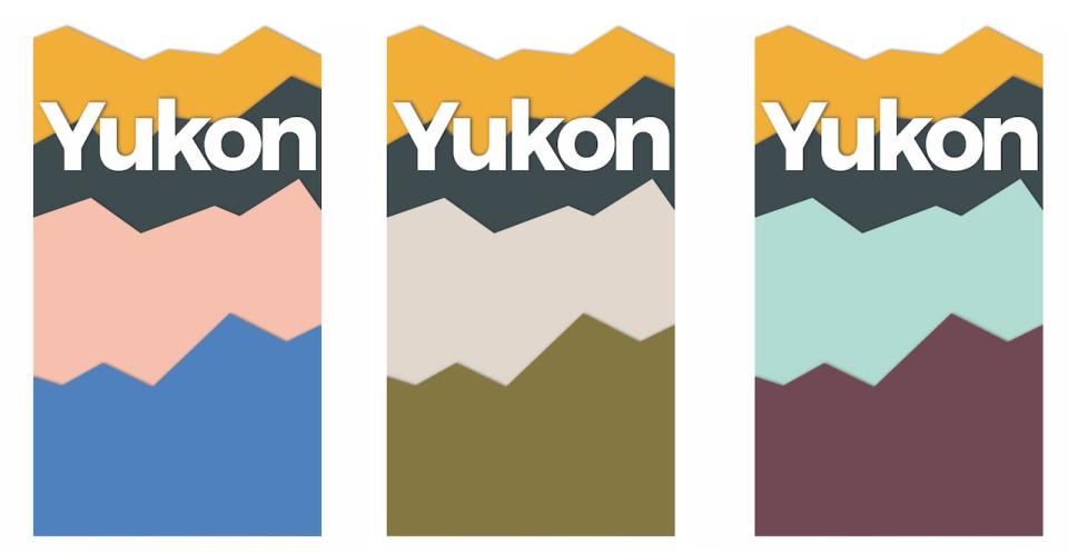
A mock-up of the new "Yukon" sign showing possible colour combinations. (Government of Yukon )
Both White and Van Bibber said they were concerned about how much the sign replacement would end up costing, and would be keeping an eye out for when the contract is awarded.
Bidding for the project closes in mid-January, with the old signs — including the ones on the highways near the borders with Alaska, British Columbia and the Northwest Territories, as well as the one outside the Whitehorse airport — to be removed and replaced by Sept. 30, 2024.
Streicker, asked about criticism of the new design, said he would have been surprised if he "didn't get some concerns."
"Show me two Yukonners and I'll show you several points of view," he said.
"I mean, I think that the old sign will always have a warm place in my heart because it's what first greeted me when I came to the Yukon, but I have some challenges with it — it's of an era itself too, right? And like, I'm excited by the new sign."
Streicker said he's had preliminary conversations about what to do with the current signs once they're replaced, including having them added to the Signpost Forest in Watson Lake.
It's not the first time a re-brand in the Yukon has caused controversy. The territorial government, in 2018, launched a new website and "visual identity" at the cost of nearly half-a-million dollars, sparking criticism, praise and a parody Twitter account.
The existing signs themselves have also gone through several alterations over their lifespan — the Yukon's last slogan was, "The magic and mystery." At another point, the signs had a "Welcome" above them instead of a drawing of the sun peaking over three mountaintops, had mountain graphics on top of the large blue "Yukon," and referred to the territory as "Canada's true north."

